After testing hundreds of paint colors over the years, I’ve learned that choosing the right one is less about luck and more about following the right process. These are the tips and principles I rely on for every project.

Paint Color Basics
LRV (Light Reflectance Value)
- LRV measures how light or dark a paint color appears on a scale of 0 (black) to 100 (white)
- Lower LRV = darker color. Higher LRV = lighter color.
- Photos can be deceiving. Always reference LRV when comparing colors.
- The same paint color can look dramatically lighter or darker depending on the amount of natural light in the room.
- In low-light or north-facing rooms, go warmer and lighter than you think you need. Colors read darker and cooler in limited natural light
- In bright south or west-facing rooms, colors can handle lower LRV without feeling cave-like
Undertones
- Ignoring undertones is the #1 paint mistake people make
- Every paint color has an undertone: warm (yellow, beige, pink, red) or cool (blue, green, gray, purple)
- White paint has undertones too—even the brightest whites.
- Undertones only reveal themselves next to other colors in the space. Always test against your existing floors, counters, and fixed elements.
- I personally lean towards warmer undertones and steer clear of anything with cool gray or purple undertones.
- Greige colors (gray-beige) can pull either warm or cool with yellow, pink or blue undertones. Always test in person, never trust the chip alone
Natural Light Direction
- North-facing rooms: colors tend to read cooler and darker. Choose warmer tones than you think you need.
- South-facing rooms: get the most light, can handle deeper or cooler tones
- East-facing: warm morning light, cooler in afternoons — test at both times
- West-facing: cool mornings, warm golden afternoon light
- Artificial lighting matters too. Warm bulbs (2700K–3000K) make colors appear warmer, while cooler bulbs (4000K+) can make them feel colder and more sterile.
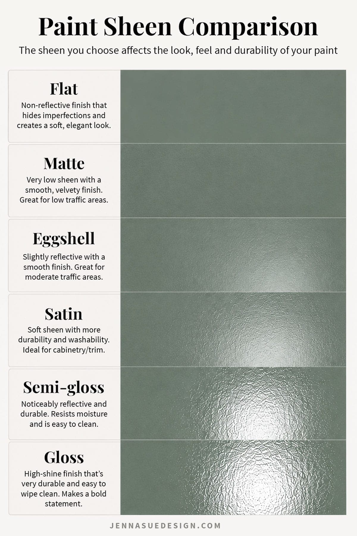
Paint Sheens: What I Use
- Walls: Flat or matte on most drywall. Eggshell for higher-traffic spaces if you want added durability.
- Walls with millwork: Satin.
- Cabinets: semi-gloss or satin for durability — recommend Benjamin Moore Advance or Sherwin Williams Urethane Enamel for cabinet painting
- Doors and trim: satin or semi-gloss
- Ceilings: flat/matte
Learn more about the different finishes in my Paint Sheen Guide.
My 7-step Paint Color Selection Process
- Start with looking up the colors online to narrow down options. Search the paint color’s name to find real-life photos of it in actual rooms before ordering a sample—these are far better indicators of the true color than online “room visualizer” tools.
- Never trust a screen or paint chip. Colors look dramatically different in different rooms, different angles, different cameras and lighting. They also often feel bolder on the wall than on the paint swatch.
- Use paint decks to compare colors side by side. SW and BM decks are available for under $30 online or at paint stores, or you can stock up on sample cards in store. Most paint companies also have an online color chart of their full catalog. Identify the closest matches in your color family and sample those too. You’ll regret not having the near-matches on hand when you’re testing.
- Order peel-and-stick paint samples. This is the most important step, never skip it. I recommend Samplize (use code JENNA15 for 15% off orders $30+). I typically order at least 8-10 samples for a single color decision (and have ordered more than 20 sometimes!) Paint is one of the least expensive decisions you’ll make during a renovation—don’t let a few extra samples determine whether you love the room for years to come.
- Test samples in the actual space at different times of day and under different lighting. Morning, afternoon, evening, and under artificial light. Move each sample around to different walls and study it from every angle, lights on and off. If a color doesn’t stand out right away, give it another day or two before narrowing down. Take your time rather than rushing the decision. Pro tip: take a photo of the swatches on the wall (in different lighting) and come back to it with fresh eyes—you’ll often notice something on screen you missed in person, or see the color in a new way.
- Consider your trim, fixed elements, and decor. Always look at a sample next to your trim color, floors, counters, and furnishings. This is often the real deciding factor, and more important than how much you like the color in isolation. Paint should complement the finishes you can’t easily change, not compete with them.
There is no single “right” color
There is no universally perfect paint color—only the right color for your home, your lighting, and your finishes. Every paint color changes throughout the day. Morning light, evening light, cloudy skies, and artificial lighting all reveal different sides of the same color. The goal is to find a color that you love in the conditions that matter most, not one that’s flawless in all of them.
Designer Rule: Choose Paint Last
Paint should usually be one of the last major selections, not the first.
Choose your flooring, tile, countertops, furnishings, fabrics, and rugs first. Paint can be matched to almost anything, but those larger investments are much harder to change. This simple shift removes a tremendous amount of guesswork and dramatically increases your chances of ending up with a cohesive home.
Looking for the top paint recommendations by color? Try these guides:
- The Most Popular Interior Whites: https://www.jennasuedesign.com/the-10-best-white-paint-colors-as-chosen-by-designers/
- The Best Exterior Whites: https://www.jennasuedesign.com/the-10-best-white-exterior-paint-colors/
- The Best Greige Paint Colors: https://www.jennasuedesign.com/the-15-best-greige-paint-colors-with-real-photos/
- 40+ Sage Green Paint Colors: https://www.jennasuedesign.com/sage-green-kitchen-cabinets-with-paint-colors/
- Popular Olive Greens: https://www.jennasuedesign.com/the-best-olive-green-paint-colors/