Choosing the right white paint can feel like a daunting task, given the seemingly endless array of options to choose from. In this post, I’ll help you narrow down the search with real-life examples of the most popular white paint colors, as chosen by designers.
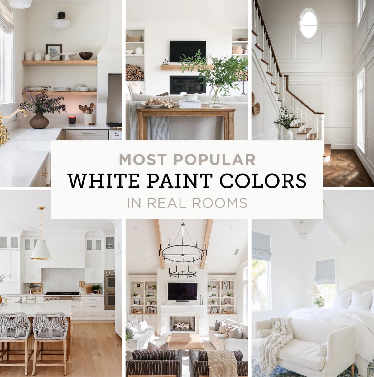
The paint colors in this guide are the tried and true favorites that appeared most frequently on designer and home magazine lists around the web. Let’s dive in and explore what makes these colors stand out among the rest.
Jump to:
How to Choose the Right White Paint
There are more shades of white than any other paint color, so the first step is to do a little research to narrow them down (this blog post is the perfect start!)
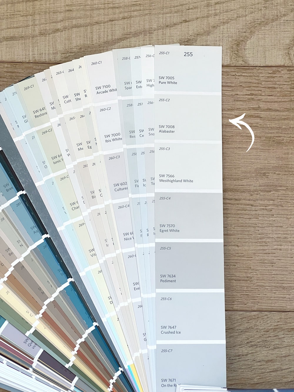
I’ve also found paint decks very helpful to compare colors side by side (I bought my Sherwin Williams and Benjamin Moore decks for under $30).
Once you have a handful of favorites identified, order peel and stick paint samples to test them out in person. This is the most important step—don’t skip it! I typically order at least 5-10 colors to be safe, because they always look a little different in person than online.
You can read more about why I recommend these reusable samples below.
What is LRV?
LRV, or light reflectance value, refers to how light or dark a paint color will look on a scale of 0 (black) to 100 (white). The darker the paint color, the lower the LRV number. The lighter the paint color, the higher the LRV number. This number is helpful when comparing paint colors, as photos can be deceiving.
The 10 Best White Paint Colors
Here are the most popular white paint colors amongst designers:
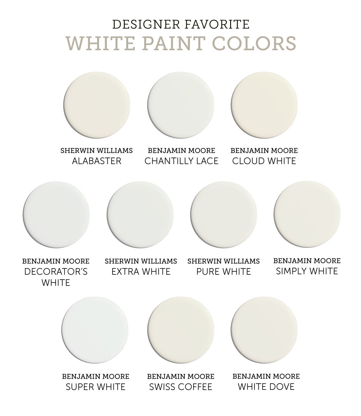
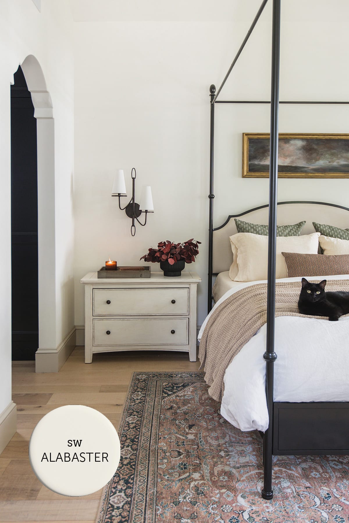
Sherwin Williams Alabaster SW 7008 / LRV: 82
Sherwin Williams Alabaster is a warm, creamy white paint with yellow-beige undertones. It’s a personal favorite of mine, and the color I used throughout both the Hacienda Hideaway and our own home.
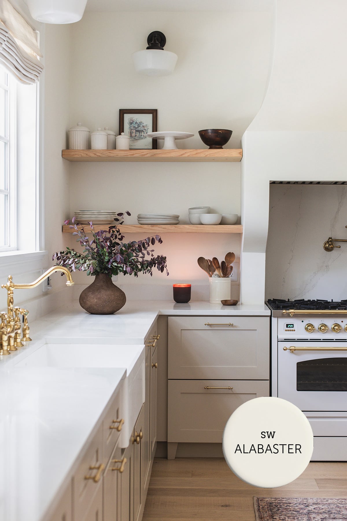
Considered more of an off-white than a true white, Alabaster can range from crisp and light, to slightly yellow next to stark whites. With an LRV of 82, it’s on the darker end of the white paint spectrum.
Alabaster is can be a chameleon depending on the room/time of day/light source, so you’ll definitely want to test this one out before painting your walls. I personally love the cozy and comfortable feel it provides in our homes.
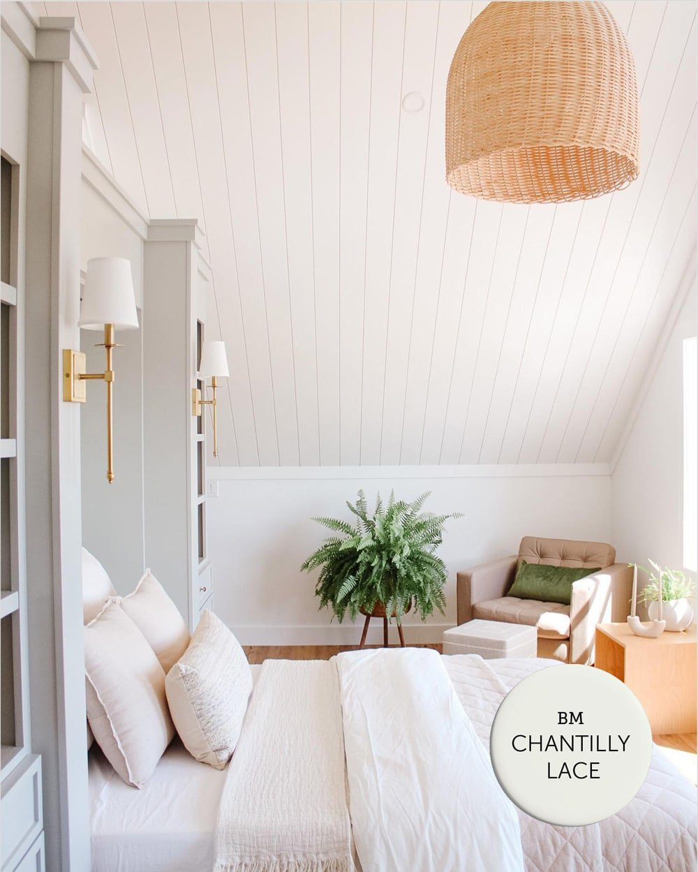
Benjamin Moore Chantilly Lace OC-65 / LRV: 90
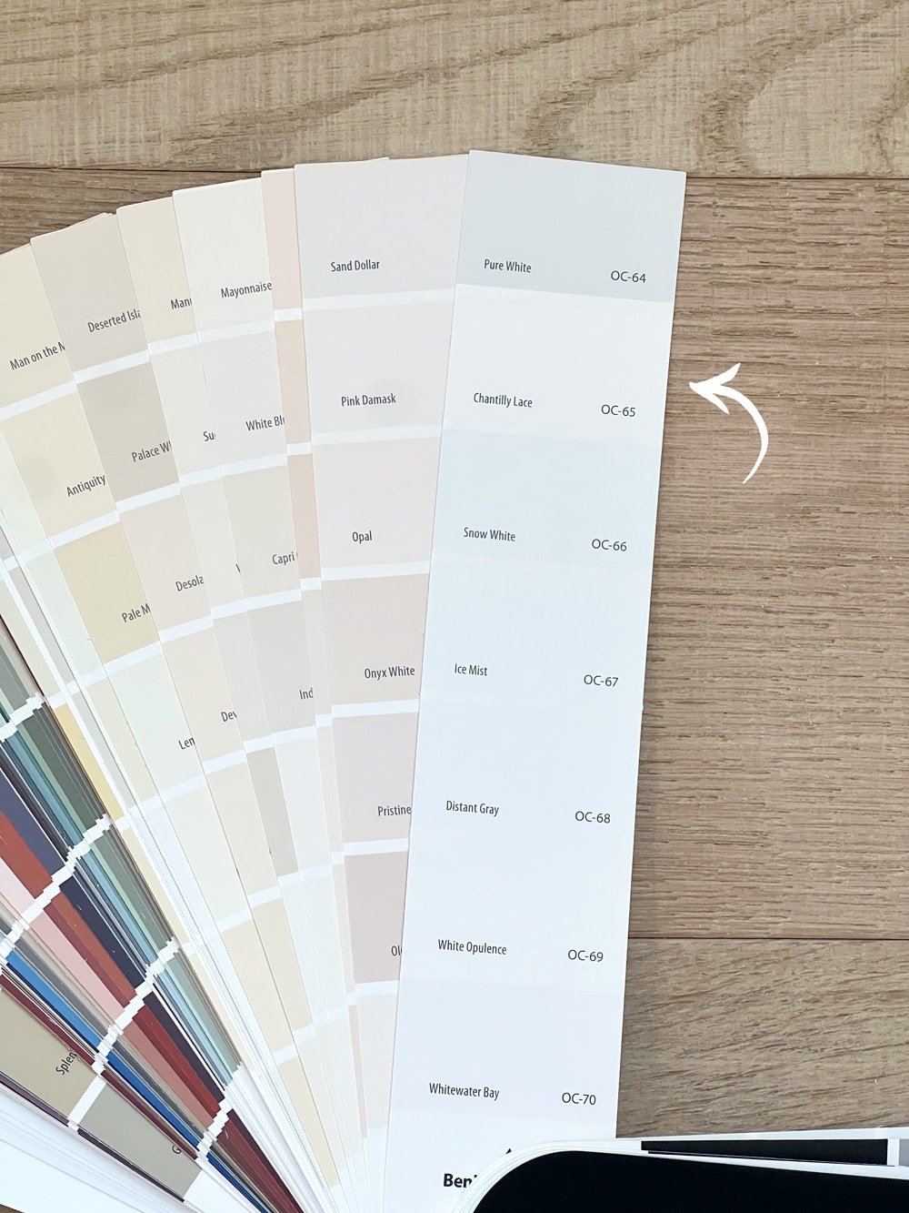
Chantilly Lace is clean and pure white with minimal undertones. It is Benjamin Moore’s brightest white with an LRV of 90, making it one of the brightest and most neutral whites available. This lack of noticeable undertones makes it a versatile choice for a wide range of design styles and color palettes.
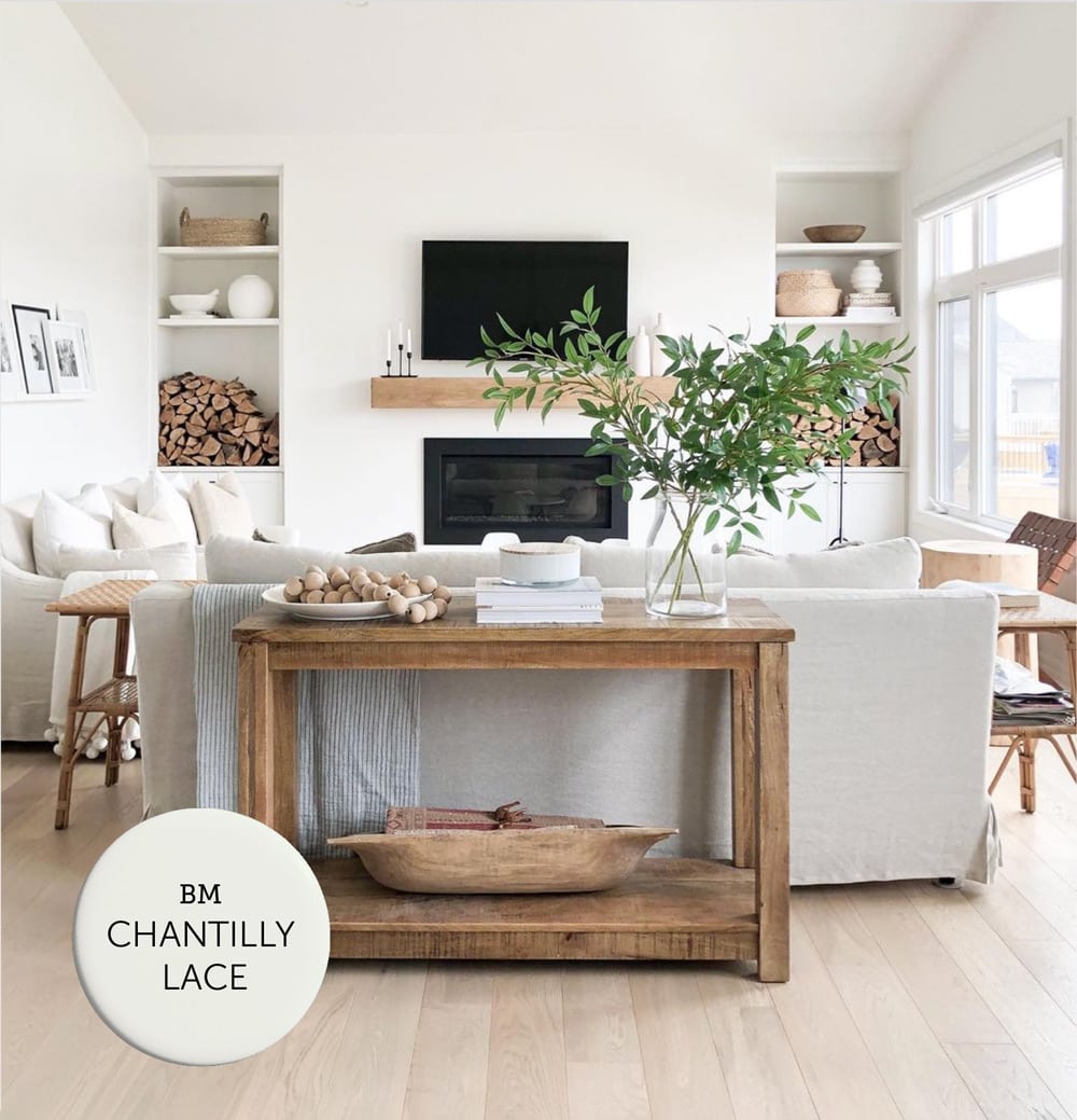
The crisp and neutral appearance also makes it a popular choice for trim, ceilings and kitchen cabinets. It’s a classic, go-to white and one of Benjamin Moore’s best selling paints.
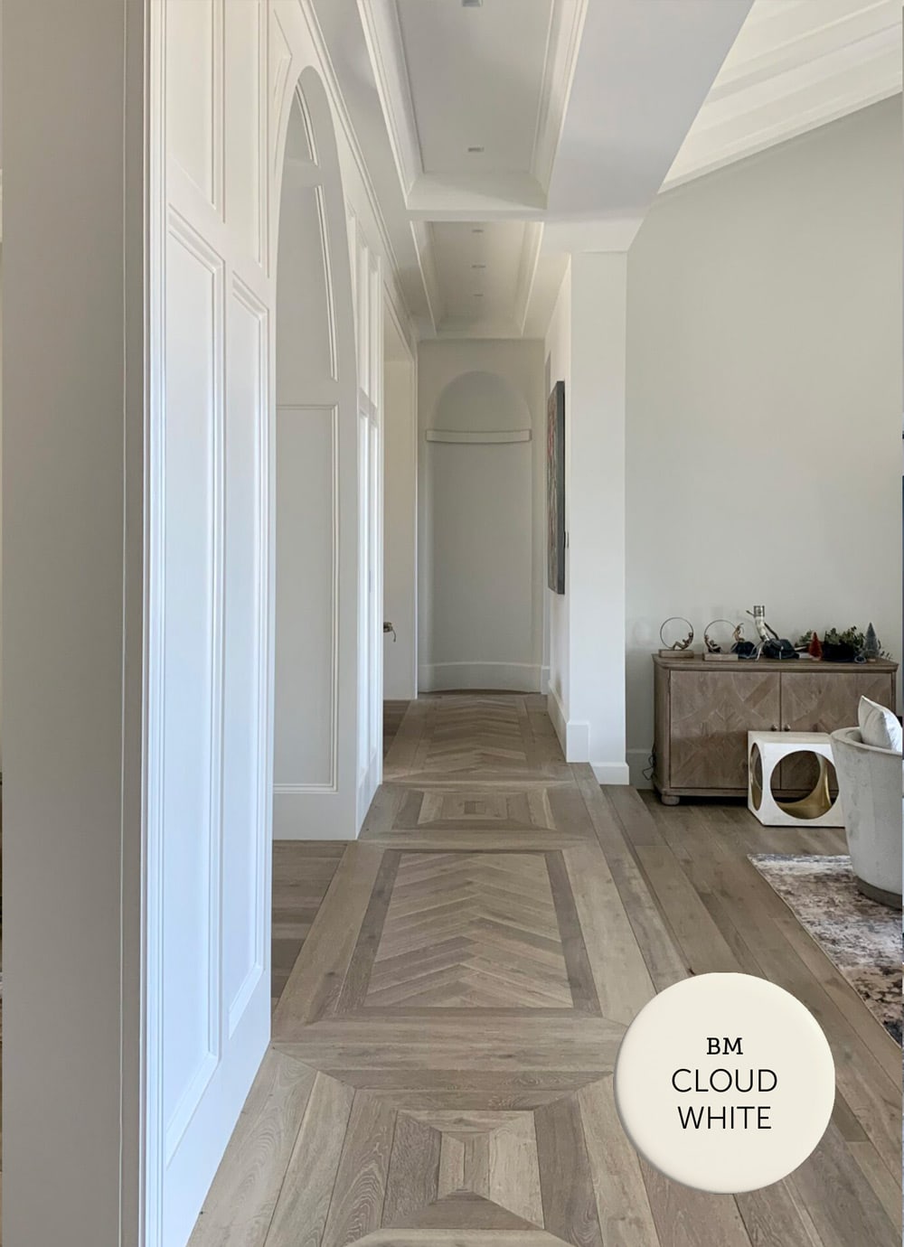
Benjamin Moore Cloud White OC-130 / LRV: 85
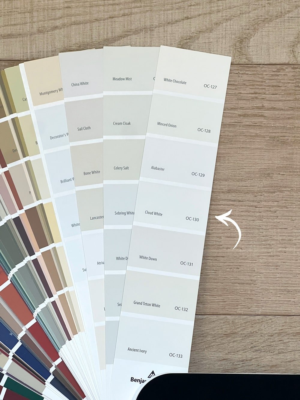
Cloud White is a warm, slightly creamy white with a subtle undertone that leans towards the warm spectrum. This hint of warmth makes it feel soft and balanced, in contrast to brighter, cool whites.
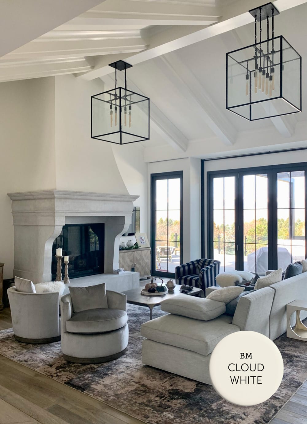
With an LRV of 85, Cloud White is not as bright and reflective as some other whites, and could be considered an off-white. The added warmth can make a space feel inviting and comfortable without feeling too stark or clinical.
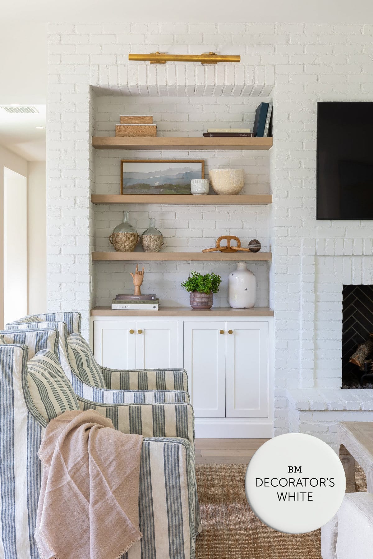
Benjamin Moore Decorator’s White CC-20 / LRV: 82.7
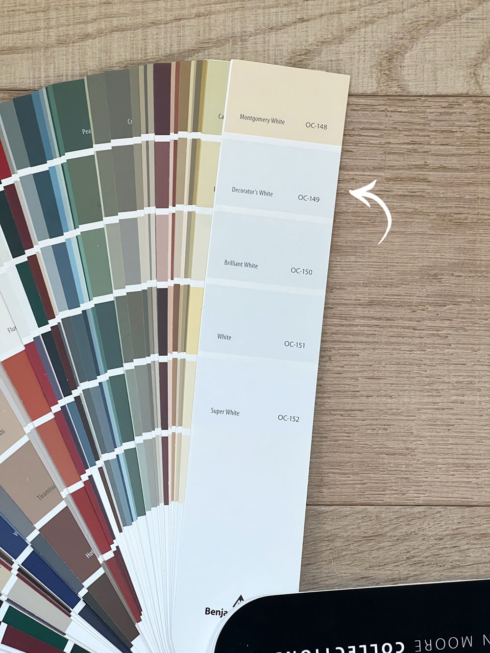
Decorator’s White is a versatile shade that works well on walls, trim, and cabinets. It’s a soft, muted white with cool gray undertones.
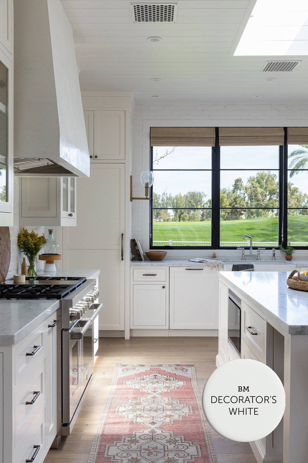
When placed next to brighter whites with a higher LRV, Decorator’s White can appear slightly gray. Even still, it is one of the most popular choice amongst designers for walls and cabinetry.
Looking for more neutral paint color inspiration? Check out the most popular Greige paint colors next! →

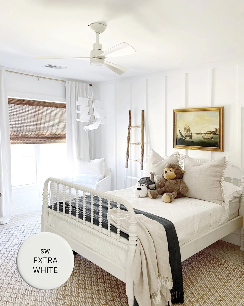
Sherwin Williams Extra White SW 7006 / LRV: 86
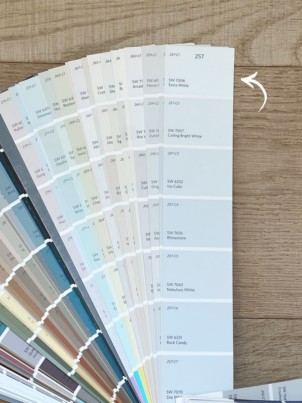
Extra White is one of the cleanest and purest whites by Sherwin Williams. It’s a cool and crisp white paint with blue undertones. It is often used as a trim color but can also work well as a wall color in rooms with warm natural light.
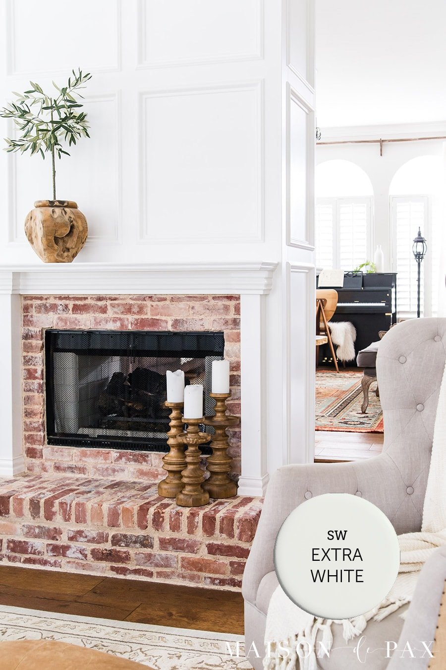
It’s one of Sherwin Williams’ most popular paint colors—in fact, most painters give their clients Extra White if they don’t know what trim paint white color to use. Many builders also use Extra White as their standard base trim color.
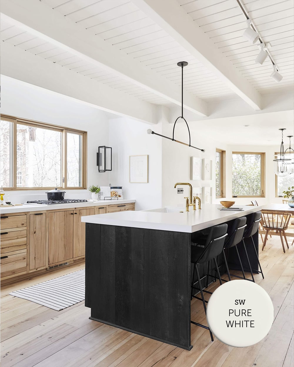
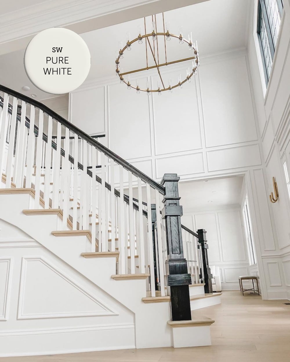
Sherwin Williams Pure White SW 7005 / LRV: 84
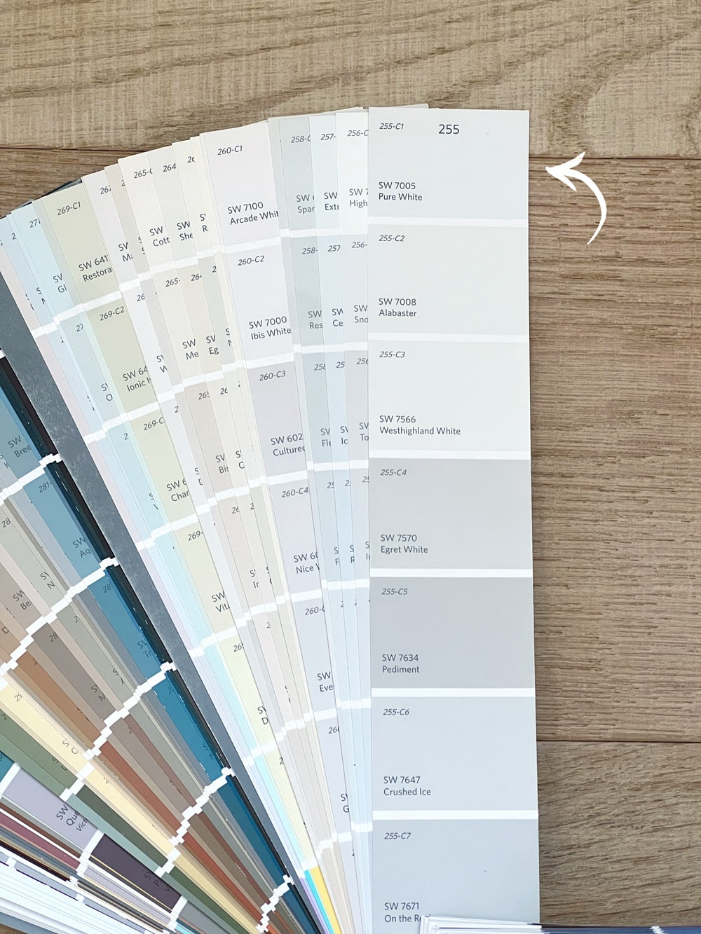
Pure White is the most popular white paint color from Sherwin Williams (and perhaps of all time!) This versatile, bright white has the slightest yellow undertone that keeps it from appearing too stark.
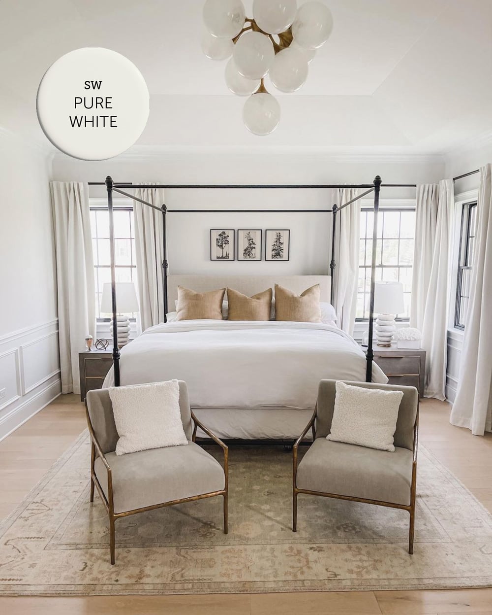
It’s a soft white that is often used on trim, but also works beautifully on walls, cabinetry, and exterior siding. It’s a safe choice in the kitchen, as it won’t clash with most white countertops and appliances.
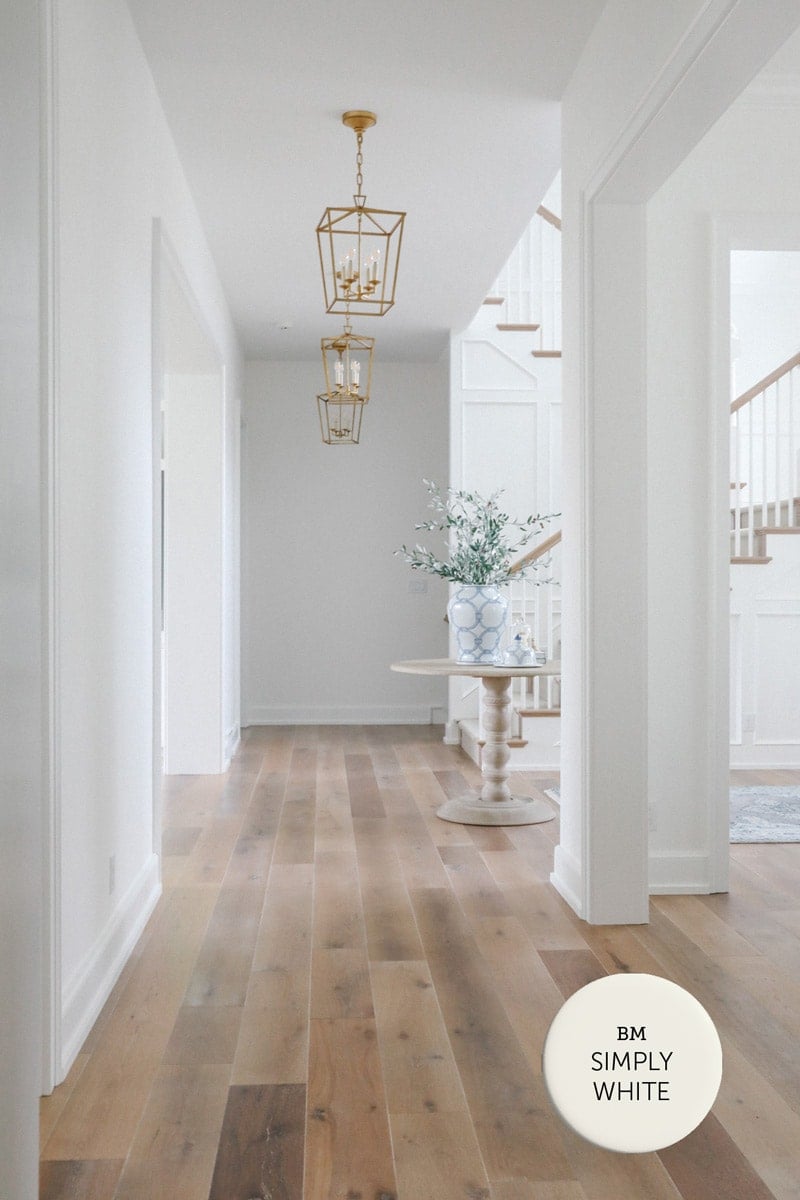
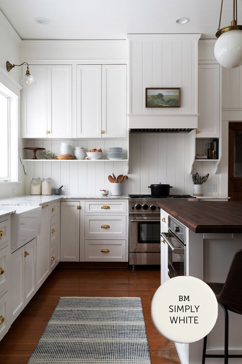
Benjamin Moore Simply White OC-117 / LRV: 89.5
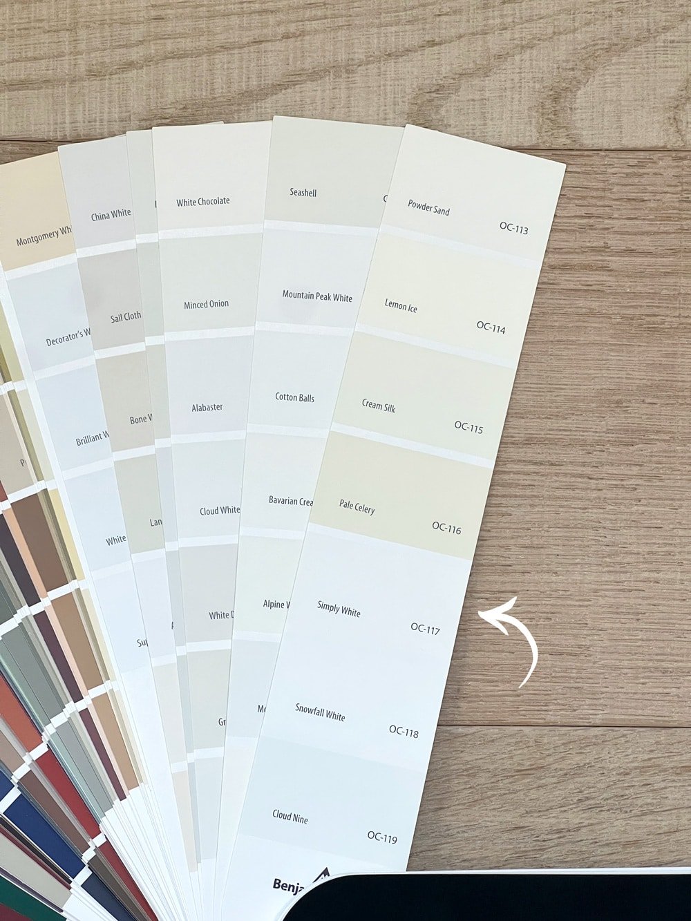
Simply White is a popular and versatile white paint color celebrated for its bright and neutral appearance. It is known for having a clean and fresh look without appearing too stark or cool.
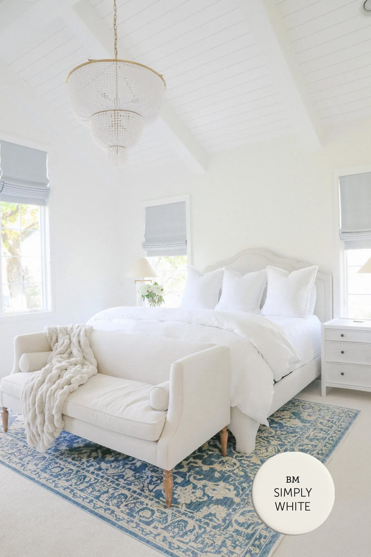
It has the slightest hint of warmth, which is especially noticeable next to cooler tones (such as gray marble countertops in a kitchen/bathroom).
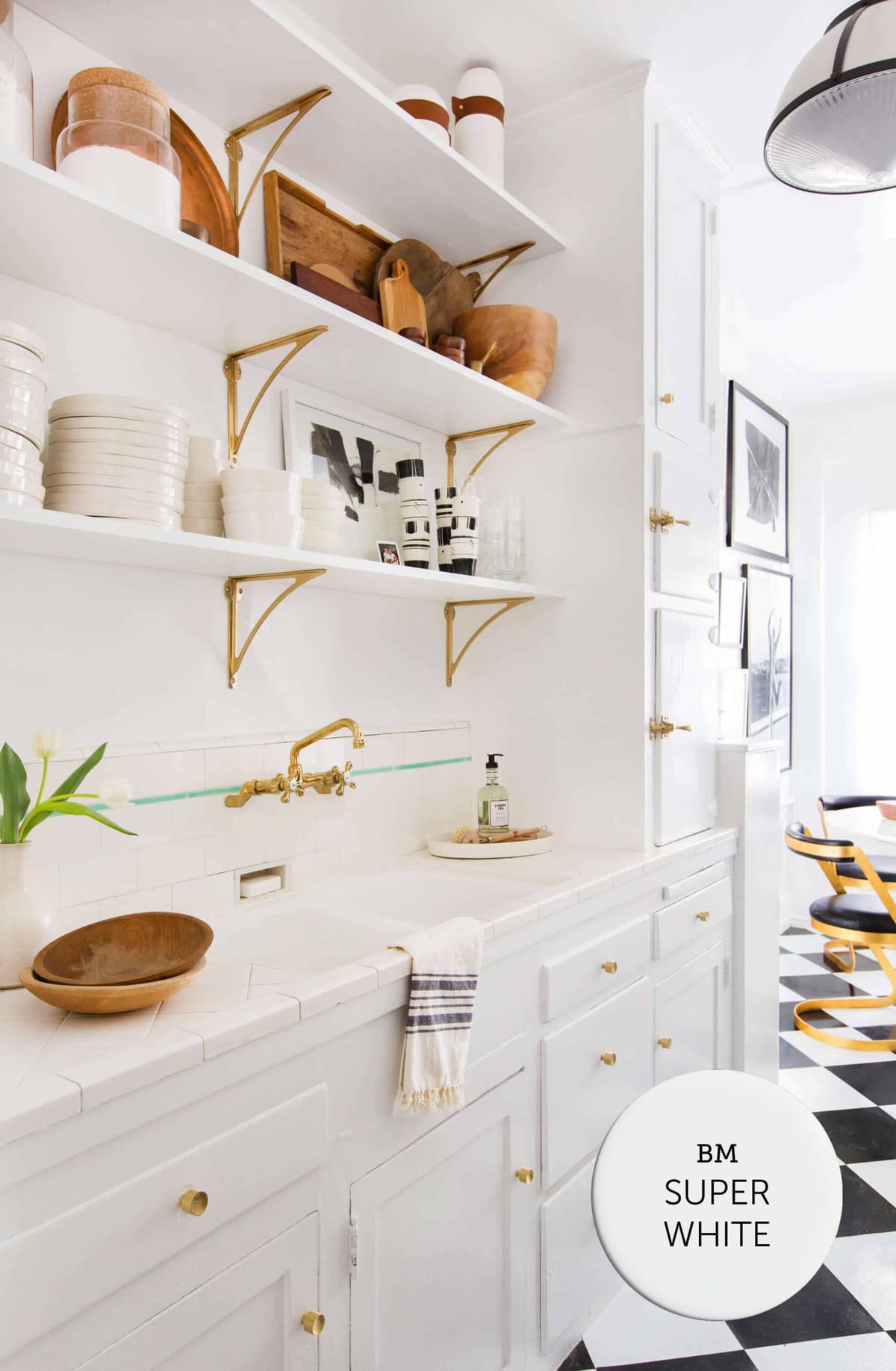
Benjamin Moore Super White OC-152 / LRV: 87.4
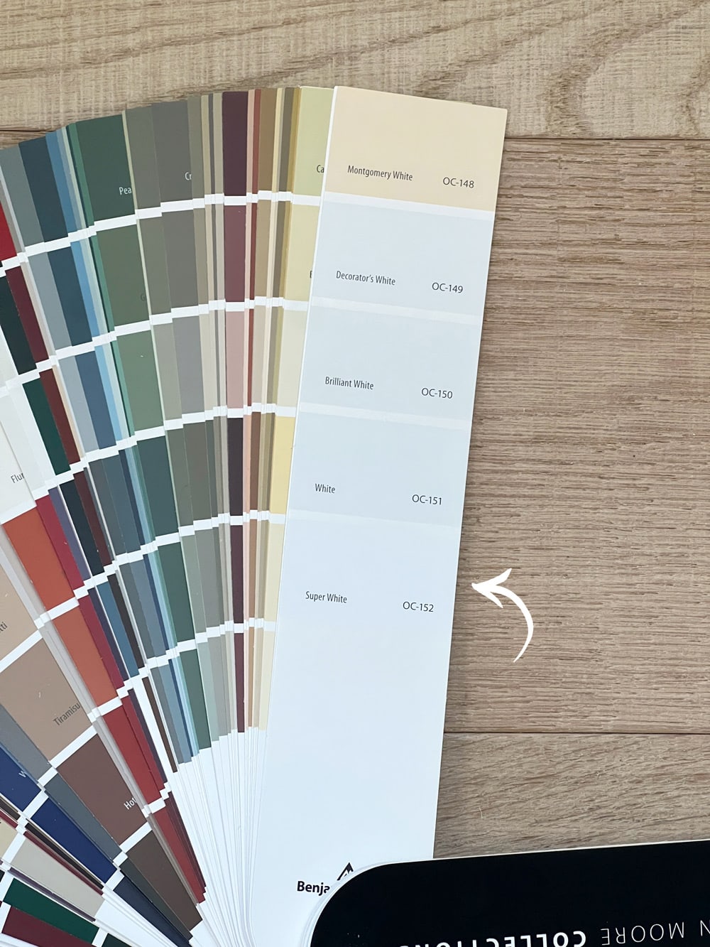
Super White is a pure and bright white paint color with slightly cool undertones. It is a popular choice for modern and minimalist design styles.
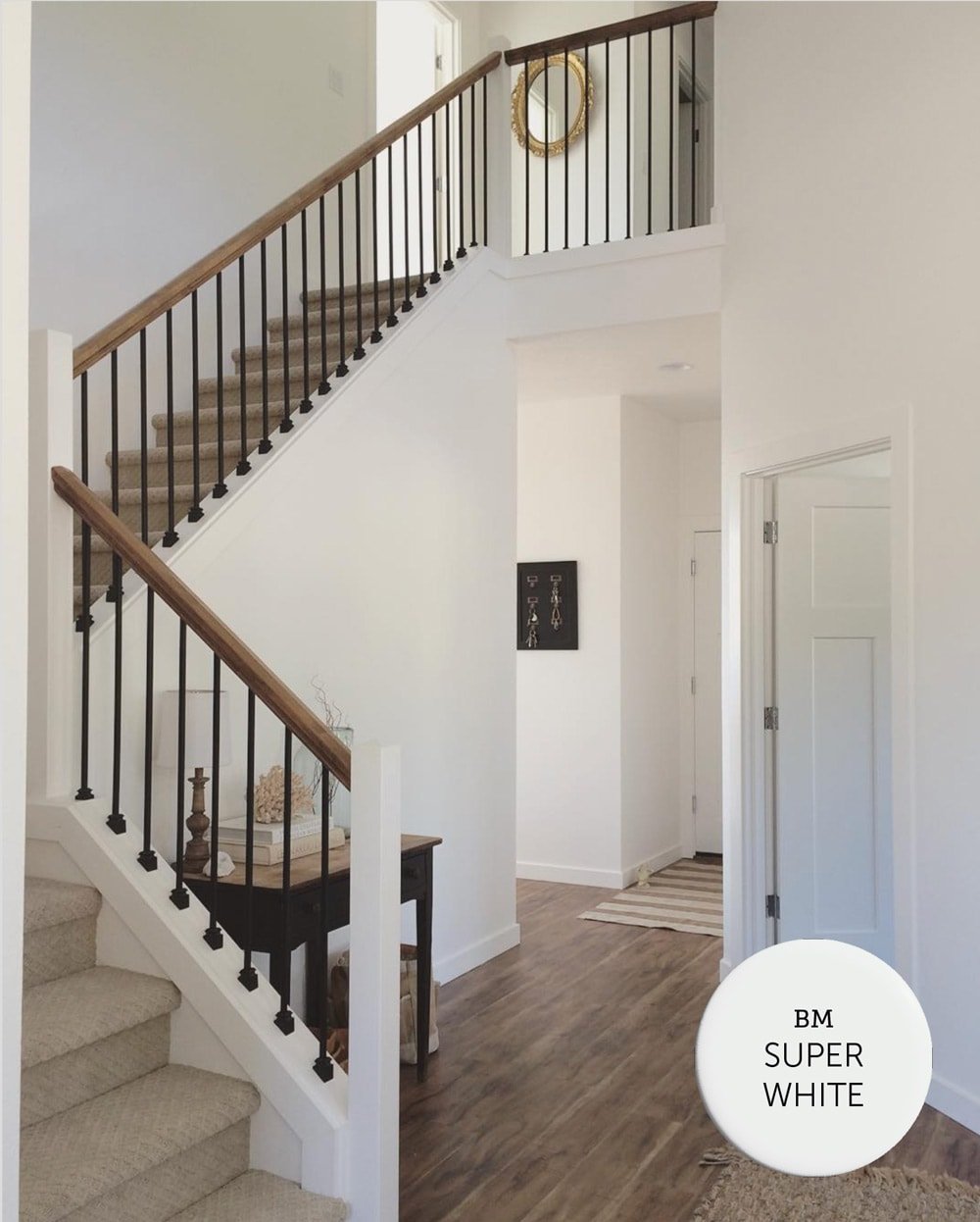
If you are looking for a bright, crisp white—Super White should be on your list of paint samples to test out!
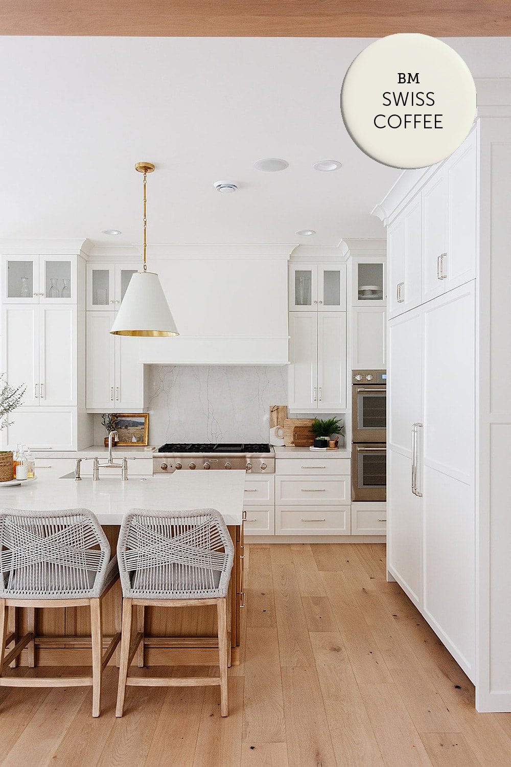
Benjamin Moore Swiss Coffee OC-45 / LRV: 81.9
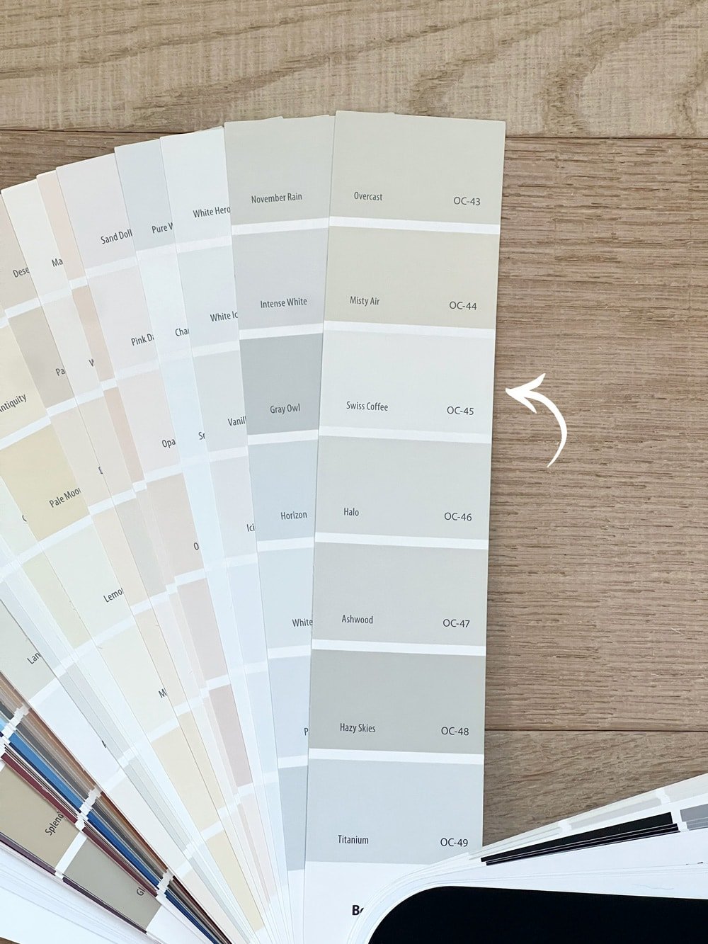
The darkest shade on the list, Benjamin Moore’s Swiss Coffee is a classic, creamy off-white that has been popular for ages.
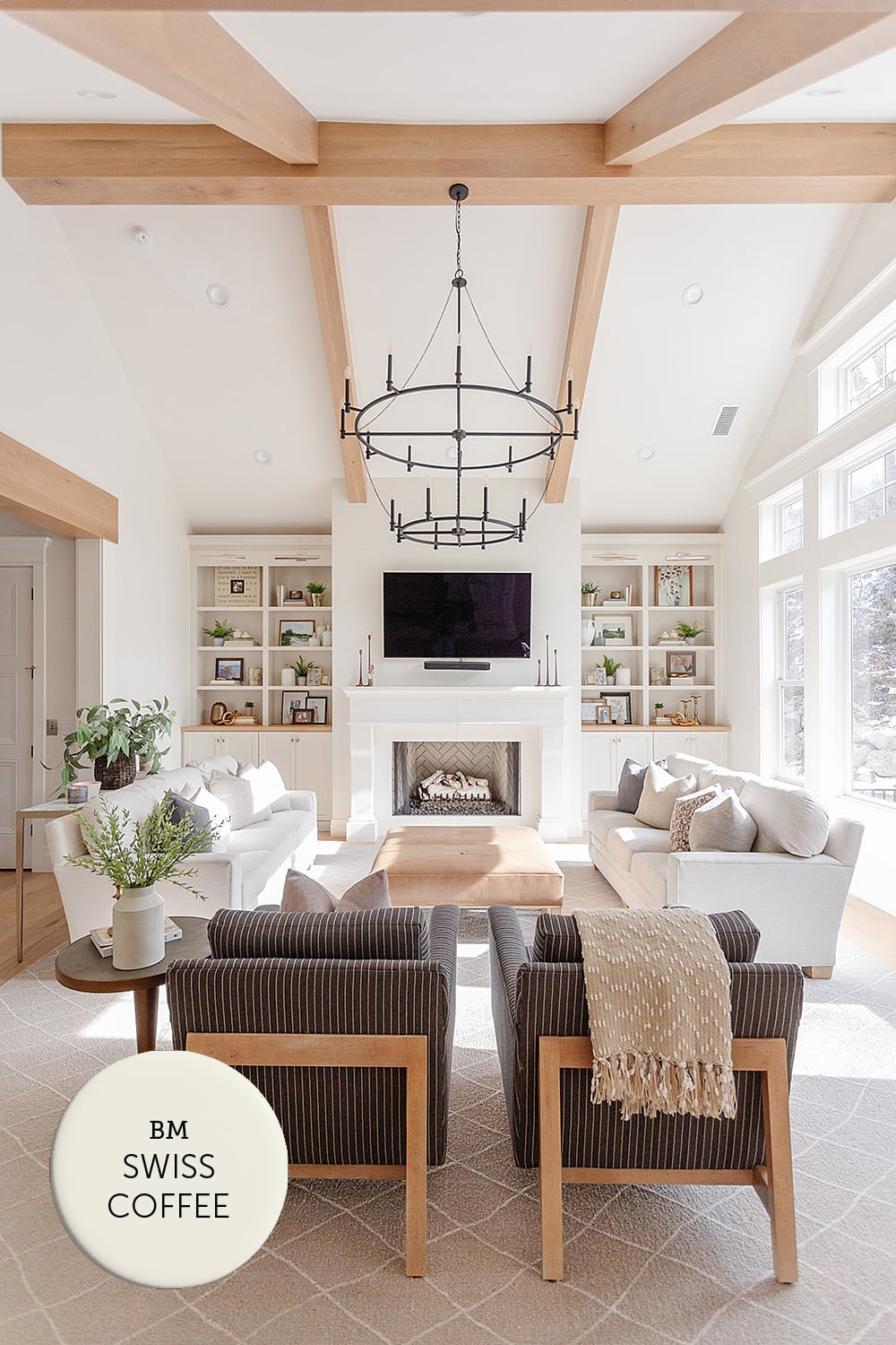
Swiss Coffee has warm, barely-there green undertones that can lean toward yellow. It works best with warm, earthy tones, and is a popular choice to pair with older style granite and laminate countertops.
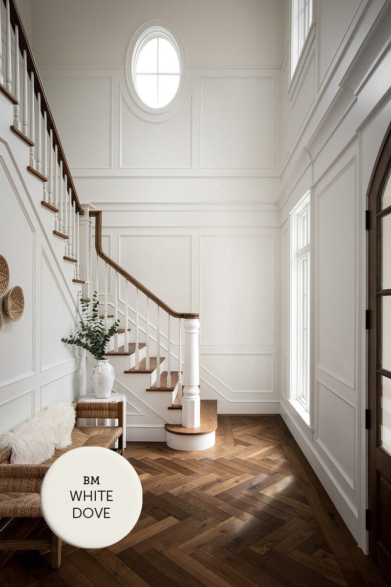
Benjamin Moore White Dove OC-17 / LRV: 83
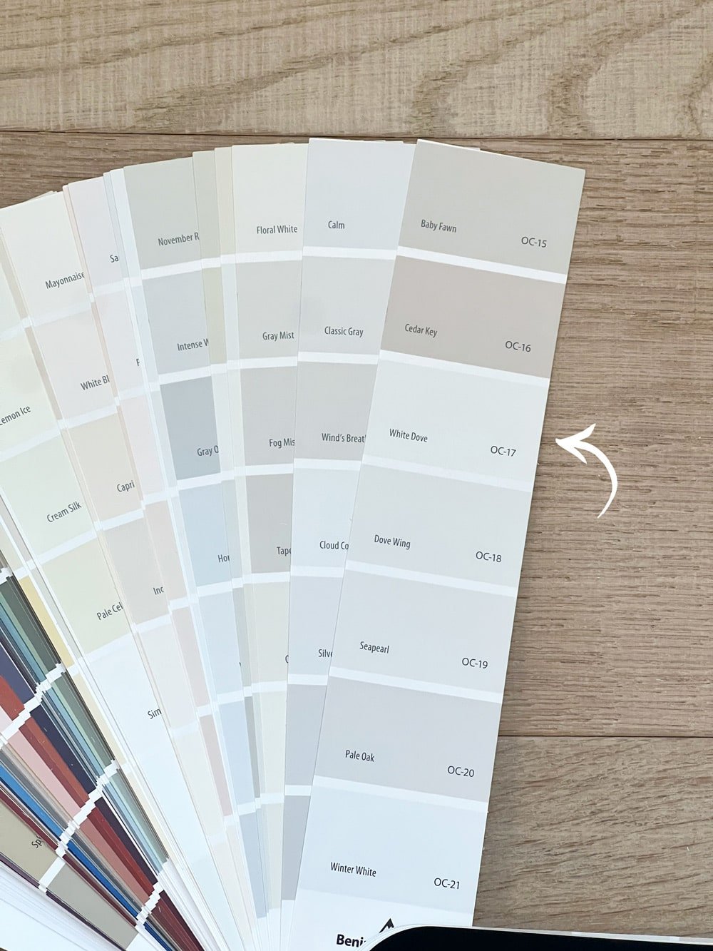
White Dove is Benjamin Moore’s best selling color. It’s a soft and warm off-white, with slight gray undertones that keep it from looking yellow.
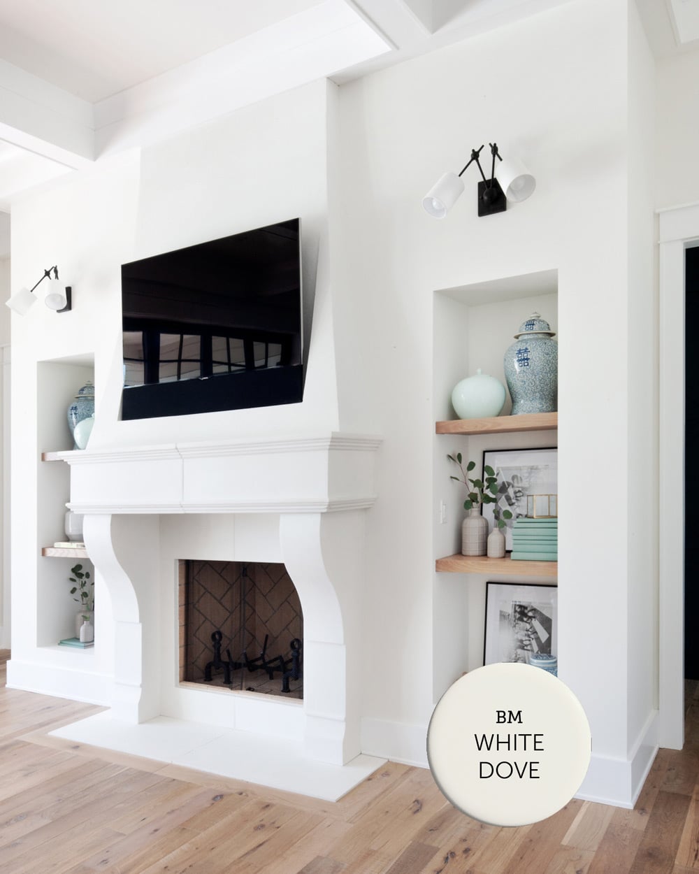
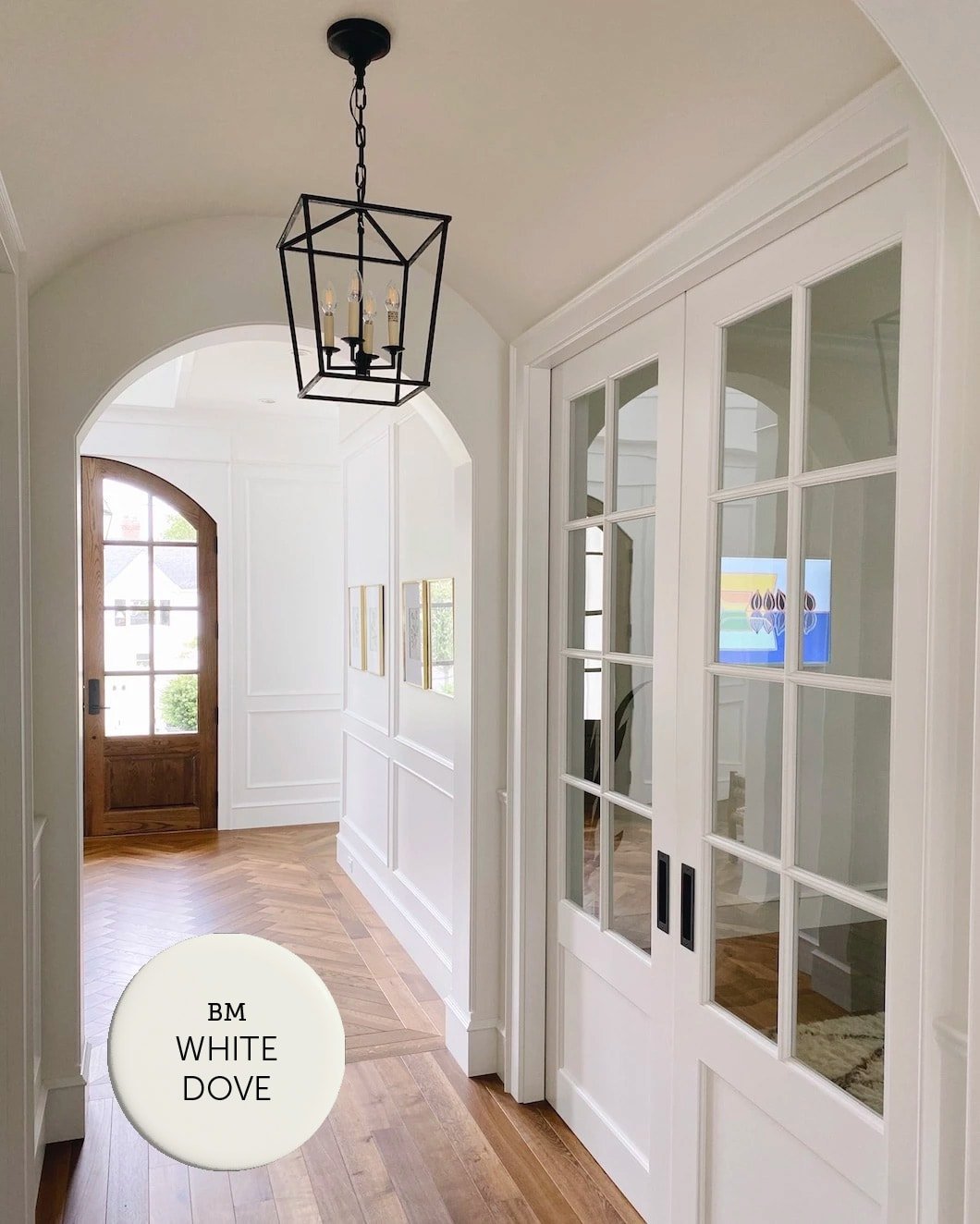
It’s a notable favorite among designers due to its versatility and balanced tone. It’s a tried and tested, fool-proof choice that looks great on just about any surface of the home.
Side by Side Comparisons
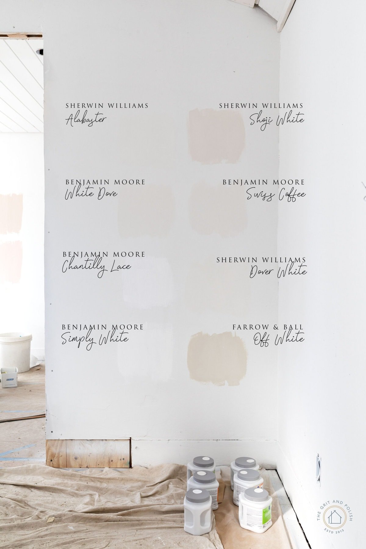
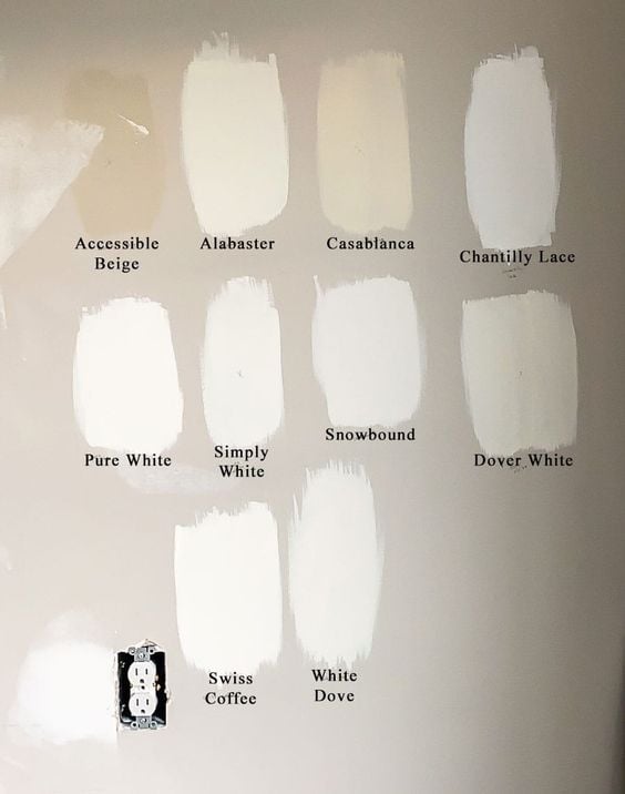
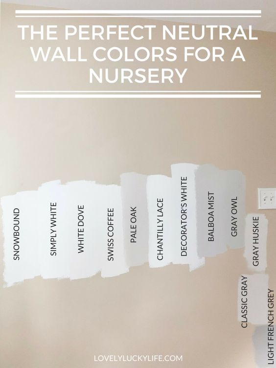
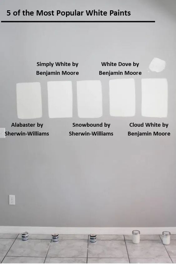
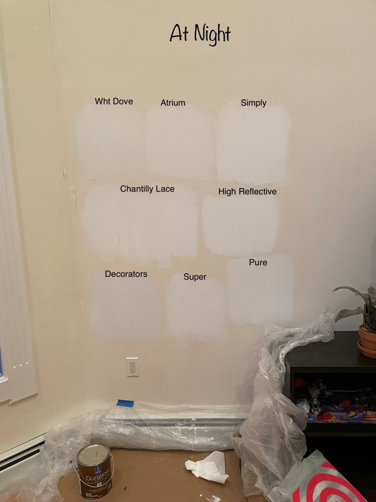
Here are some real-life, side by side paint sample comparisons. You’ll notice how different they can appear from room to room and in each photo. This illustrates just how important it is to test the samples in your own home!
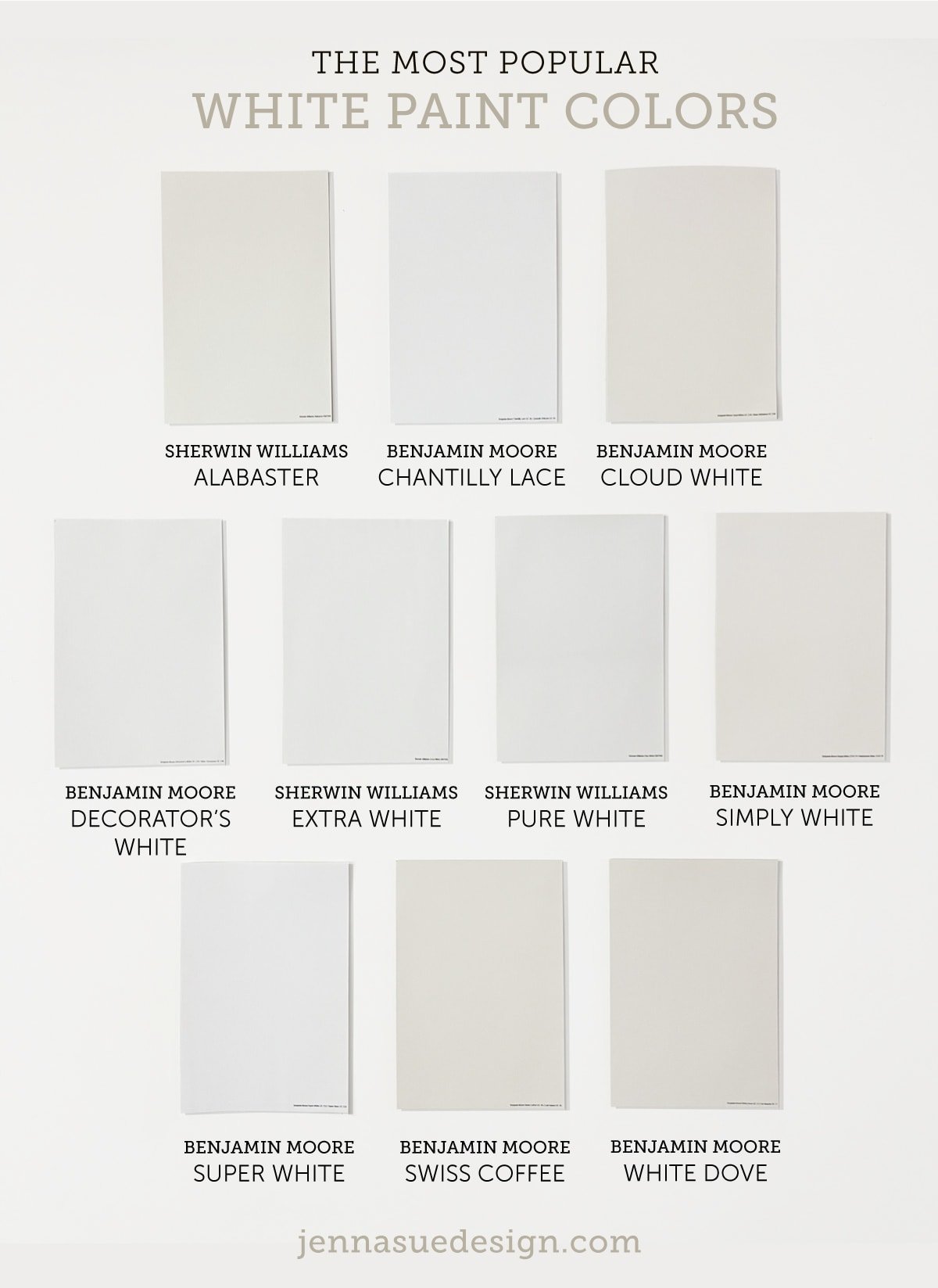
I ordered a sample of each to compare for this post—here’s how they look side by side:
Here are a few more in real homes from around the web (alongside other popular paints):
Considerations when using white paint
White is perhaps the trickiest paint color to choose, as there’s an astonishing array of shades available, and the subtle differences between them can be challenging to discern.
Natural and artificial lighting in a room can dramatically alter how a white paint color appears, making it crucial to consider the room’s lighting conditions. Under warm incandescent lighting, white may appear cozier and take on a slightly warmer tone. In contrast, under cool fluorescent or LED lighting, it can appear crisper and cooler.
White paint is also highly reflective, which means it will take on the tone of surrounding objects. Consider the furniture/decor in the room, and the view from the windows outside, as the walls will reflect those hues throughout the day.
Paint Selection Tips
- Do your research. I start by searching online to find real-life examples and blog reviews (like this post!) to narrow down potential colors.
- Don’t trust renderings (or monitors). Ignore the computer generated “paint visualizer” rooms—online renderings do not translate to real-life results! Even real photos online will vary greatly, so find as many contrasting examples as you can and expect it to still look different in your space.
- Order more samples than you think you need. There’s nothing more frustrating than spending hours narrowing down a handful of colors, only to find that none of them are what you wanted. Play it safe and order lots of reusable samples (at least 6-10). More likely than not, they’ll come in handy again later.
- Take your time when testing samples. Move the samples around to each wall, and study them from every angle, with the lights on and off, throughout the day and night. If one doesn’t stand out right away, give it another day or two and start narrowing them down until a winner is chosen.
- Consider your trim color/decor. It’s critical to look at the paint next to your trim (or wall) colors, as well as your furnishings and decor. Many times, this will be the main deciding factor, and more important than your preference for the color on its own.
What is the best way to test paint colors?
Without a doubt, in my opinion, the best way to sample paint colors is with Samplize reusable peel and stick samples. I’m constantly testing out new colors and looking for ways to streamline the process. Here’s why I made the switch:
- You can order samples without leaving the house, and have them delivered overnight.
- They cost about the same (or less) than store paint samples.
- They’re made using actual paint, so they’re a perfect match every time.
- No mess to clean up, no extra paint cans to store in your garage, and no wasted paint!
- It’s SO much faster to stick them on the wall than to paint 2-3 coats and wait for them to dry.
- You can stick them to anything—including molding, cabinetry, trim and textured walls, to see how they’ll look on any surface.
- You can store and reuse them for future projects. I file mine away in folders grouped by color family.
Pro tip: Samplize also sells a Warm Whites and Cool Whites bundle at a discounted price with all of their most popular whites!
White Paint Q&A
The most popular white paints sold today are Sherwin Williams Pure White, and Benjamin Moore’s White Dove.
The paint colors with the highest LRV (aka, the brightest white) are Kelly Moore Whitest White (LRV: 94.6), Behr Ultra Pure White (LRV 94.4), Sherwin Williams High Reflective White (LRV: 93), Benjamin Moore Chantilly Lace (LRV: 90).
The recommendations in this guide apply to trim and baseboards as well. If your walls aren’t white, you’ll want to consider the overall color scheme and choose a shade with complementary undertones. For a clean and cohesive look, try using the same as your wall color, but in a satin or semi-gloss finish to provide contrast.
If your walls are white, it’s generally recommended to continue the same color on the ceiling for visual continuity (in a flat/matte finish). If your walls aren’t white but your trim is, consider using the trim color (also in a flat/matte finish). Some of the most popular choices from designers include Sherwin Williams Pure White and Decorator’s White; Benjamin Moore White Dove, Super White and Chantilly Lace.
Other designer favorites include Sherwin Williams Greek Villa, Snowbound, Dover White; and Benjamin Moore’s China White, Aesthetic White, Atrium White.
Whew, I think that just about covers it! If you plan to choose a white paint soon or anytime in the future, make sure to bookmark this page as a guide for future reference.
What is your favorite white paint color? Let me know in the comments below!




Gail Goldsberry says
We have travertine tile floors in our condo. They are a beige with yellow gold tones. What color white would be best for the walls and trim?
Elizabeth says
Thank you for a wonderful post. I adore white, but it can be intimidating, and those little sample thingies are not always helpful. I have a couple questions on using a different white for trim: (1) Should the trim color be in the same undertone family (e.g., warm, cool — yellow, gray, pink), or would it matter all that much?; and (2) What about furnishings and accessories? Would you keep everything in the same undertone range, or would it matter all that much? Or even be boring? White seems like it would be easy, but I don’t find that to be true. Oh, and as long as I’m asking,, have you ever heard of wallpapering a ceiling, but not the walls? I’m thinking . . . . Love your blog. Read it from day one, and your growth, and fearlessness, is inspiring!
Emma says
Great post! Would you consider doing a similar post but for exterior whites?
Melinda says
+ 1 on Emma’s request! I use Simply White on a lot of my interior walls but am not sure what white to use externally. I have a stucco spanish house with a red-tiled roof and right now I feel like the exterior is a bit too beigey. I think it’s Navajo White by Kelly Moore. Would love a warm white that doesn’t hurt your eyes in the sun but also doesn’t look too muddy. 🙂
Karen says
That post was excellent brava! Quite a lot of research!
Loved seeing Bradys kitchen again via e henderson. Its right up there with best reveal ever.
Celestte says
Thank you for this post. Timely. I recently moved to North Carolina and our home has very little light because we are surrounded by lots of trees and the builder only installed one center ceiling light in each and every room. Even the kitchen, lol. The front of the house faces North (cool toned) which is our family room. This has been the hardest room to find a paint color because it is so dark even on sunny days. Lots of paint samples is the only way to decide as I don’t want to have to paint the room (and ceiling) twice. Great post!
Carly says
Loved your post on white paints. Lived 12 states almost 20 homes now with A LOT of paint choices. I had a few laughs over differences in regional white paint colors choices depending on what state I was in, the trends are so different(luxury homes). Southern Cali the only word for white was Swiss Coffee and only Swiss Coffee, another state Shoji White, Super White, Assessible Beige, Dove White, Simply White, etc. Current FL new construction inventory home closing shortly the designers picked Snowbound and I am changing all walls as soon as possible to Pale Oak. Great post!!