Are you looking for the perfect greige paint color but don’t know where to start? This post covers the most popular greige paints as chosen by designers, homeowners and the top two paint companies: Sherwin Williams and Benjamin Moore.
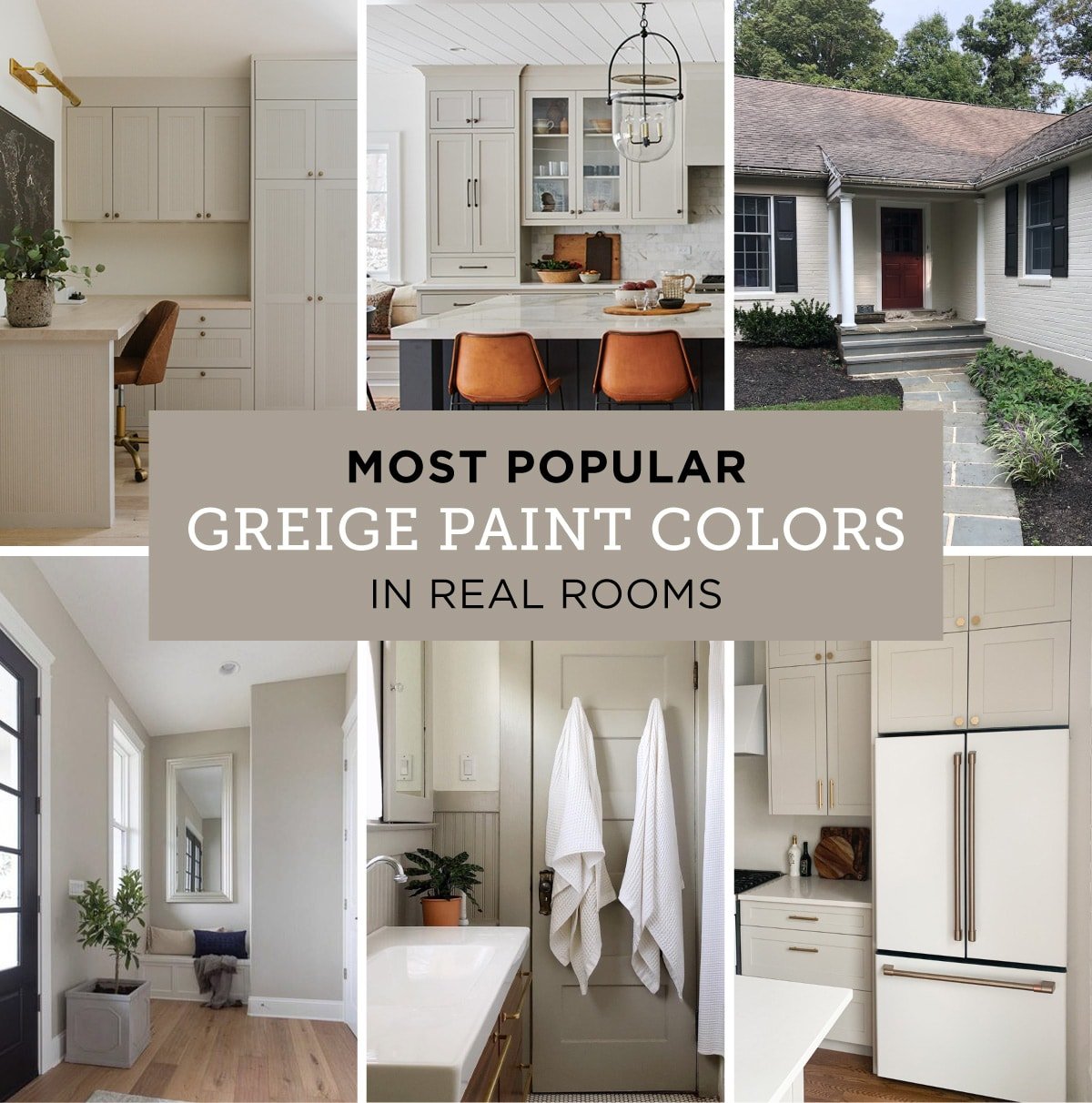
I scoured the internet to find the best, real-life examples of each color in different rooms to help you narrow down your search. Paint colors can look very different on screen vs in person, at different times of day, different rooms/angles, cameras/editing, etc—so I’ve included a range of photos to help provide the most accurate representation.
As always, it’s important to test out samples in person before committing to a color to see how it will look in your space! First, let’s cover the basics:
Jump to:
What is Greige?
Greige is defined as a color that falls within the grey to beige range. Any warm gray or cool beige could be labeled as greige. Often, taupe and mushroom are used interchangeably with the word greige, although taupe typically carries purple/brown undertones.
What is LRV?
LRV, or light reflectance value, refers to how light or dark a paint color will look on a scale of 0 (black) to 100 (white). The darker the paint color, the lower the LRV number. The lighter the paint color, the higher the LRV number. This number is helpful when comparing paint colors, as photos can be deceiving.
The 15 Best Greige Paint Colors
Here are the most popular greige paint colors you’ll find today, from the best selling paint brands—Sherwin Williams and Benjamin Moore:
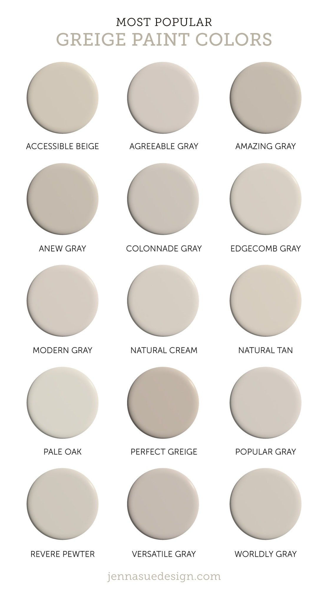
Sherwin Williams Greige Paint Colors
Sherwin Williams has the widest range of popular greige shades, and landed 11 of the top 15 spots on this list. Here’s what you need to know about each of their most popular greige paints:
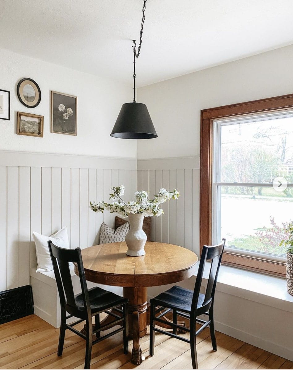
Sherwin Williams Accessible Beige – SW 7036 / LRV: 58
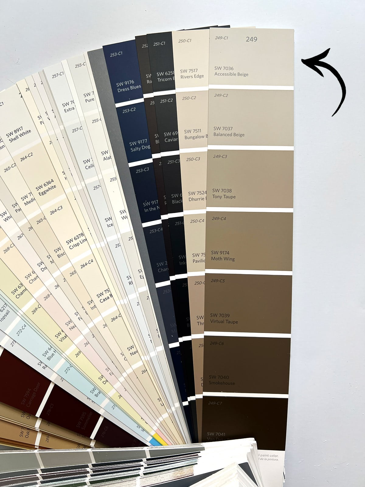
This hugely popular paint color is classified as a beige, but it really walks the line between greige and beige. It’s worth a spot on this list, as it’s a Sherwin Williams best seller and of the most frequently used paint colors by designers and homeowners.
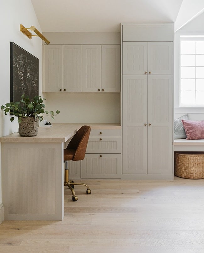
It has just the right amount of warmth to keep it out of gray territory, with neutral undertones that make it versatile and safe choice for any room. It’s also one of my personal favorite paint colors of all time, and the color I chose for the trim, doors, and custom cabinetry in our own home.
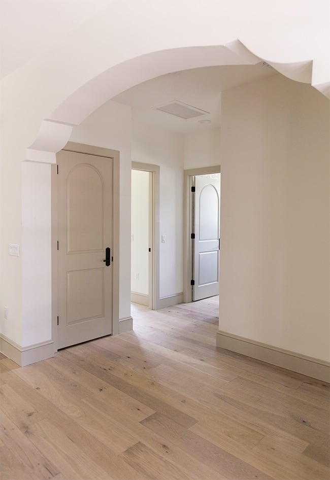
Under warm indoor lighting, it leans more beige, while in cooler daylight, you’ll notice more of the gray undertones. Even still, it is one of the warmest colors on this list.
Sherwin Williams Agreeable Gray – SW 7029 / LRV: 60
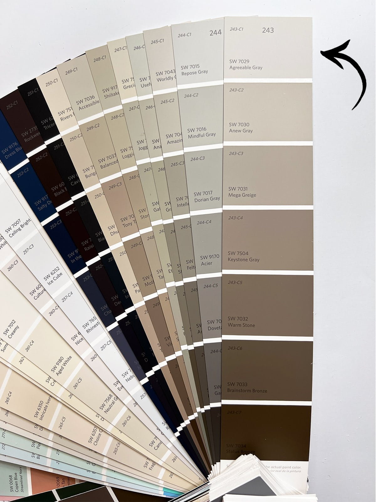
Agreeable Gray has been ranked the top selling Sherwin Williams paint color in recent years. It leans more towards gray on the gray-beige scale, and a great choice if you’re looking for a true warm gray.
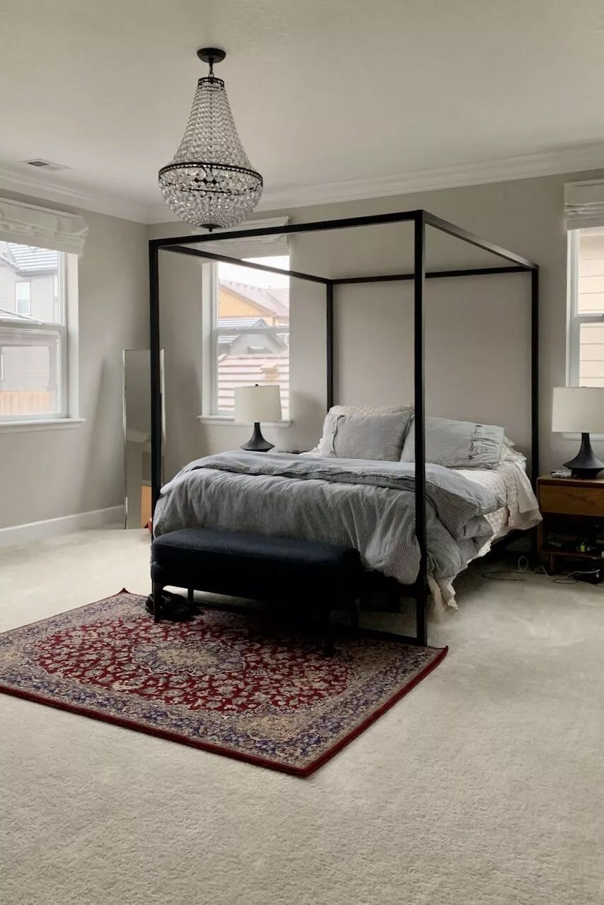
With an LRV of 60, it’s a medium to light shade that works well in many rooms and lighting conditions.
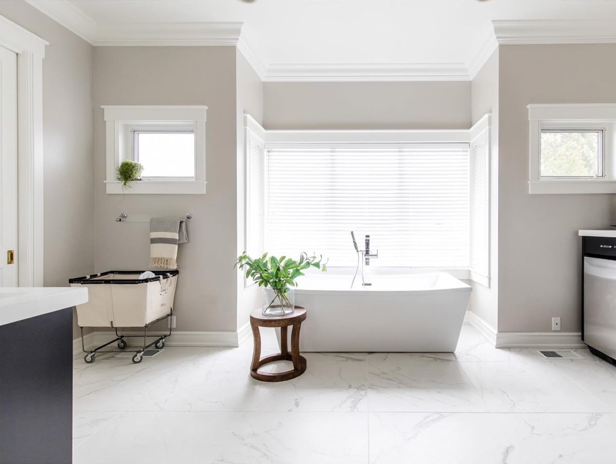
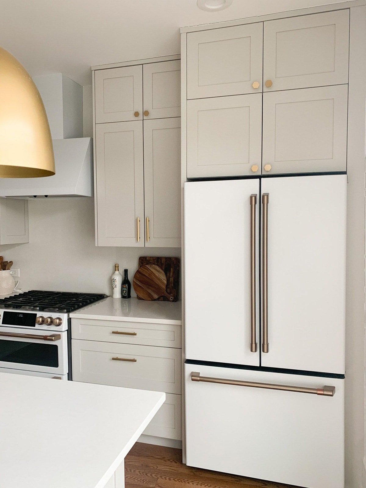
One reason this color is so popular is because of how versatile it is. Agreeable Gray has very neutral undertones, making it compatible and complementary to most flooring, trim colors and decor.
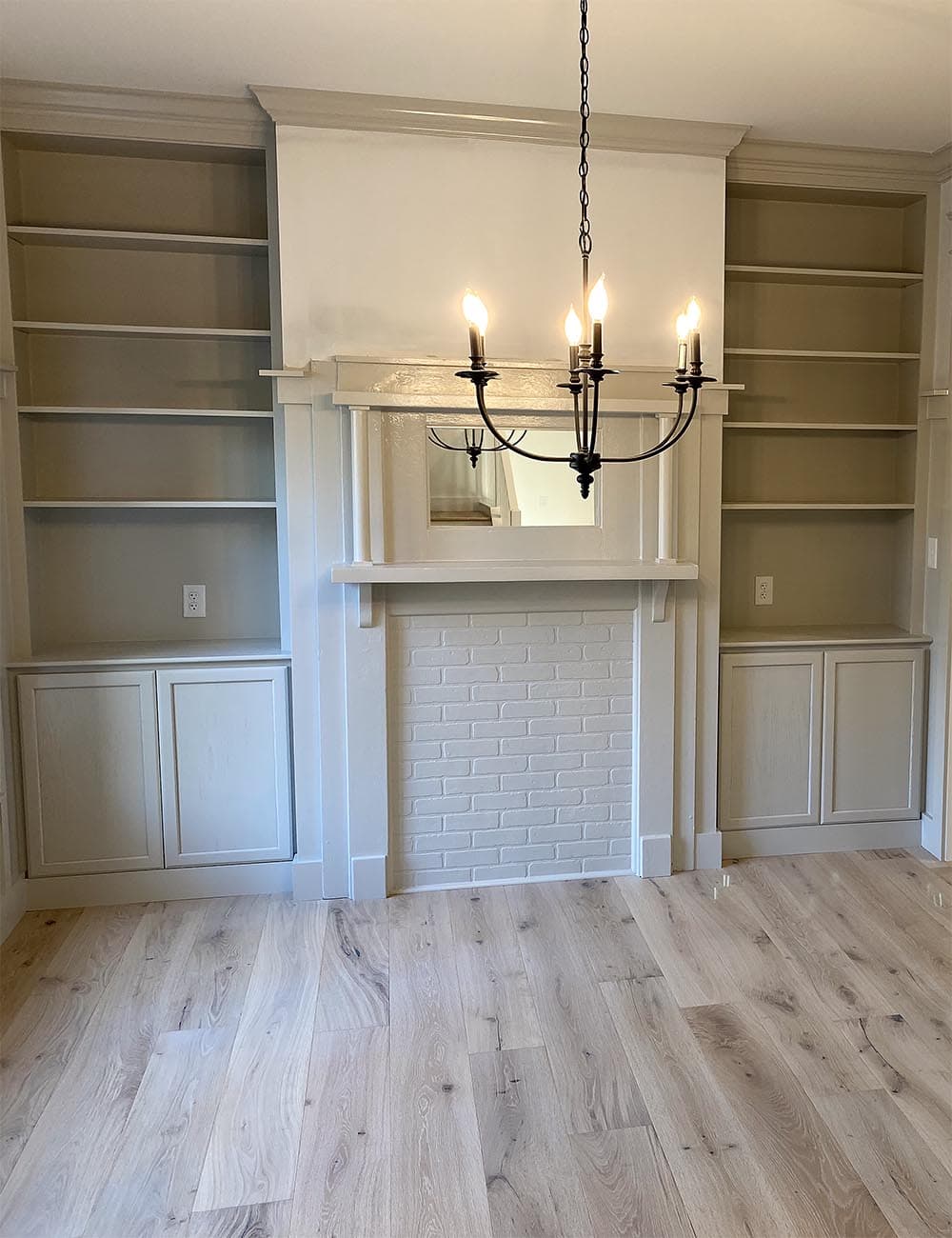
Sherwin Williams Amazing Gray – SW 7044 / LRV: 47
A true middle ground between gray and beige, Sherwin Williams describes Amazing Gray as “Impressively versatile. This light hue, with warm green-gray undertones, works in just about any setting. A popular choice for interiors and exteriors.”
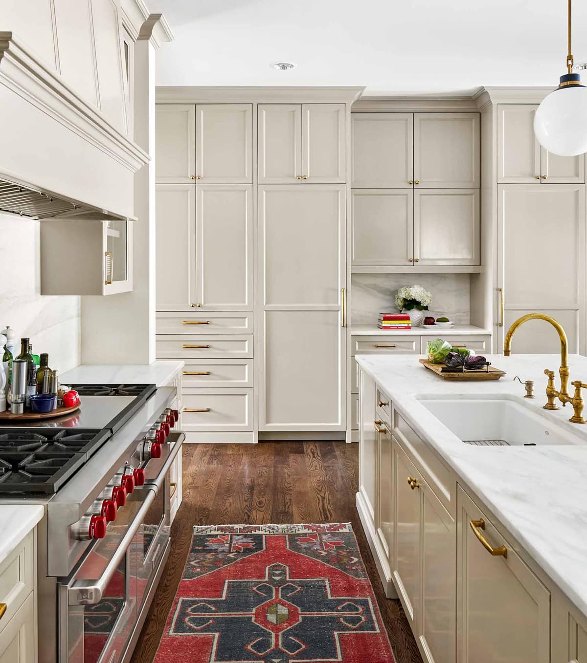
With an LRV of 47, it’s considered a mid-range color, and one of the darker greiges on this list. It’s a popular choice for many rooms, including on walls, trim and cabinetry.
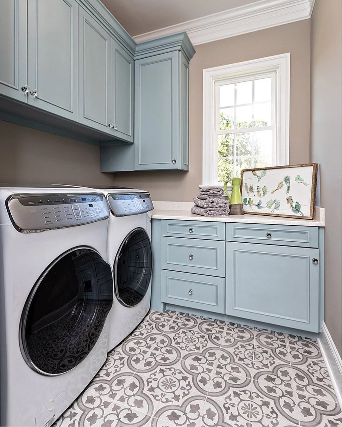
Amazing Gray is also similar to Benjamin Moore’s popular Revere Pewter, but a bit darker.
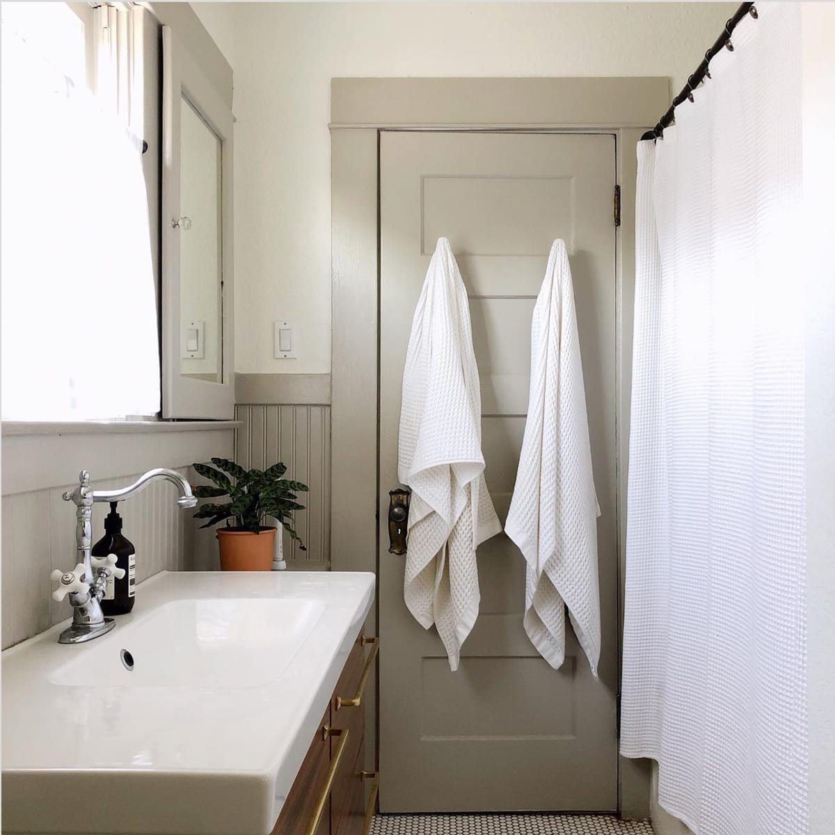
Sherwin Williams Anew Gray – SW 7030 / LRV: 47
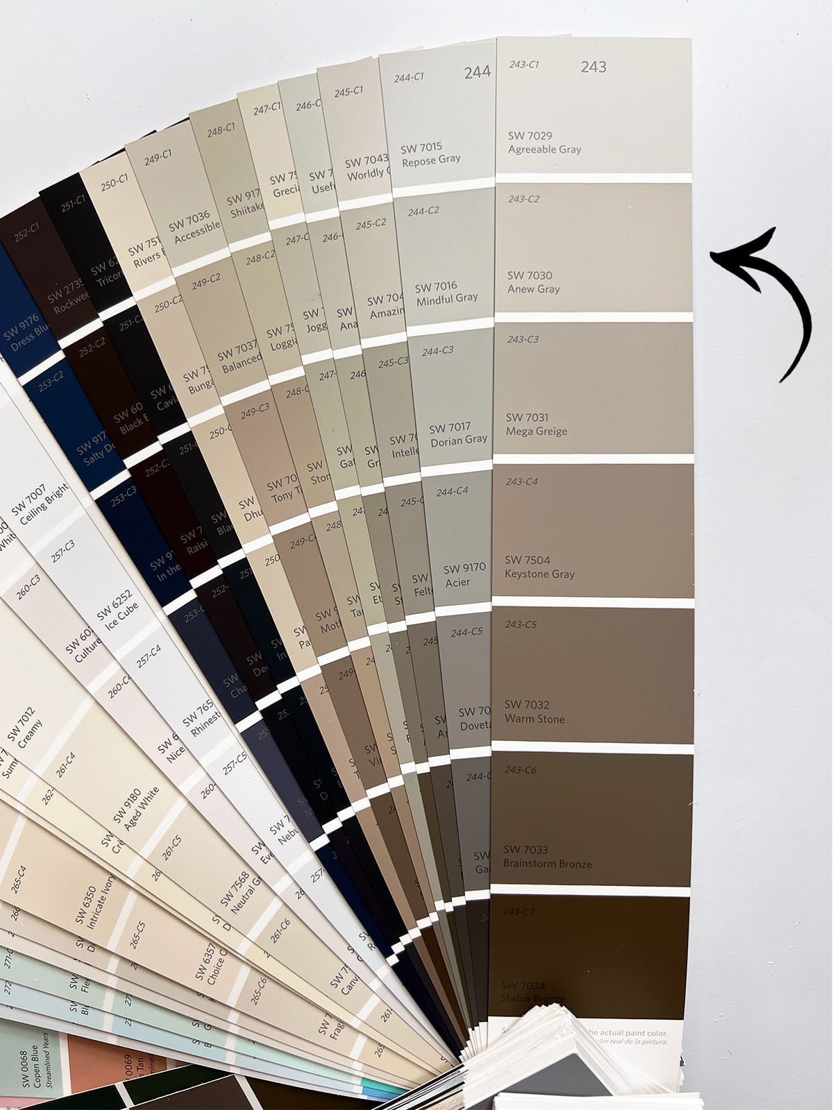
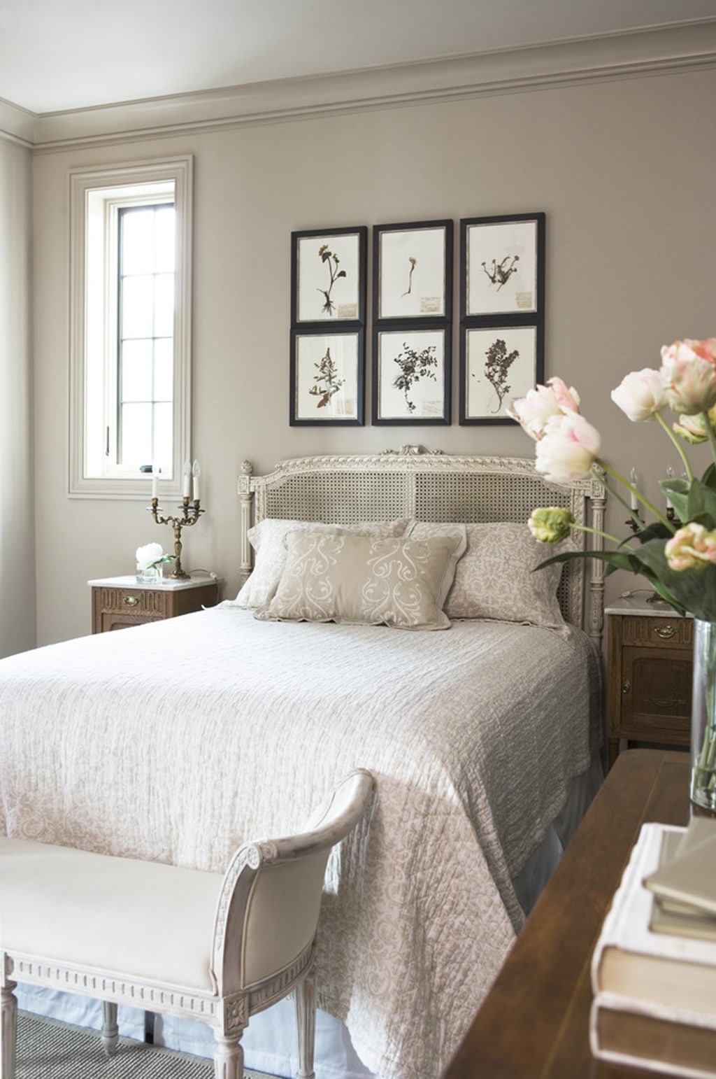
With an LRV of 47, Anew Gray is considered a darker version of Agreeable Gray, and another popular choice for a versatile and neutral warm gray.
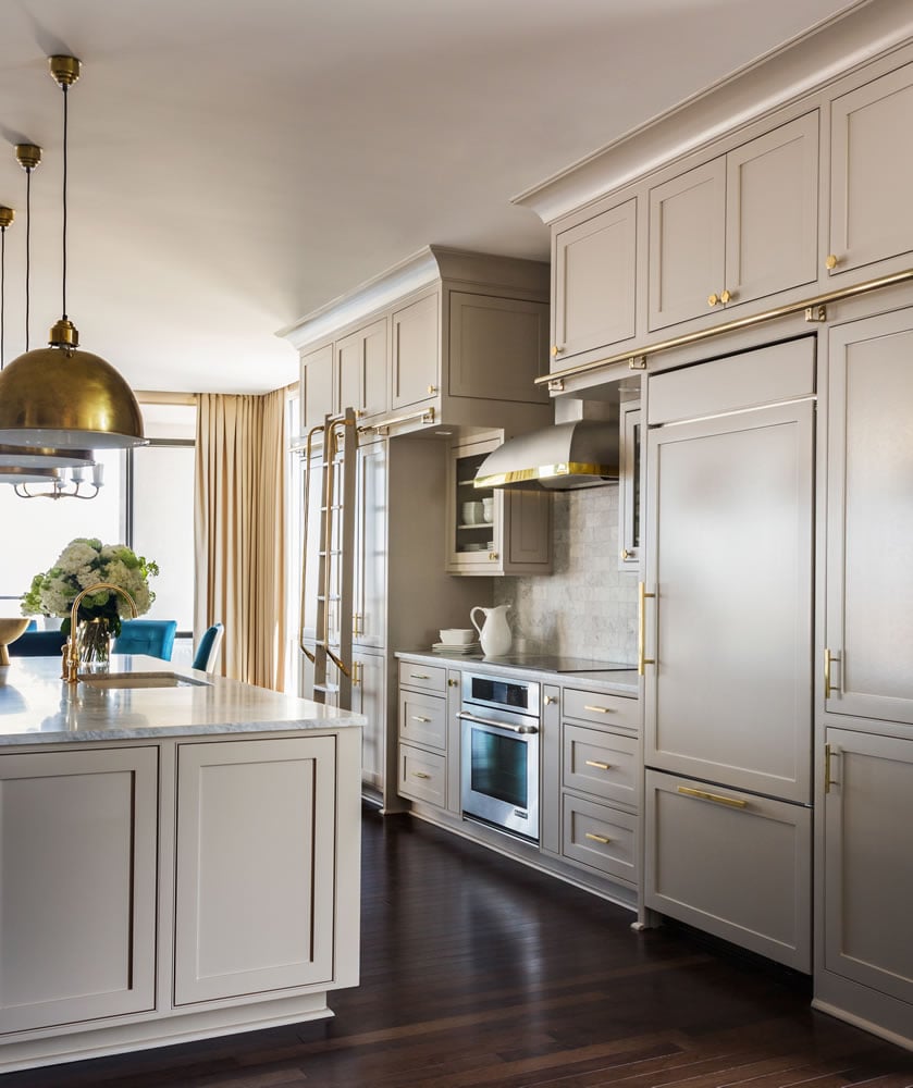
Sherwin Williams describes it as a “mellow, mid-tone gray that works in every room. Its warm stone undertone exudes a quiet energy, even in dim lighting.”
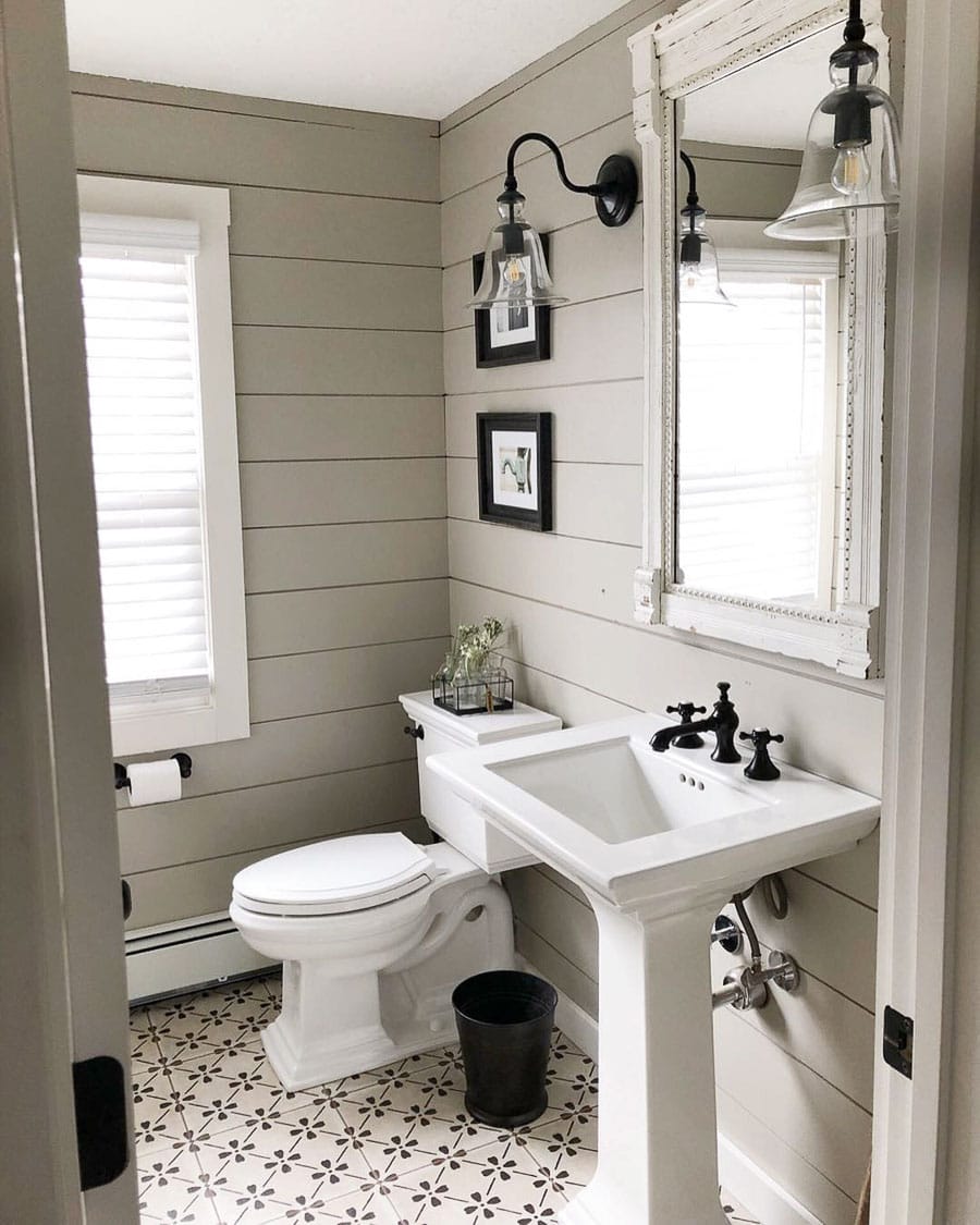
If you’re looking for a warmer greige, Anew Gray will appear too cool in most lighting conditions. It definitely leans more towards gray than beige.
Sherwin Williams Colonnade Gray – SW 7641 / LRV: 53
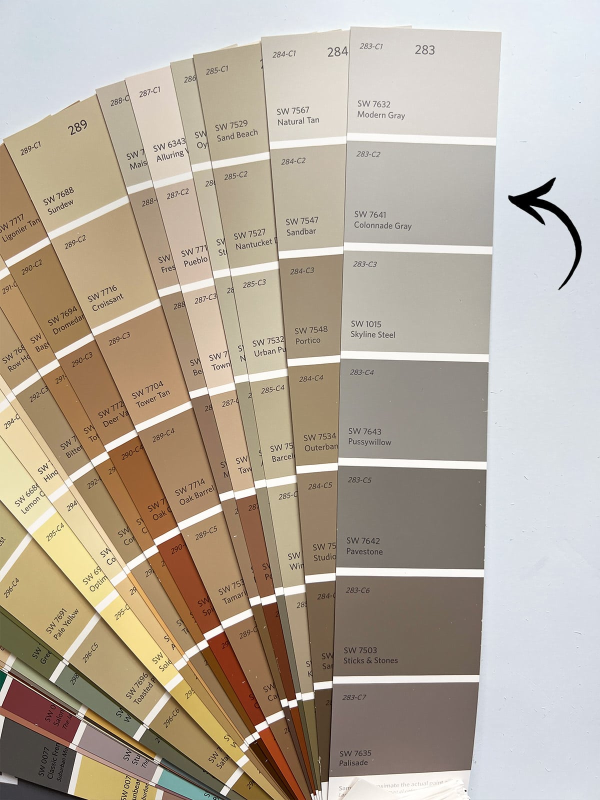
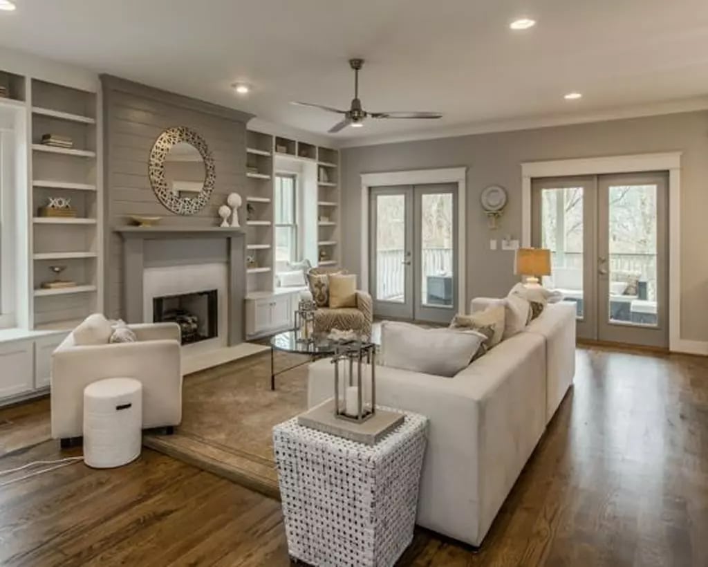
Colonnade Gray narrowly made this list, as I personally consider it more of a gray paint color, but it’s often classified as a greige. Here it is on a living room fireplace and walls, with a mix of natural and artificial lighting:
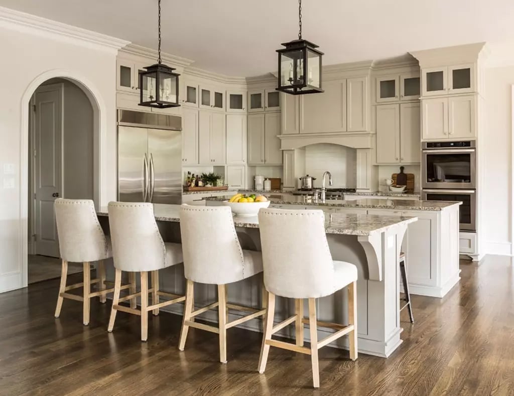
Below, it appears warmer and lighter on kitchen cabinetry, in a professional (edited) photo:
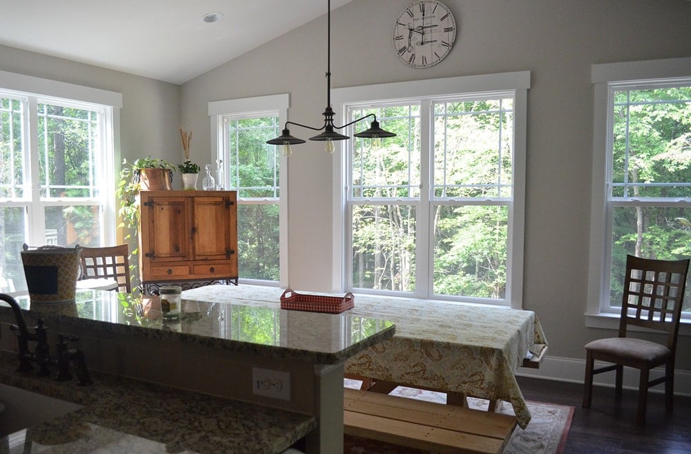
I tend to trust unedited phone photos more when searching for the most accurate representations. Here, you can see how gray it looks with some natural light:
Sherwin Williams Modern Gray – SW 7632 / LRV: 62
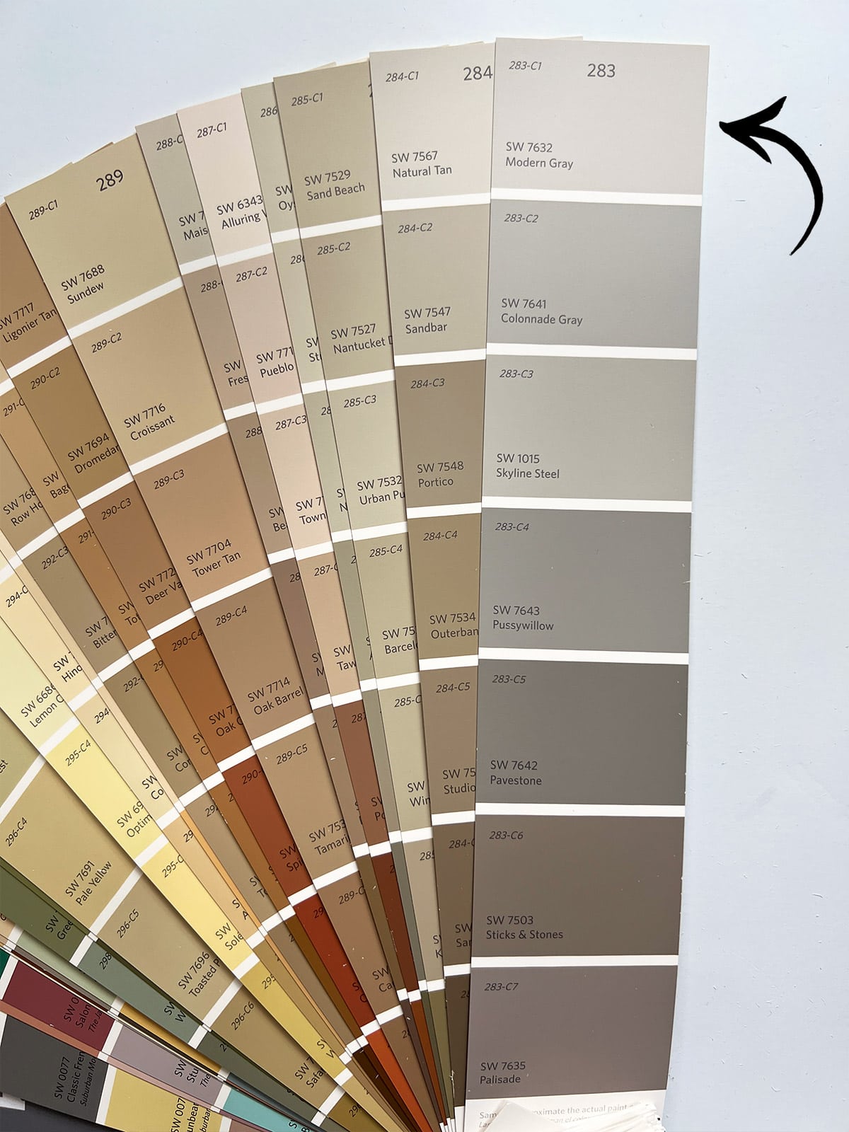
Modern Gray is another color I’d label as more of a gray than a greige or beige. It’s the lighter sibling of Colonnade Gray, with an LRV of 62.
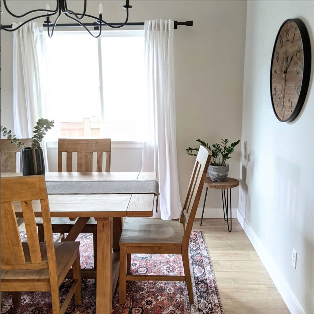
If you search for photos of Modern Gray online, you’ll find many of them looking quite gray like this:
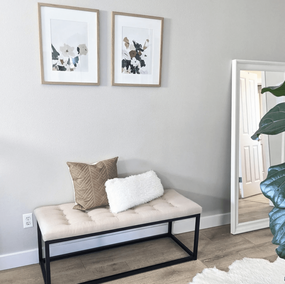
But then you’ll come across a photo like this, where it looks very greige:
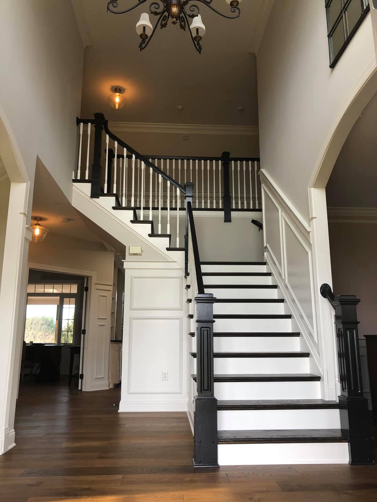
Here’s another unedited phone photo in a room with little natural light. You can see the range of tones from dark to light, and it definitely still has some warmth to it.
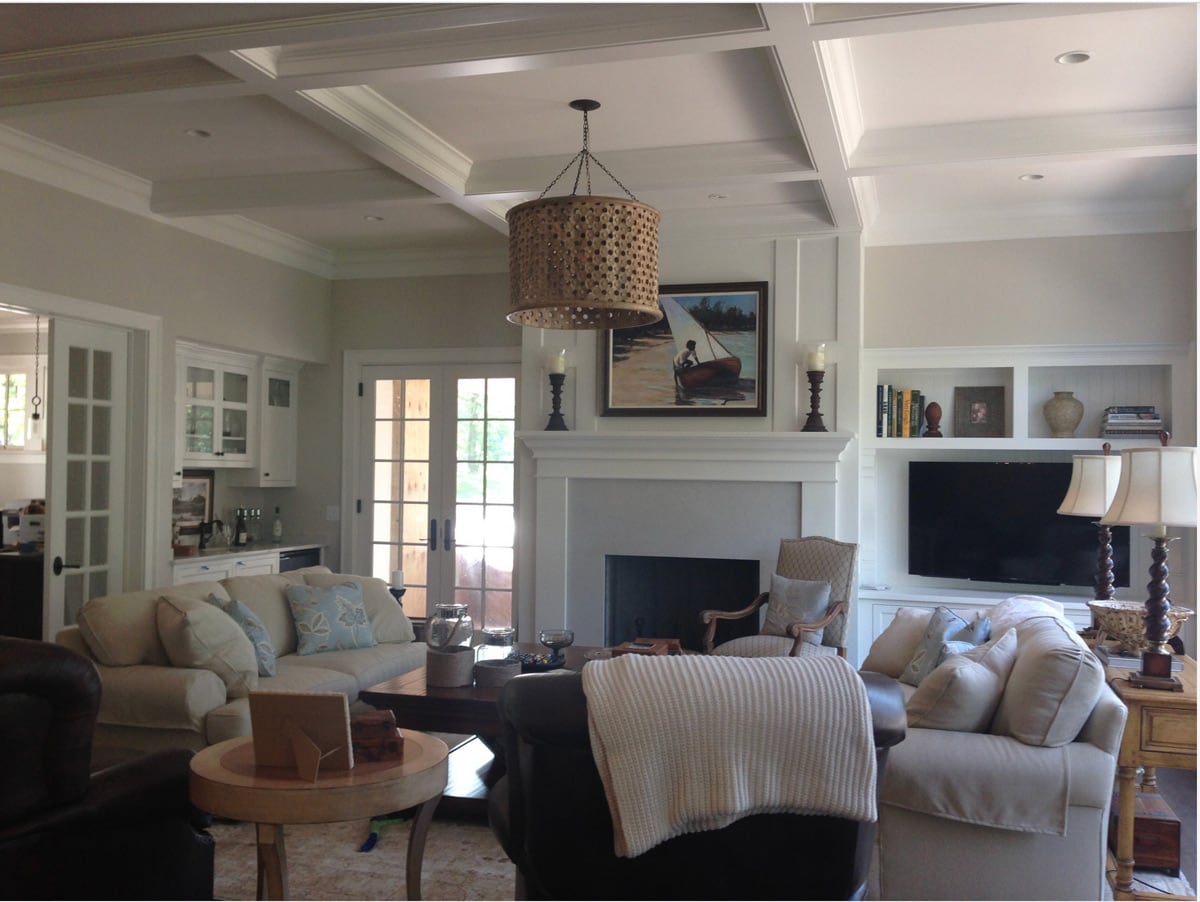
If you’re looking for a light warm gray, this one is definitely worth sampling to see how it will appear in your space!
Sherwin Williams Natural Tan – SW 7567 / LRV: 65
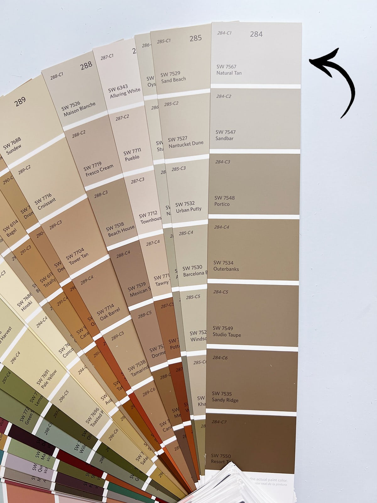
While this color is technically grouped into the tan family, don’t let the name fool you—it can lean very griege under certain lighting conditions. I recently chose this color for the doors and trim throughout the Hacienda Hideaway, and had to include it on this list after testing it out in person.
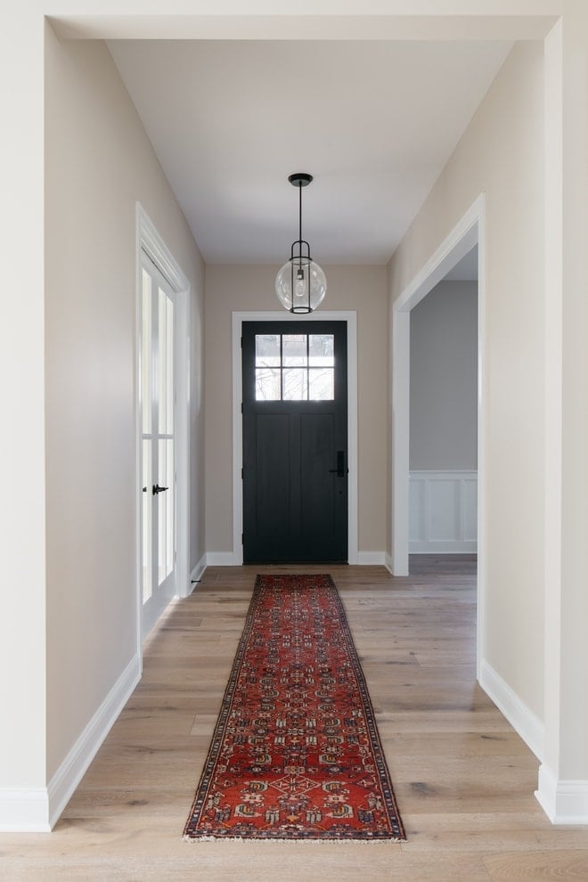
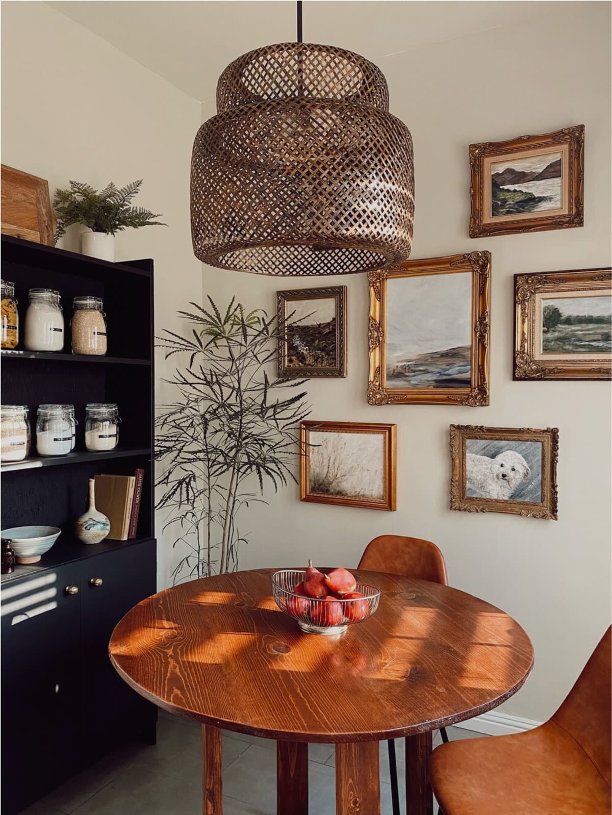
I found Natural Tan to be a lighter, and slightly warmer version of Accessible Beige. It also pairs beautifully as a subtle contrasting trim with SW Alabaster walls.
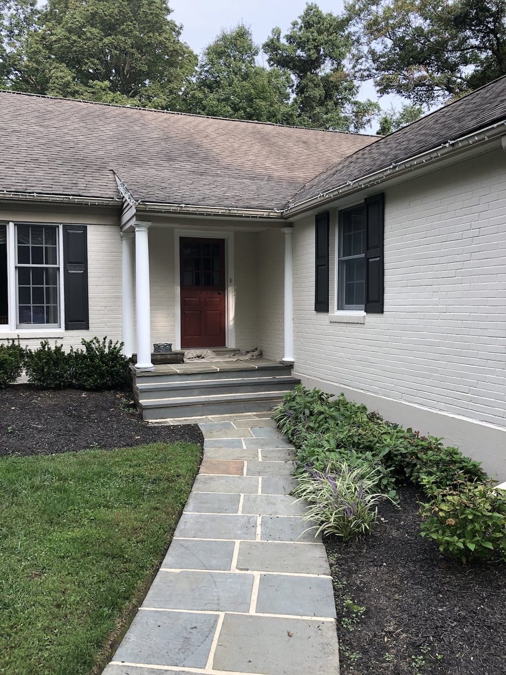
Natural Tan is also a great choice for exteriors. You can see how it looks painted on brick, below:
Sherwin Williams Perfect Greige – SW 6073 / LRV: 42

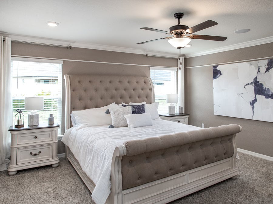
With an LRV of 42, Perfect Greige is the darkest paint color on this list. Sherwin Williams calls it a mid-range gray with red undertones, though it looks more beige in many examples online.
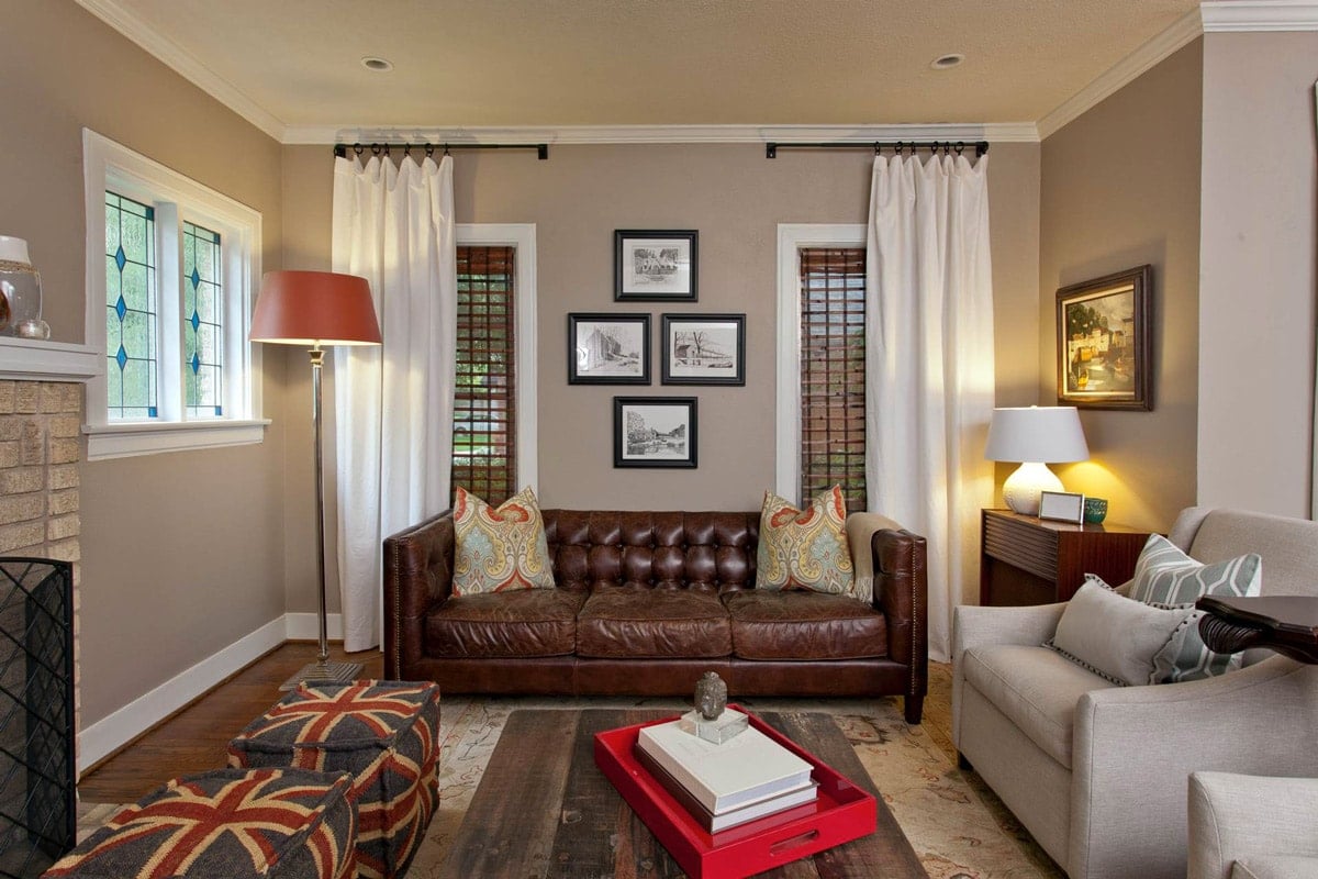
This color can also be classified as a taupe, with very brown undertones. It’s definitely one of the warmer paints that can still be considered greige.
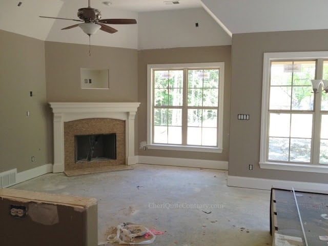
If you’re looking for a mid-range taupe or beige that isn’t too warm, I’d recommend grabbing a sample of Perfect Greige.
Sherwin Williams Popular Gray – SW 6071 / LRV: 61
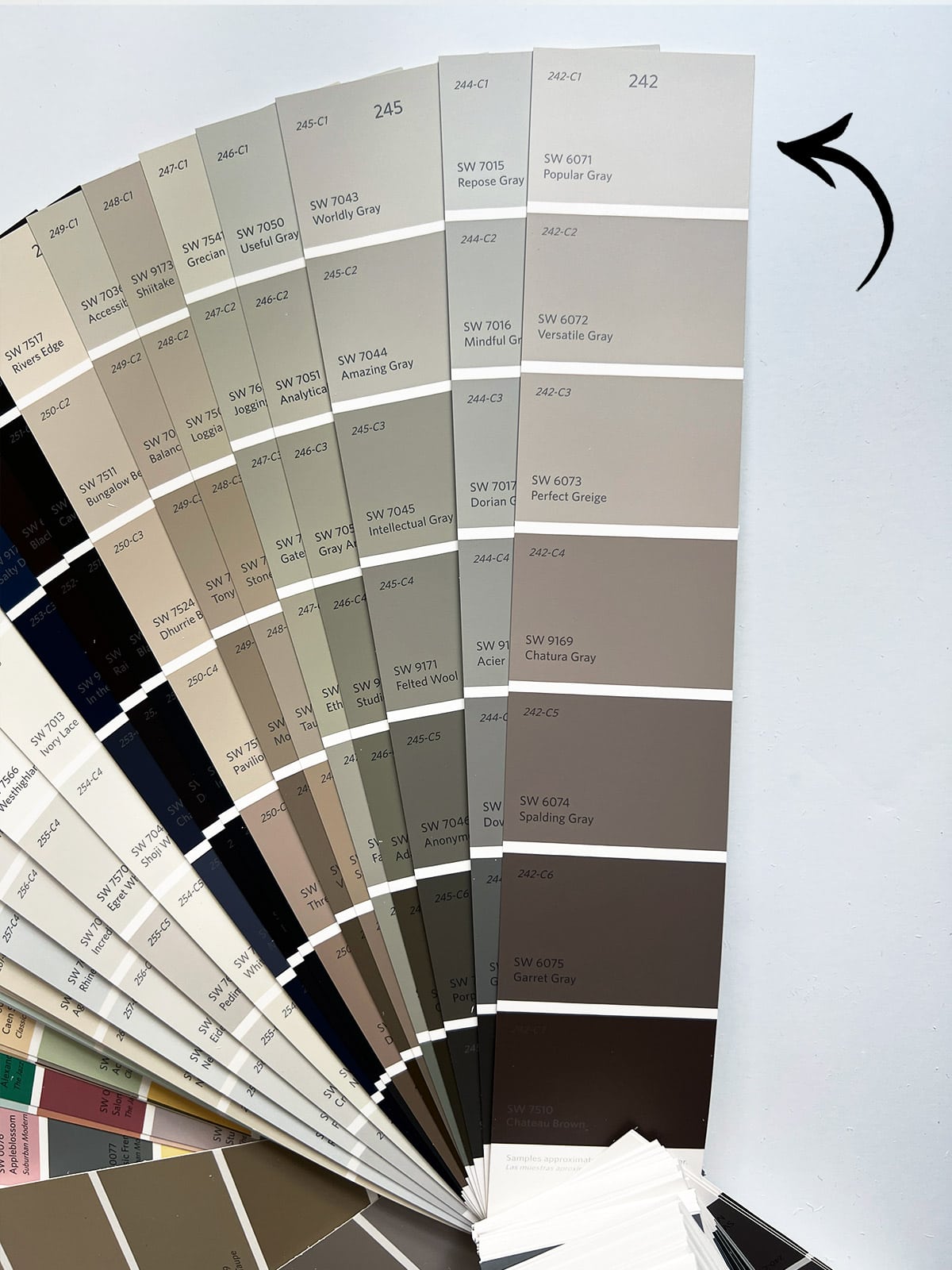
Described as a light gray with a “clay undertone”, Popular Gray is a lighter paint color that lands right at the intersection of gray and beige.
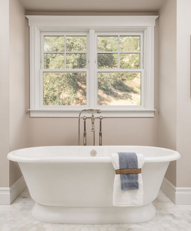
You’ll see it range between gray and beige in various photos online, depending on lighting. Notice the mix of natural and overhead lighting below, compared to the natural light alone in the last photo:
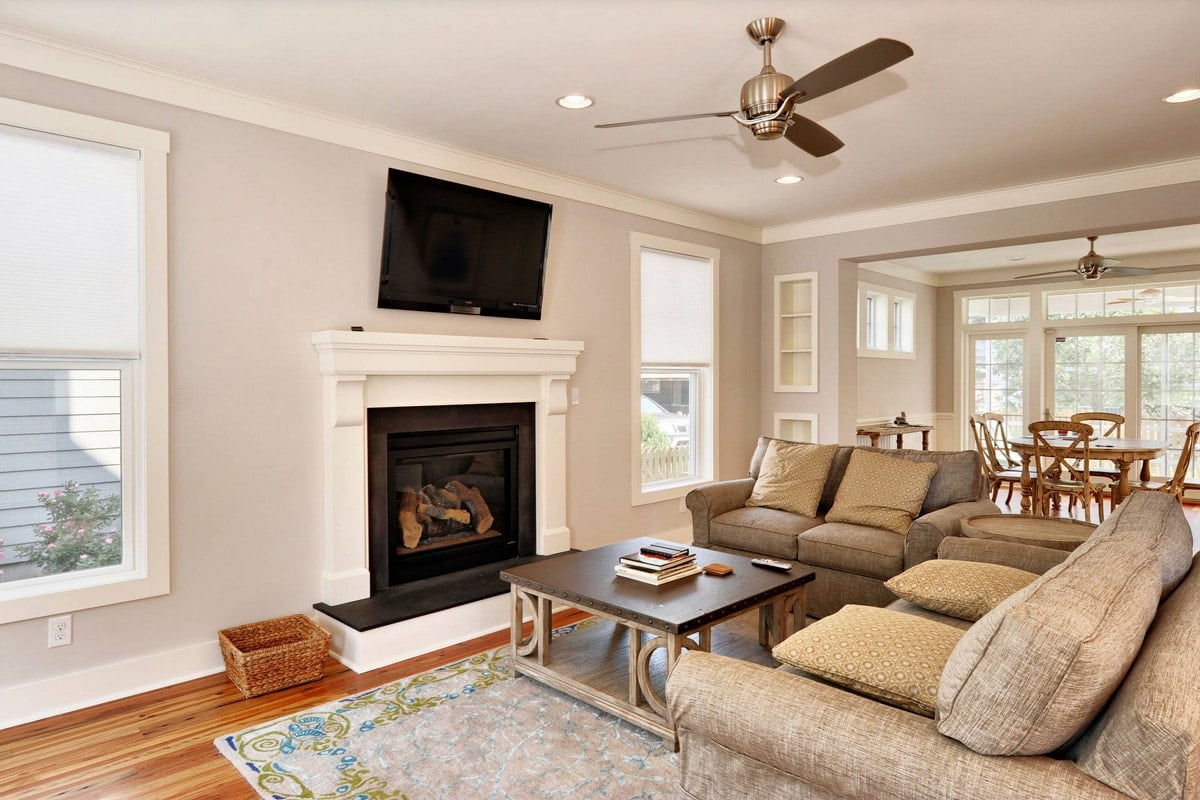
This color does have noticeable pink-purple undertones in certain lighting, so it’s especially important to test out a sample to see how it looks in your room before committing.
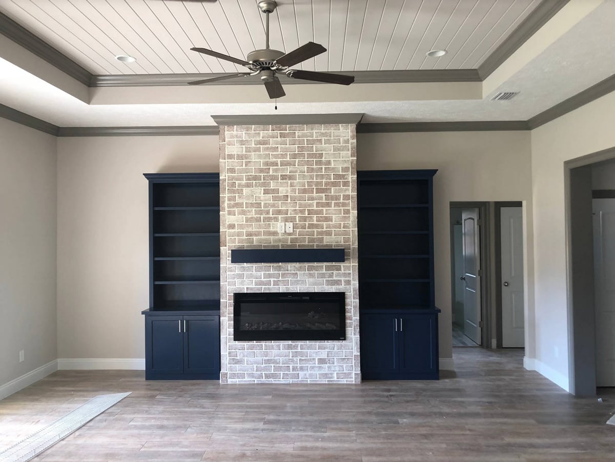
Sherwin Williams Versatile Gray – SW 6072 / LRV: 48
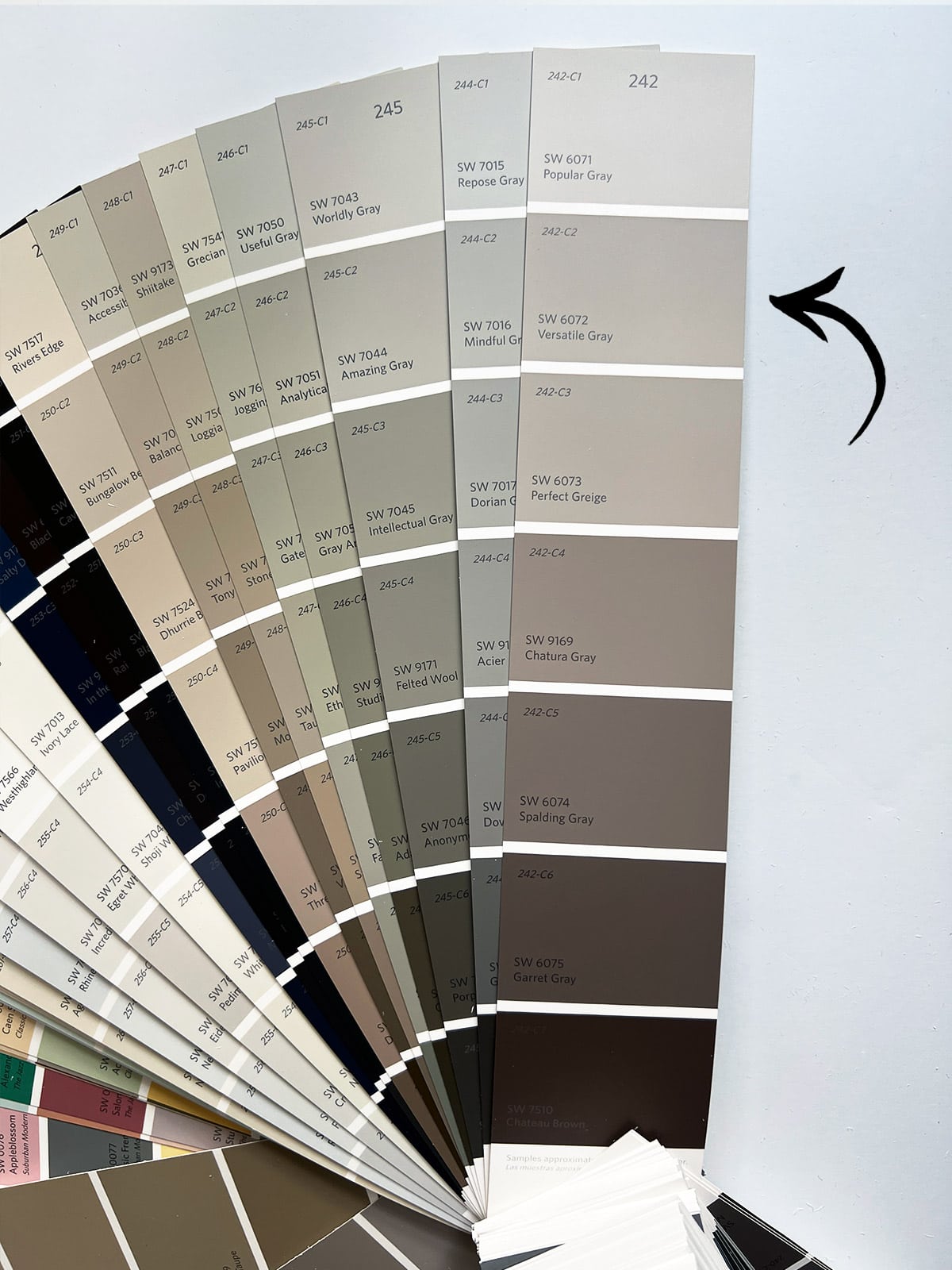
As the name suggests, Versatile Gray is a true versatile color that works well in a variety of spaces. It’s a mid-range color with an LRV of 48, and can appear both gray and taupe depending on the room and lighting.
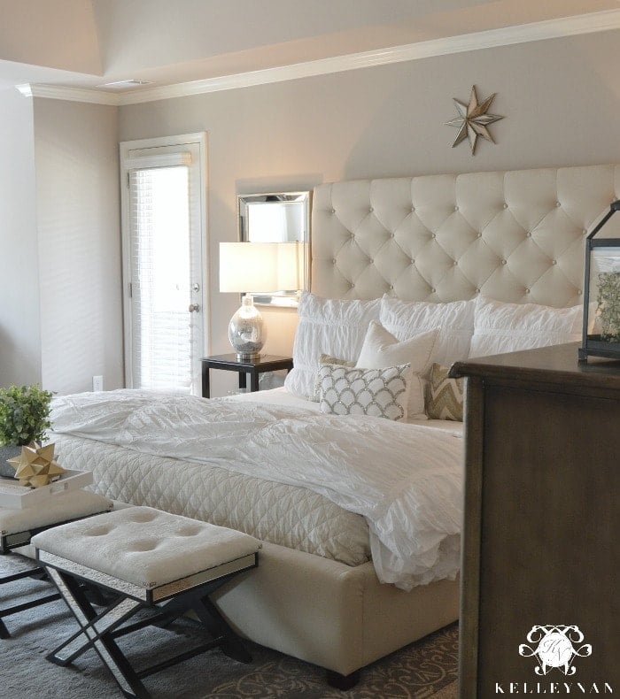
Because of its pink-purple undertones, it can be classified as a ‘taupe’, so you’ll definitely want to try out samples in person to see how it looks in your space.
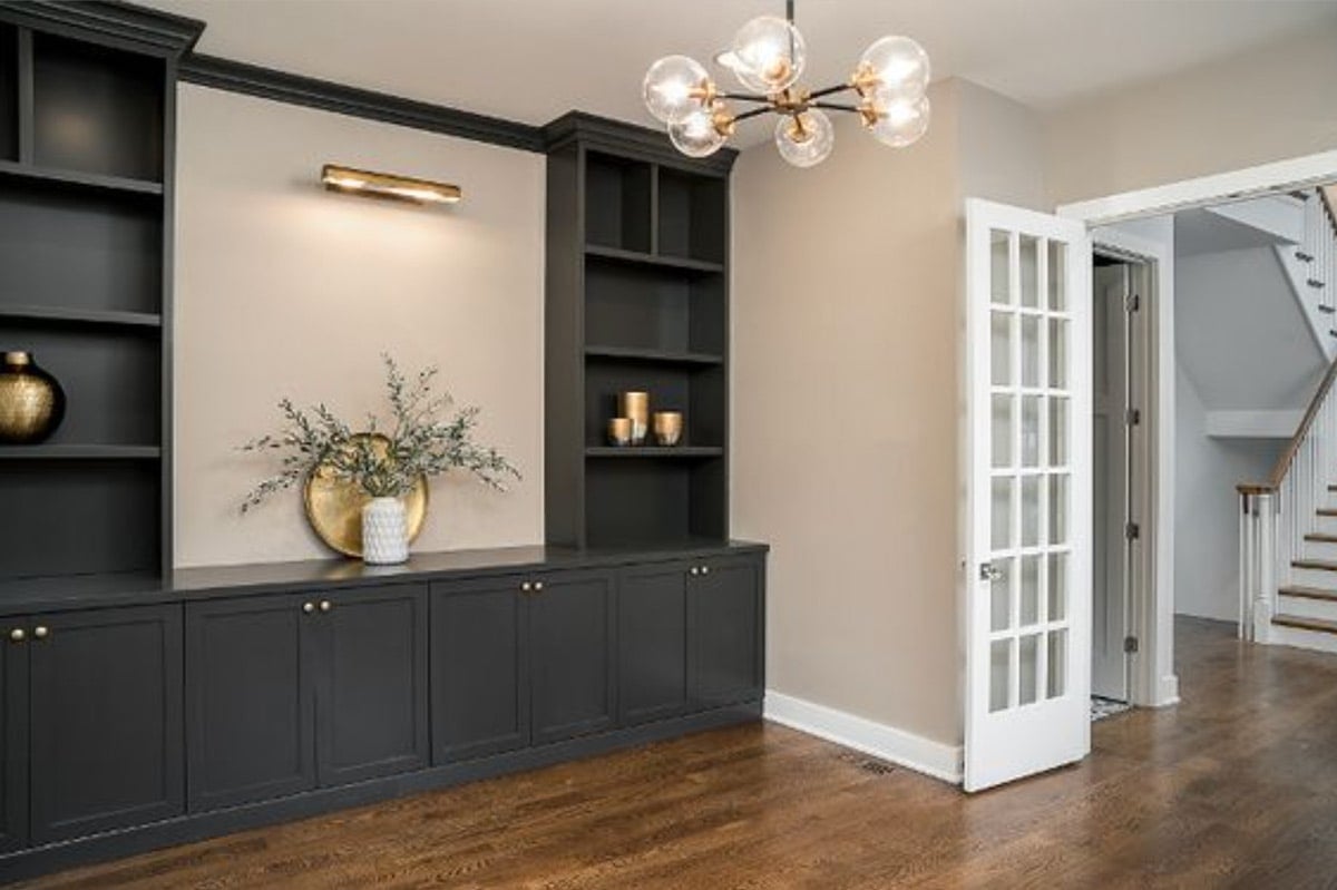
Versatile Gray is also a popular choice for exteriors, as it isn’t too dark or light, and hits the sweet spot between gray and brown.
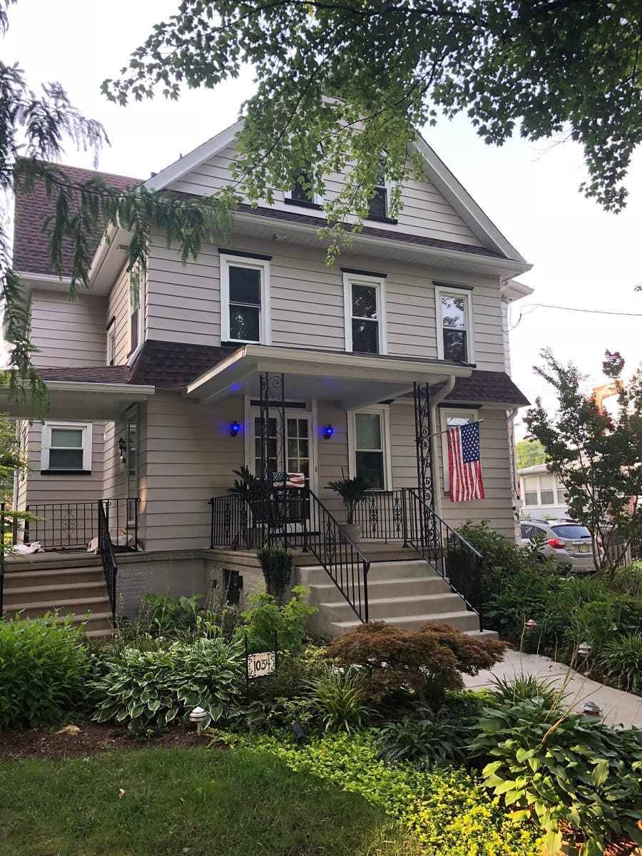
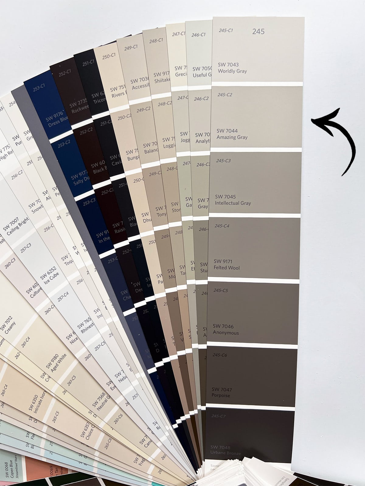
Sherwin Williams Worldly Gray – SW 7043 / LRV: 57
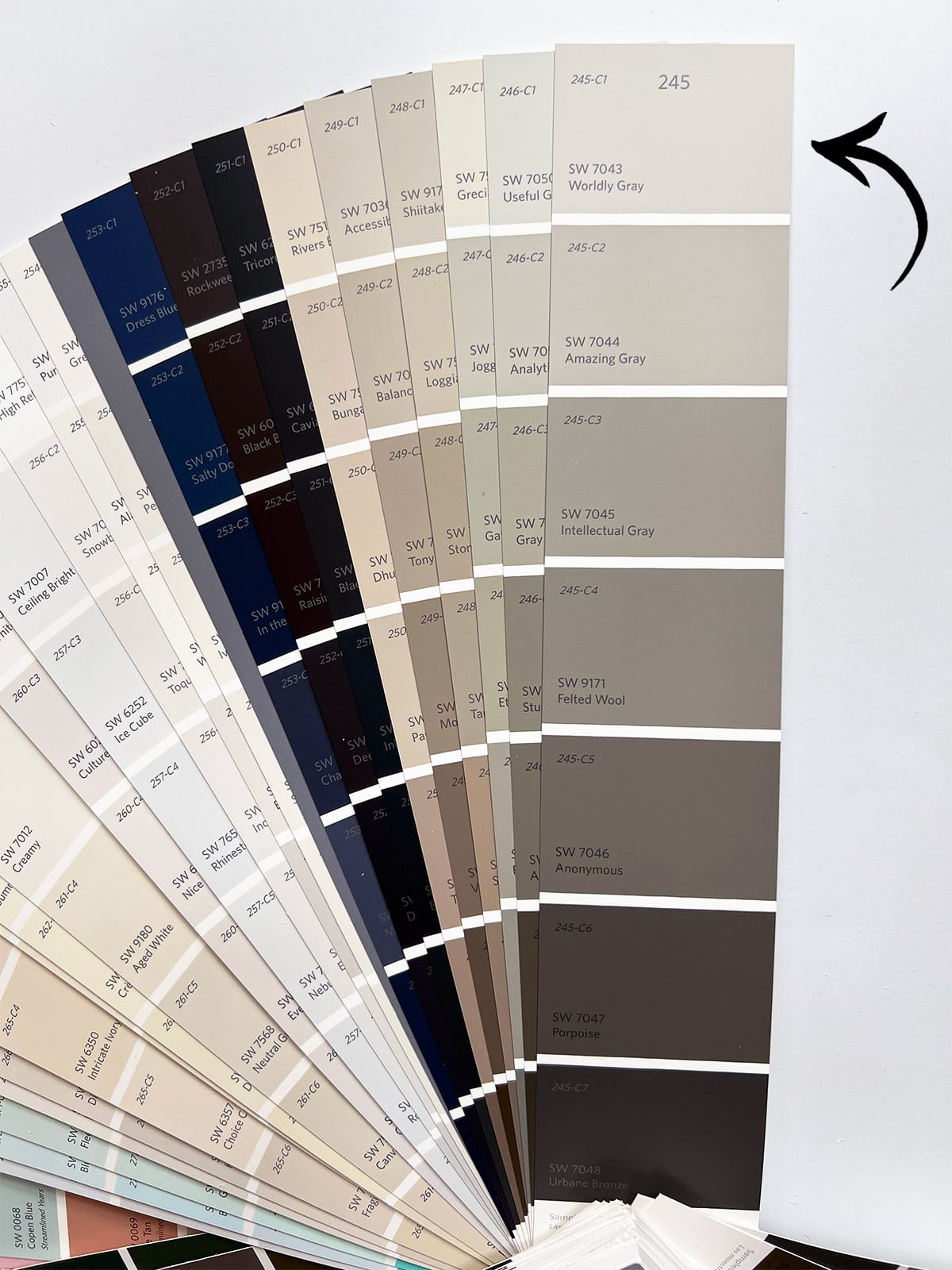
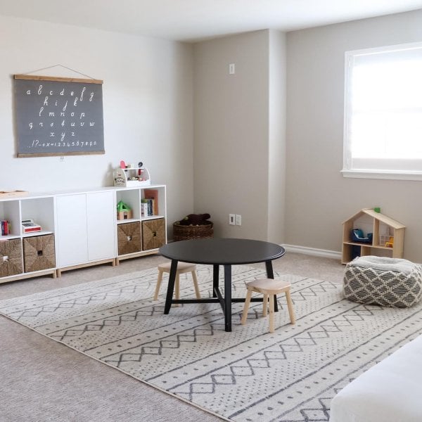
One shade on the fan deck lighter than Amazing Gray, Worldly Gray is a soft neutral greige that leans more into gray.
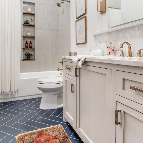
It’s a great choice for everything from cabinetry, to walls, and exteriors. I chose it for our exterior window and door trim (paired with Sherwin Williams Oyster White):
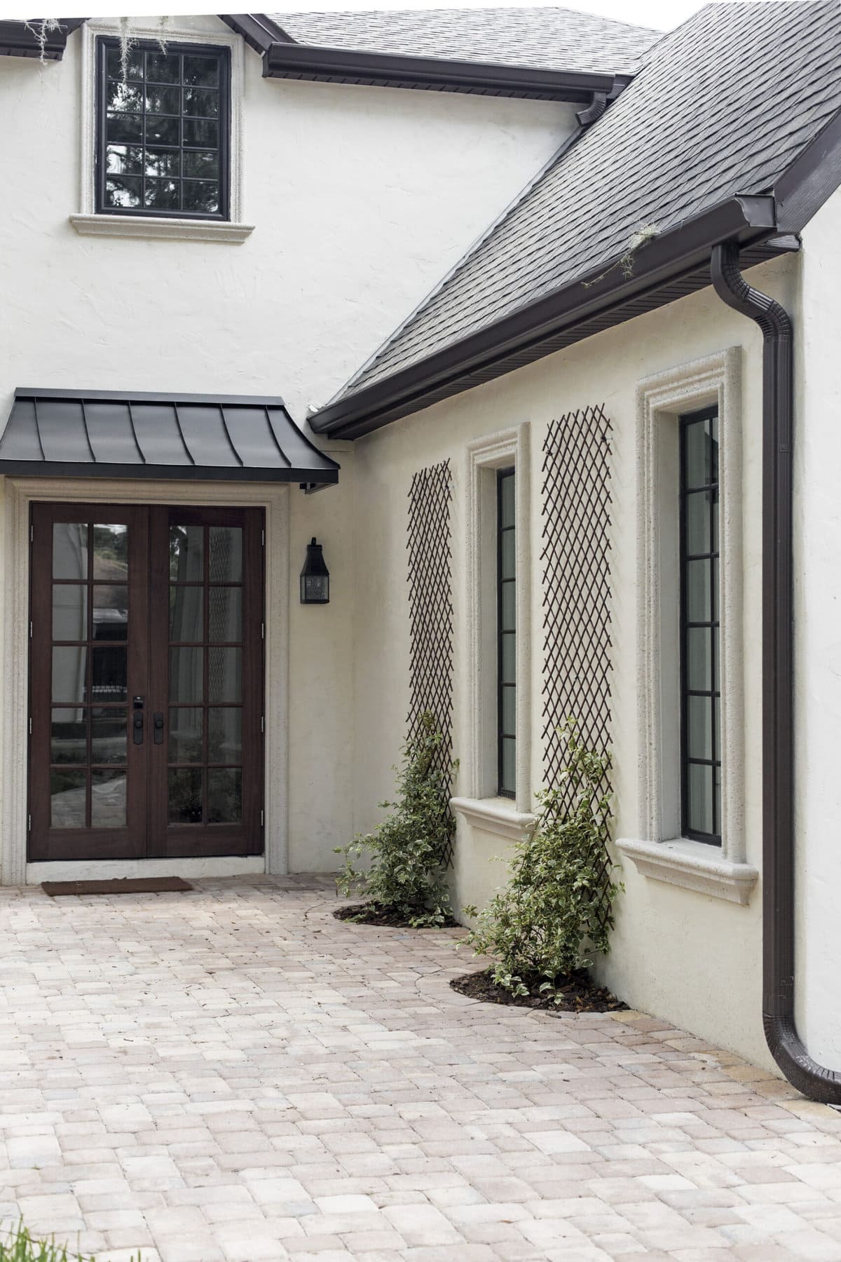
If you’re looking for a lighter soft gray that isn’t too warm, I’d highly recommend grabbing a sample of Worldly Gray to test out in your space.
Benjamin Moore Greige Paint Colors
While Benjamin Moore doesn’t carry the largest selection of popular greige paint colors like Sherwin Williams, there are a few that are hugely popular and widely used by designers, bloggers and homeowners. Let’s dive in!
Benjamin Moore Edgecomb Gray – HC-173 / LRV: 63.09
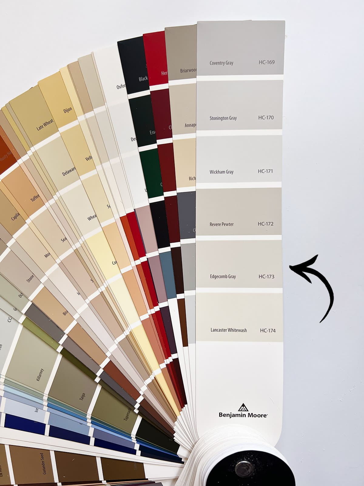
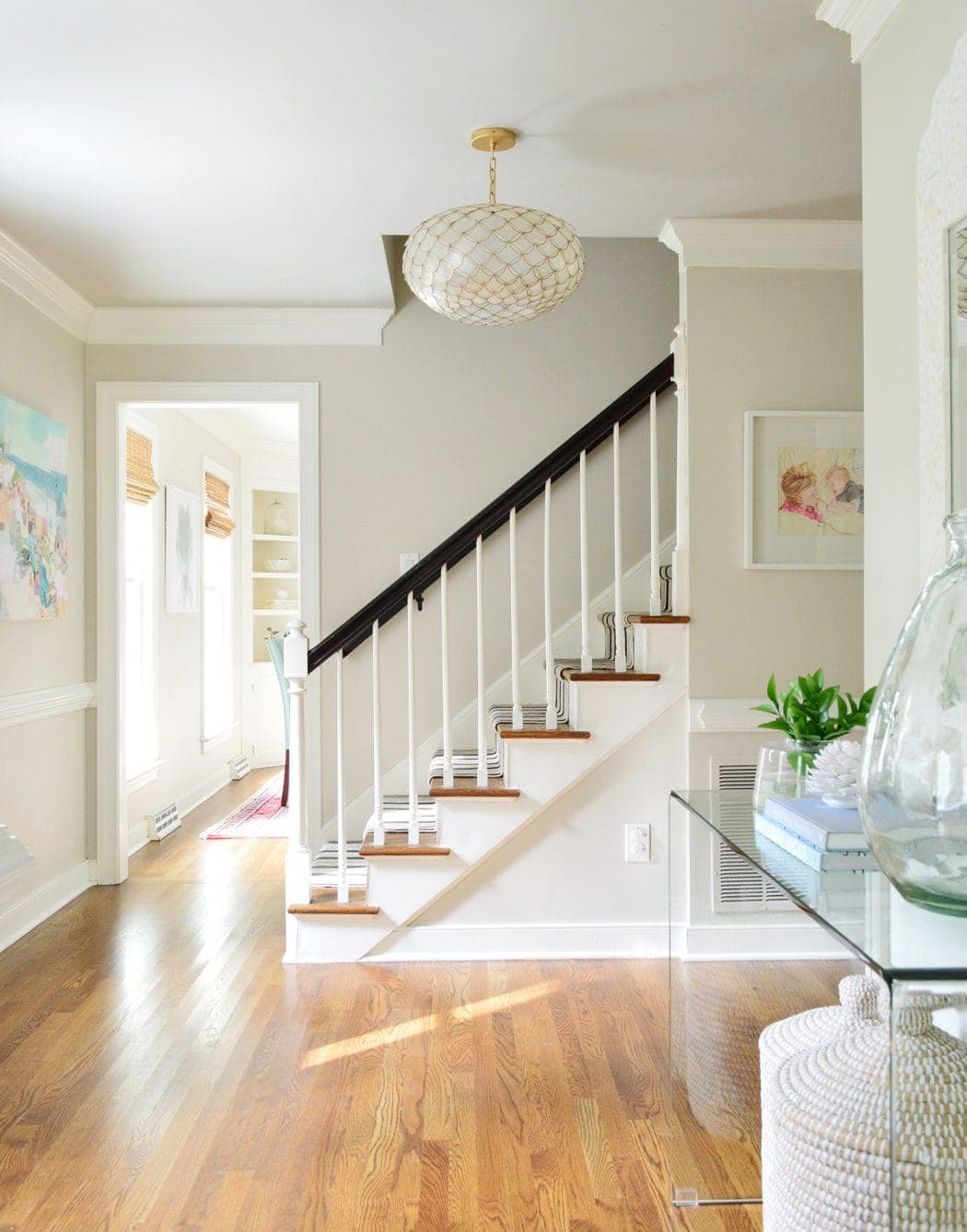
Edgecomb Gray (also known as Baby Fawn) sits next to Benjamin Moore’s most popular greige on the fan deck, Revere Pewter. It’s a great choice for a subtler and softer greige that works well in any space. You’ll find examples online where it leans more gray and others more beige, but it’s a true middle ground.
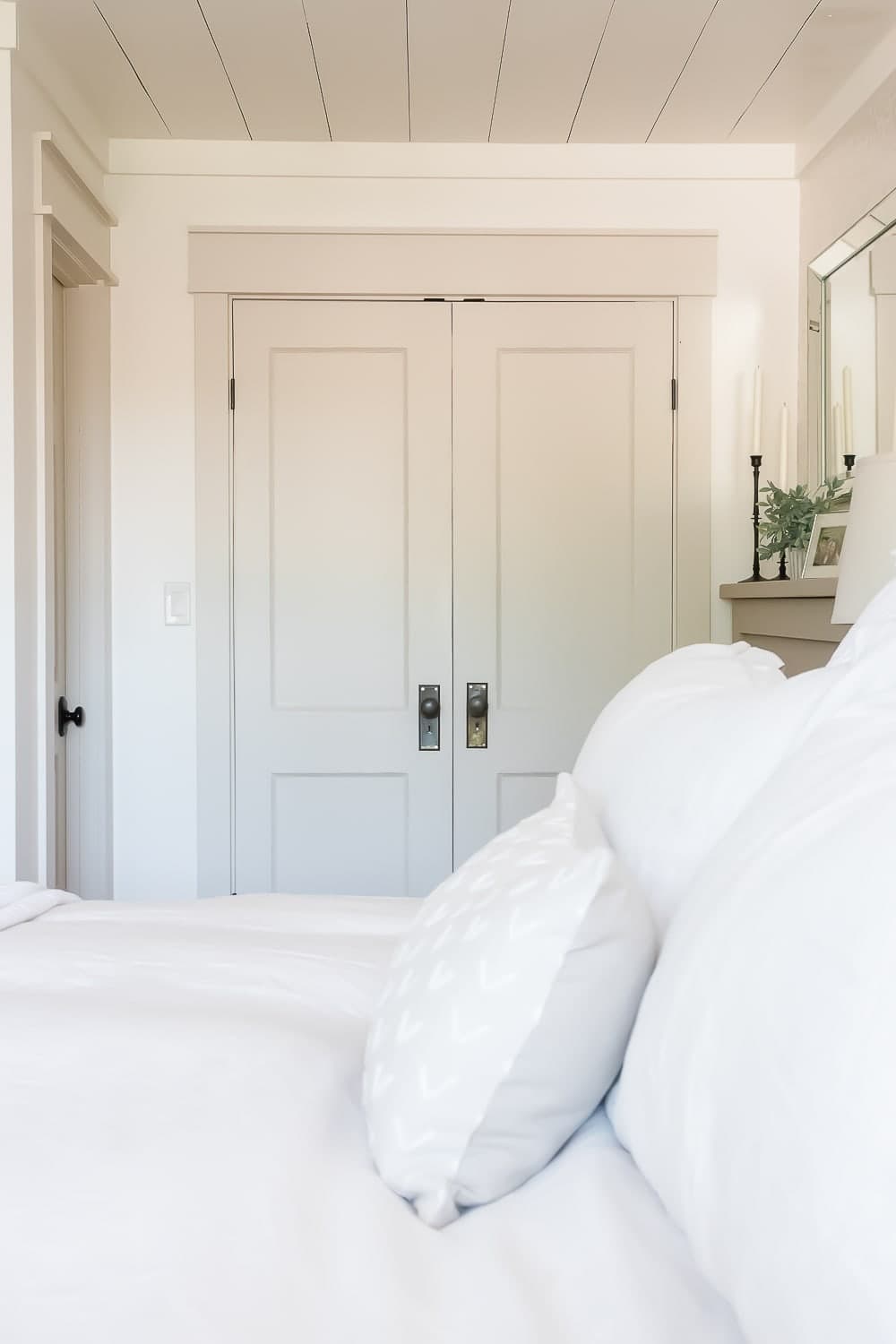
It has minimal undertones, making it one of the most neutral and safe greige paint colors for any room.
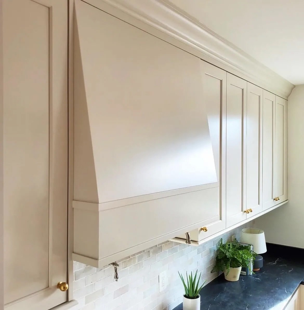
It’s also a beautiful choice for mushroom colored cabinetry:
If you’re looking for a safe, tried and true greige in a lighter color range, definitely pick up a sample of Edgecomb Gray to try out in your home!
Benjamin Moore Natural Cream – OC-14 / LRV: 64.78
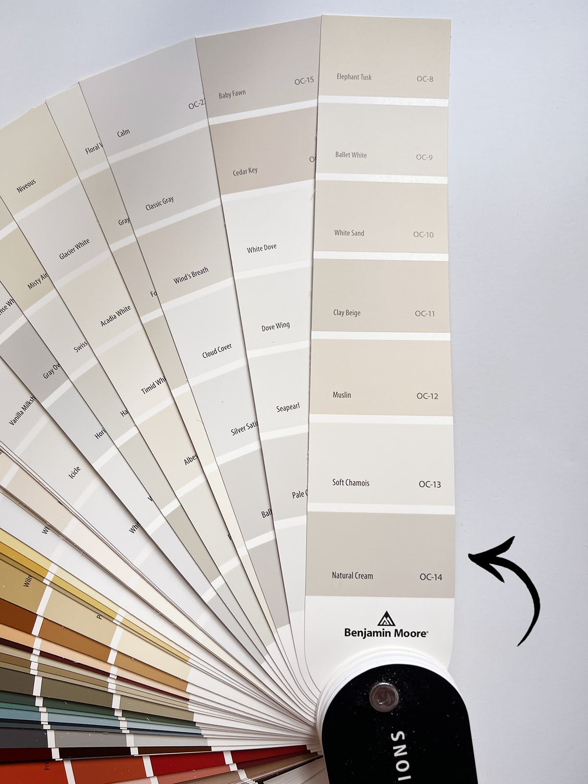
Though grouped within the Creams, Natural Cream is a light greige at heart. It’s also one of Studio McGee’s tried and true paint colors, as beautifully displayed on this McGee Home ceiling below:
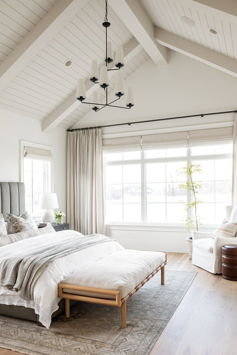
Natural Cream is one of the lightest colors on this list, and can even pass for a dark ivory in some lighting conditions:
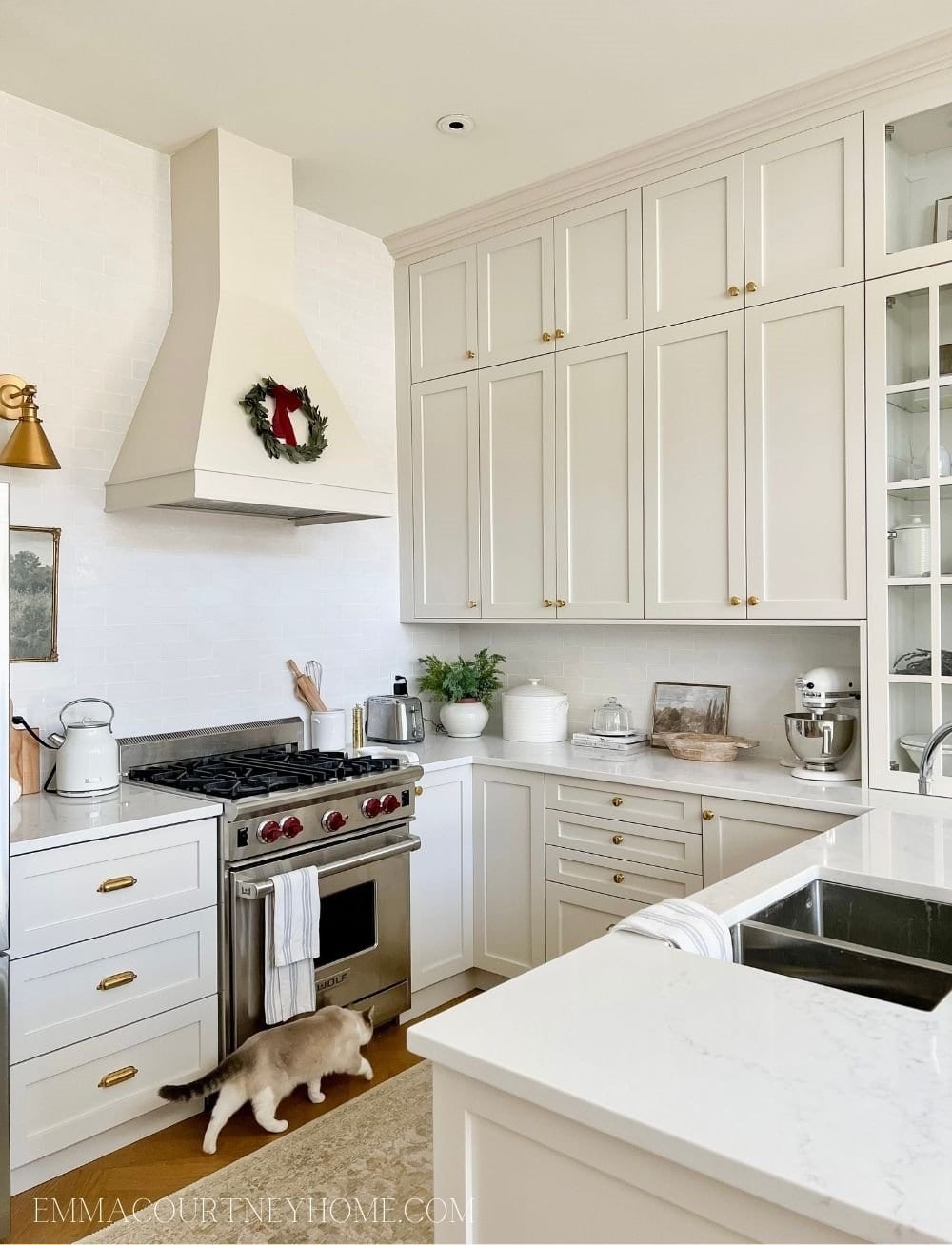
It’s also one of the colors I considered for our Hacienda Hideaway kitchen island, though I ultimately landed on Creamy White instead:
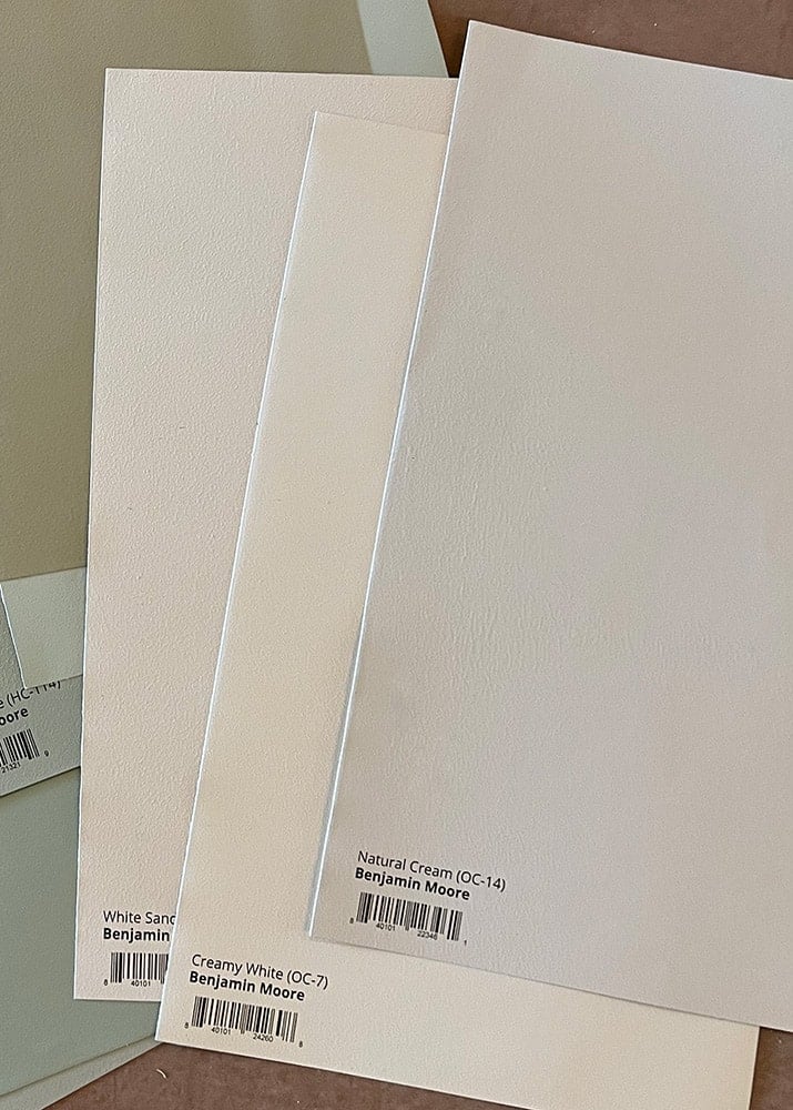
After ordering samples in person, I think the photo below is the most accurate real-life representation. You can see it looks a bit darker compared to the first two photos, as shown on the lower cabinets in this kitchen:
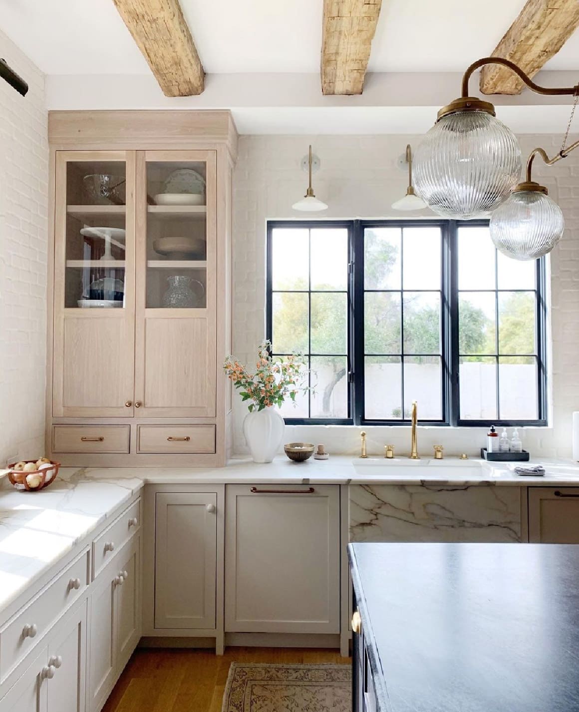
The variations you see on screen are another reason that it’s necessary to order samples before committing to a paint color! I personally find Samplize the easiest and most cost effective way to test colors.
Benjamin Moore Pale Oak – OC-20 / LRV: 68.64
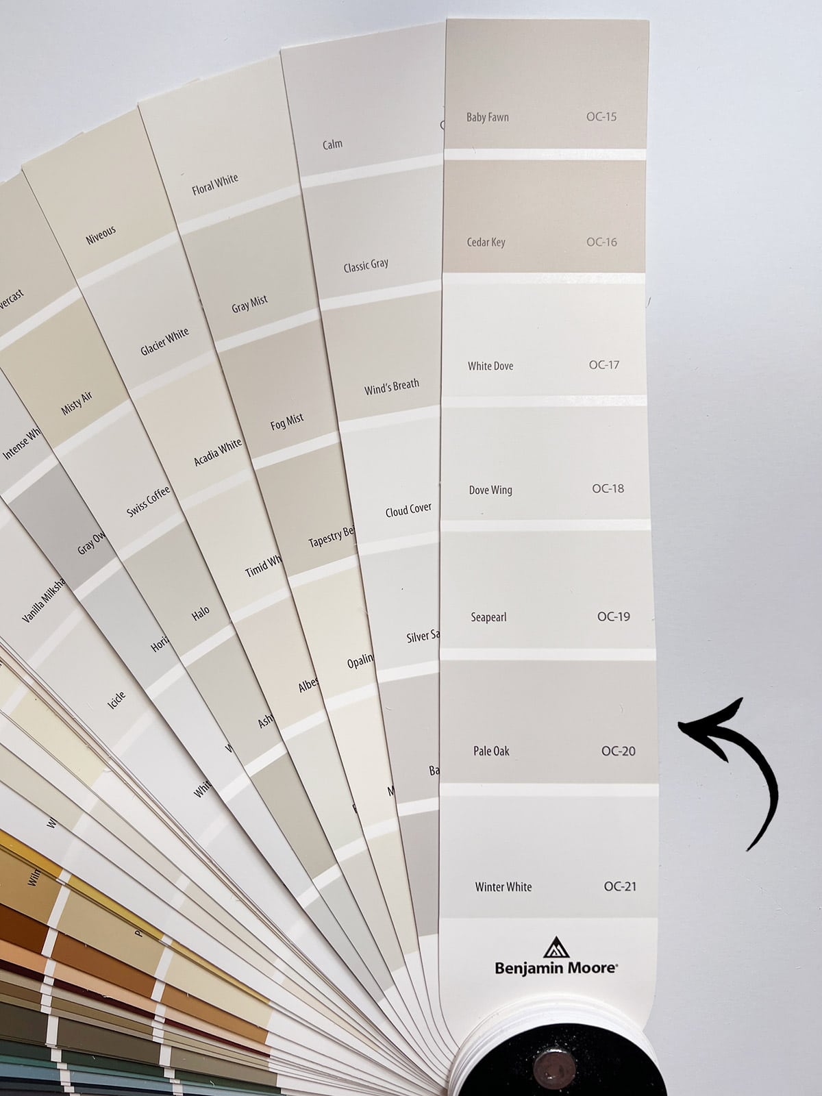
The lightest color on this list, Pale Oak is another best seller that leans slightly more gray under most lighting conditions. With pink-purple undertones, it can also fall into the ‘taupe’ category.
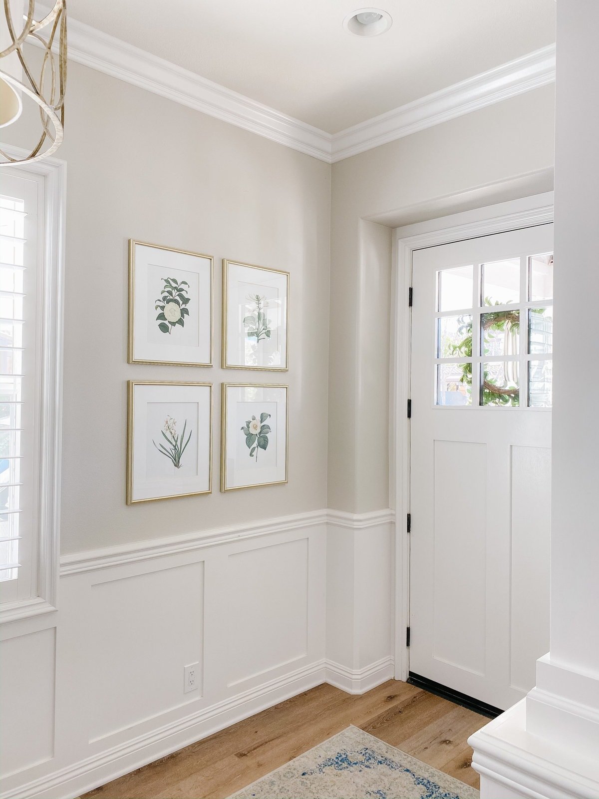
It’s a beautiful choice for subtle contrast trim, as seen below paired with white walls:
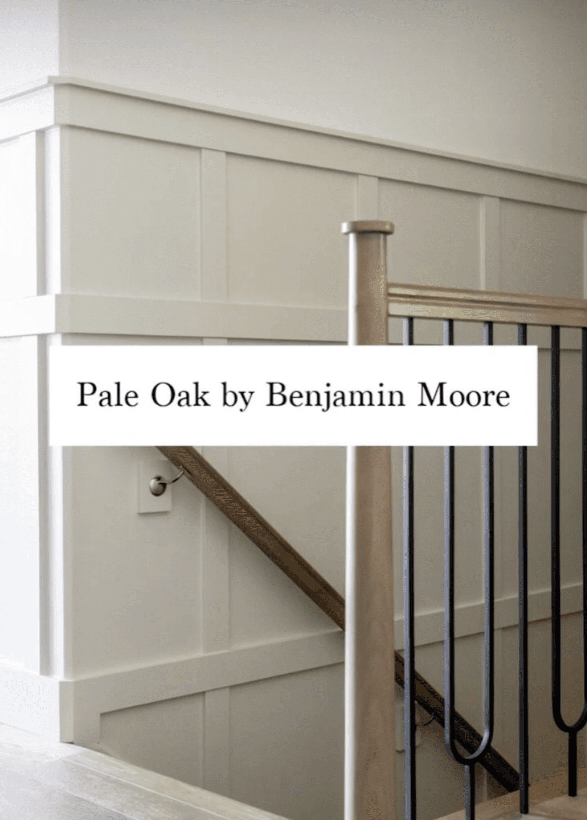
The lighter tone of this color makes it a safer and less committal option if you’re looking to test the greige waters. It also makes a great neutral backdrop that will complement almost any decor style.
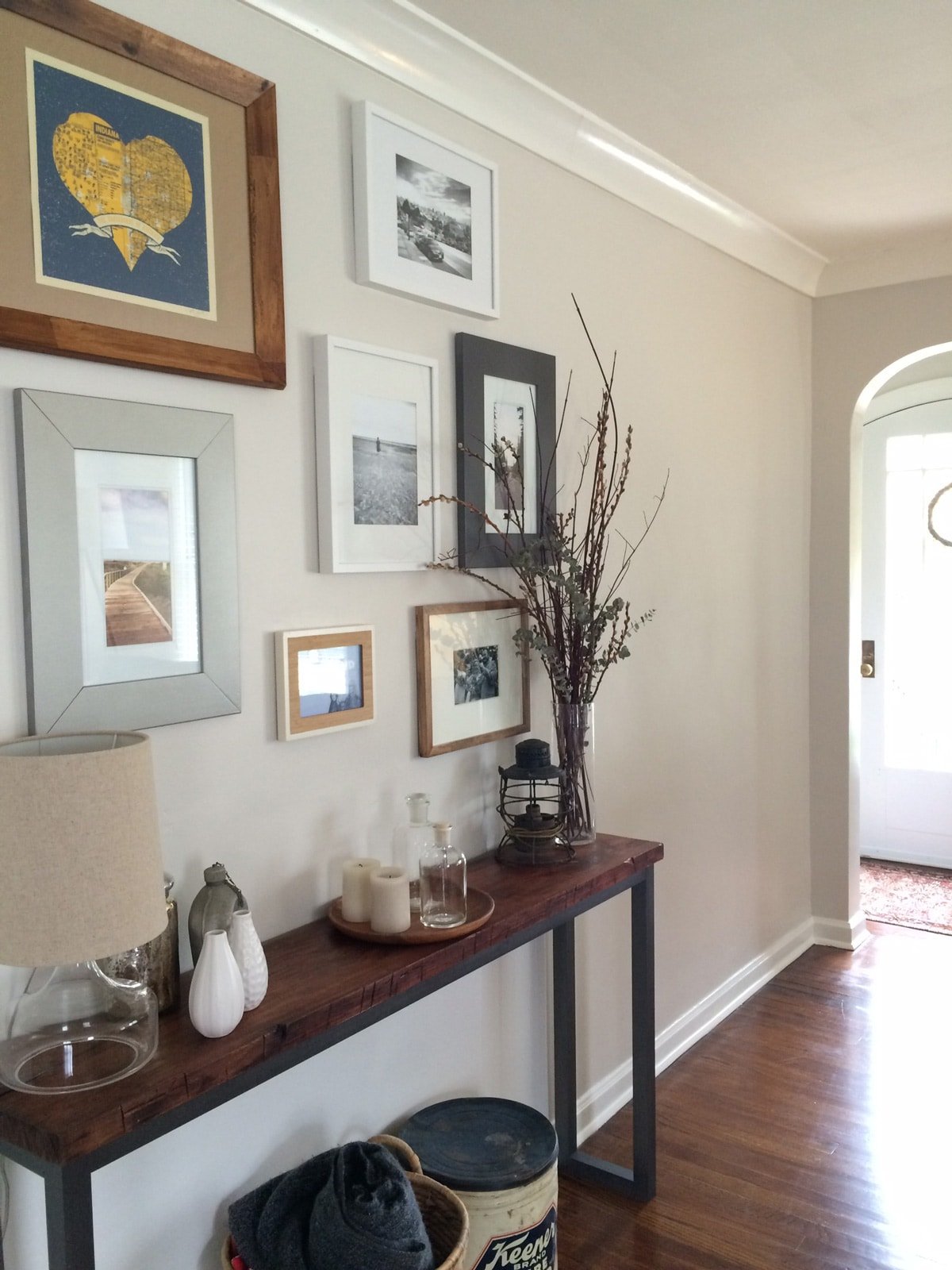
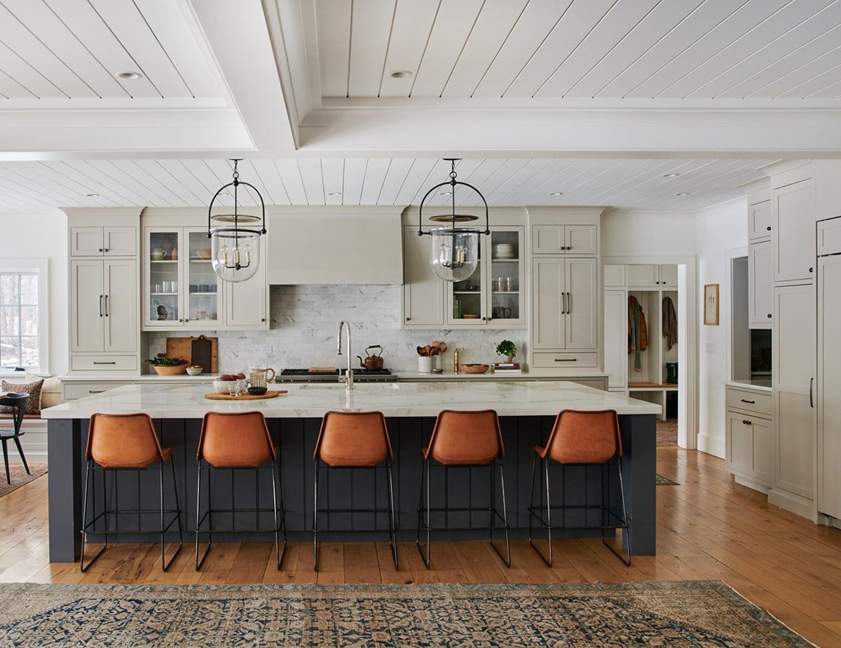
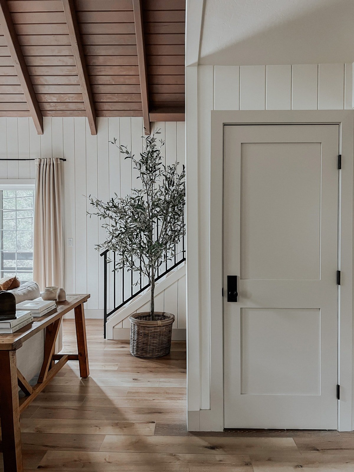
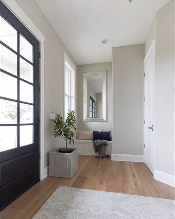
Benjamin Moore Revere Pewter – HC-172 / LRV: 55.05
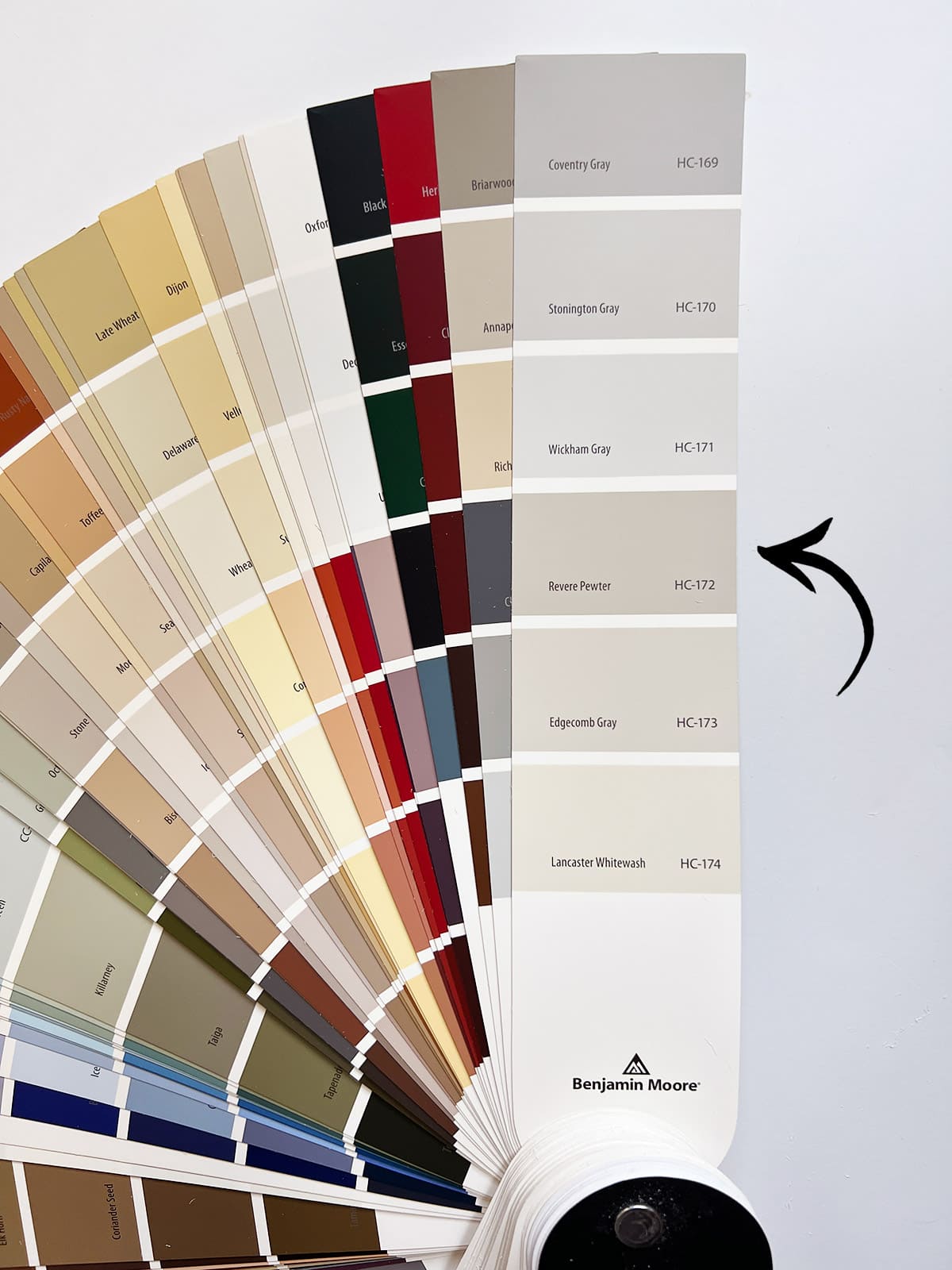
A favorite among designers and DIYers alike, Revere Pewter is one of the most popular paint colors of all time. It’s also a go-to for many designers, including Amber Interiors:
It’s a stunning color on any surface, from cabinets to walls, furniture and trim. I really love it used on contrasting doors and trim, as shown below:
If you’re looking for a greige that will stand the test of time, Revere Pewter should be at the top of your list of colors to sample!
Side by Side Comparisons
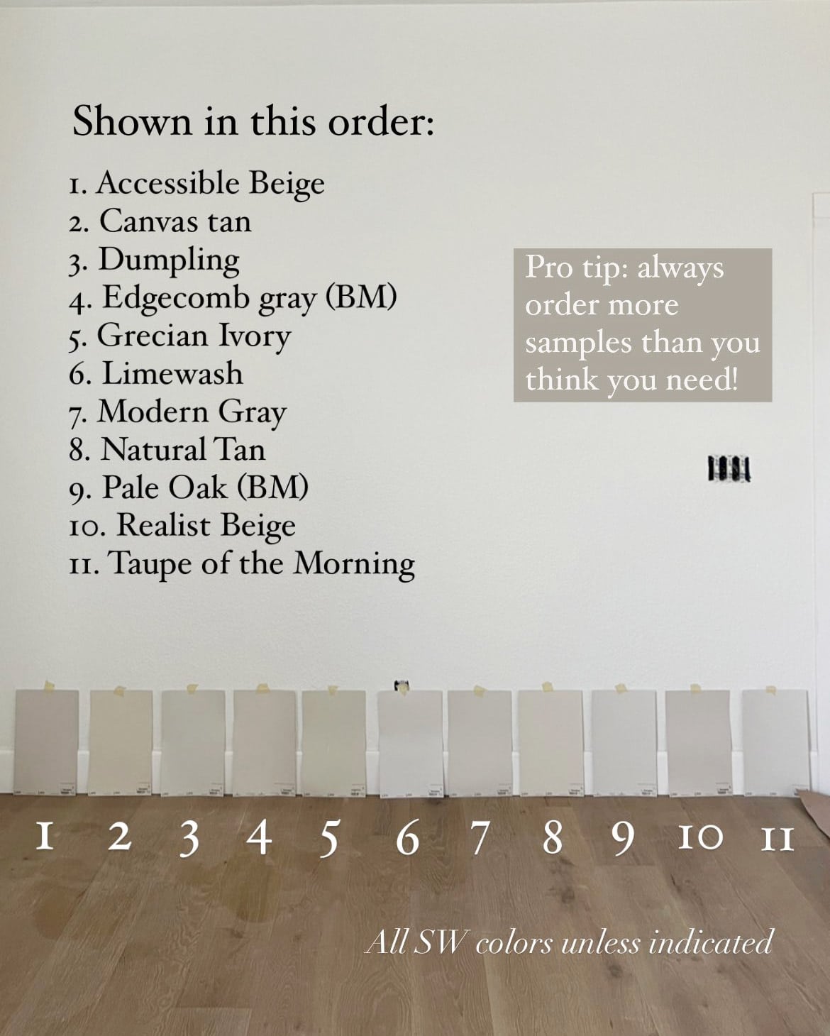
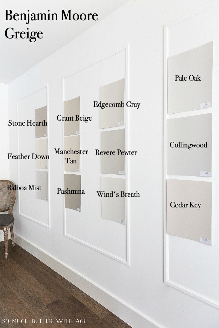
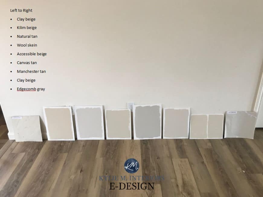
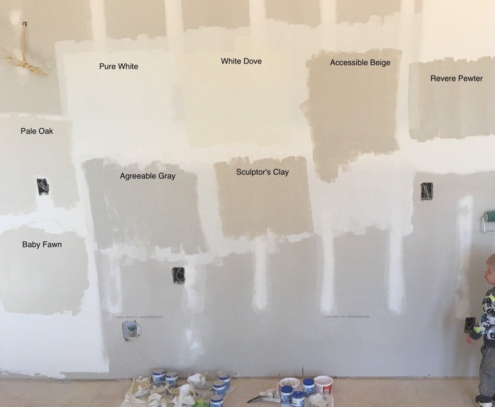
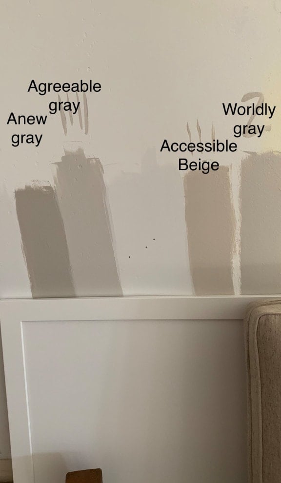
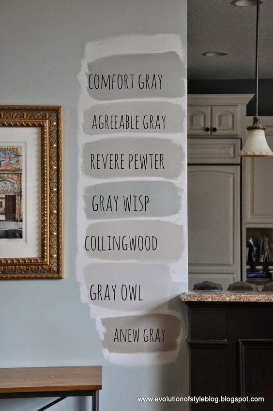
When looking for paint colors, I find it super helpful to compare different swatches side by side. The best way to do this is with real samples in your own home, of course, but seeing them online can help you start narrowing them down. This is always my first step when researching colors.
I’ve rounded up several real-life greige paint swatch comparisons below, in various rooms and lighting for you to compare. I hope you find these as helpful as I do!
Tips for choosing the right paint color
- Do your research. I start by searching online to find real-life examples and blog reviews (like this post!) to narrow down potential colors.
- Don’t trust renderings (or monitors). Ignore the computer generated “paint visualizer” rooms—online renderings do not translate to real-life results! Even real photos online will vary greatly, so find as many contrasting examples as you can and expect it to still look different in your space.
- Order more samples than you think you need. There’s nothing more frustrating than spending hours narrowing down a handful of colors, only to find that none of them are what you wanted. Play it safe and order lots of reusable samples (at least 6-10!) More likely than not, they’ll come in handy again later.
- Take your time when testing samples. Move the samples around to each wall, and study them from every angle, with the lights on and off, throughout the day and night. If one doesn’t stand out right away, give it another day or two and start narrowing them down until a winner is chosen.
- Consider your trim color/decor. It’s critical to look at the paint next to your trim (or wall) colors, as well as your furnishings and decor. Many times, this will be the main deciding factor, and more important than your preference for the color on its own.
What is the best way to test paint colors?
Without a doubt, in my opinion, the best way to sample paint colors is with Samplize reusable peel and stick samples. I’m constantly testing out new colors and looking for ways to streamline the process. Here’s why I made the switch:
- You can order samples without leaving the house, and have them delivered overnight.
- They cost about the same (or less) than store paint samples.
- They’re made using actual paint, so they’re a perfect match every time.
- No mess to clean up, no extra paint cans to store in your garage, and no wasted paint!
- It’s SO much faster to stick them on the wall than to paint 2-3 coats and wait for them to dry.
- You can stick them to anything—including molding, cabinetry, trim and textured walls, to see how they’ll look on any surface.
- You can store and reuse them for future projects. I file mine away in folders grouped by color family.
Greige Paint Color Q&A
When used properly, neutral colors will never go out of style. While greige has been trendy for the last several years, there’s a reason it remains a staple among interior designers. It’s the perfect marriage of cool and warm, timeless and on-trend, and it can complement most any other color. If you don’t want to fully commit, try a lighter greige (higher LRV) as an accent color (on trim, furniture, cabinetry, doors, etc).
There are countless more greige colors that you may want to consider. Here are a few less popular options worth looking into: Pashmina, Alpaca, Realist Beige, Analytical Gray, Taupe of the Morning, Dumpling, Limewash.
There are many popular grays on the cusp of greige, but slightly too gray to make this list. If you’re looking for a warm gray, check out: Repose Gray, Gossamer Veil, Classic Gray, Balboa Mist, Mindful Gray, Dorian Gray, Functional Gray.
If you’re looking for a beige that falls just outside of the greige range, try: Canvas Tan, Clay Beige, Grant Beige, Balanced Beige, Kilim Beige, Sandbar, Jogging Path, Loggia, Manchester Tan.

Whew, I think that just about covers it! If you plan to use greige soon or anytime in the future, make sure to bookmark this page as a guide to help you get started. I find this detailed information invaluable in my own research, and I hope it has been helpful to you as well.
What is your favorite greige paint color? Let me know if you have any questions/thoughts in the comments below!




Krista says
I have old hardwood floors that are red/ orange in tone. I’m having a hard time finding a greige color for my cabinets. I enjoyed this blog post, but I am still unsure what my best options are. Do you have any recommendations?
Paul says
Wow!! From gray to greige…and so many choices! I can not begin to contain my excitement.
Andrea says
I’d love to add SW’s Requisite Grey to your fantastic list. It has been a wonderful greige in my living spaces.
Thanks so much for putting together this post!
Trisha says
Are there greige paints that have green instead of pink/purple undertones?
Jenna Sue says
Yes! Many of the shades that lean more gray such as Worldly Gray, Agreeable Gray, Amazing Gray, Edgecomb Gray and Revere Pewter have green undertones. Hope this helps!
Mimi says
Thank you!! Love this post – I could’ve used it a few years back when we updated our home. Prior to that, we had Benjamin Moore Revere Pewter in the main rooms of our house and loved it. We thought we would keep it, but one thing that bugged me is how shadowy and grey it appeared at night. My thought was to lighten it by 50% but our paint guy suggested we try BM’s Rodeo. We did and love it even more than the Revere Pewter.
Michelle says
I spent way too much time looking over paint colors trying to make it work in my 18 foot ceiling great room and high ceiling kitchen. I was drawn more to the griege paint colors because of their flexibility in decorating with color. I chose anew gray which is so beautiful especially on a snowy day the purple undertones are more noticeable. For my trim I went with a softer white sw alabaster. For the primary bedroom and bathroom, I went with sw agreeable gray because of the lower 9 foot ceilings and sw pure white for my trim.
Cici Haus says
Oh my gosh this is exactly what I needed! I’ve purchased eight paint samples and hate all of them so far. I tried so hard to find examples of them in real spaces to help me picture it (ideally on cabinets) so THANK YOU for doing all the hard work!
Colleen says
I have never been a fan of white on walls or trim. How do I insure my greige/greige wall/trim paints will coordinate? Is it safer to select a color and then have a lighter hue of the same shade?
Jenna Sue says
Tone on tone is definitely a good option for you then! Or if you dislike stark white, an off-white (like Alabaster) could be worth trying. You could even paint the trim to match (in a different sheen) if you don’t want any contrast.
Colleen says
Thanks for reminding me about the different sheen. That’s another option for keeping it similar but different.
Carolyn Kellam says
This is a wonderful, thorough guide to “greige”! I wish I would have had it about a year ago, when I was trying to choose paint colors for our new build. I spent months looking at Pinterest, collecting paint samples, taping these to walls and just agonizing! I ended up choosing Benjamin Moore Classic Gray, trimmed with Simply White. It did not make your list, but I just love how clean and simple it is, but how the color can look creamy or gray or beige, depending on the lighting. Choosing paint is so tough, but your post here will be such a nice guide!
Jenna Sue says
Classic Gray is a great one too! It just missed the cutoff for this list as it looked more gray in all of the photos I found, but I included it in my Q&A as a warm gray option worth looking into!
elle says
Sooooo comprehensive! This is such a helpful post. All the descriptions, all the photos of real rooms. Saving it!!
Jenna Sue says
So glad it was helpful, Elle!