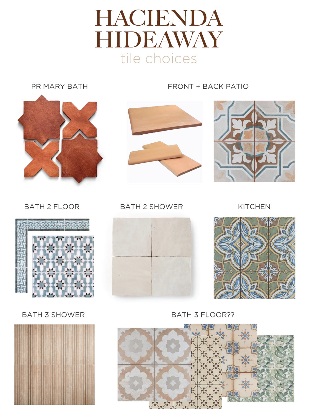
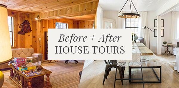
Tile is a distinctive element in Spanish/Moroccan/Mediterranean style design, and tile selection is the one thing I’ve spent the most time on throughout the design process. In this house, the tile will make a statement in every room:
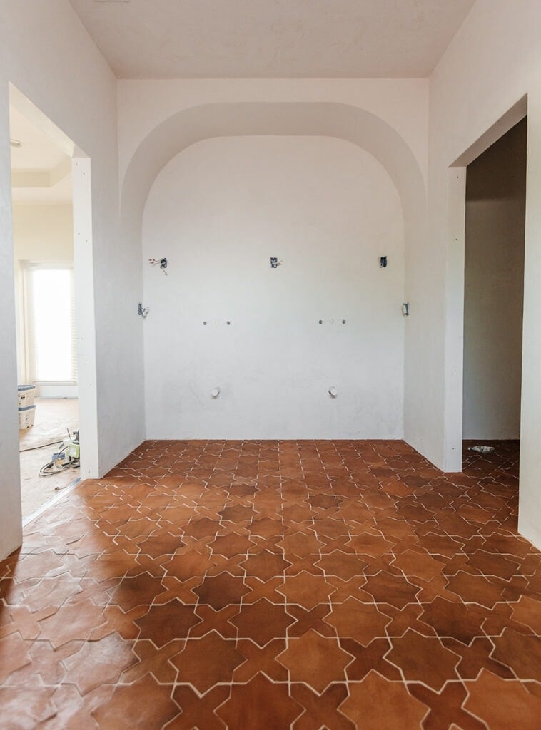
Last week, you saw the reveal of the Star & Cross red clay tile in the primary bathroom. Today, I want to share the rest of the tile selections for this house (inside and out!) and get your opinion with the last choice I’m stuck on.
After nearly a year of searching, here’s the official Hacienda Hideaway tile lineup:
Let’s start with the decision that took the longest…
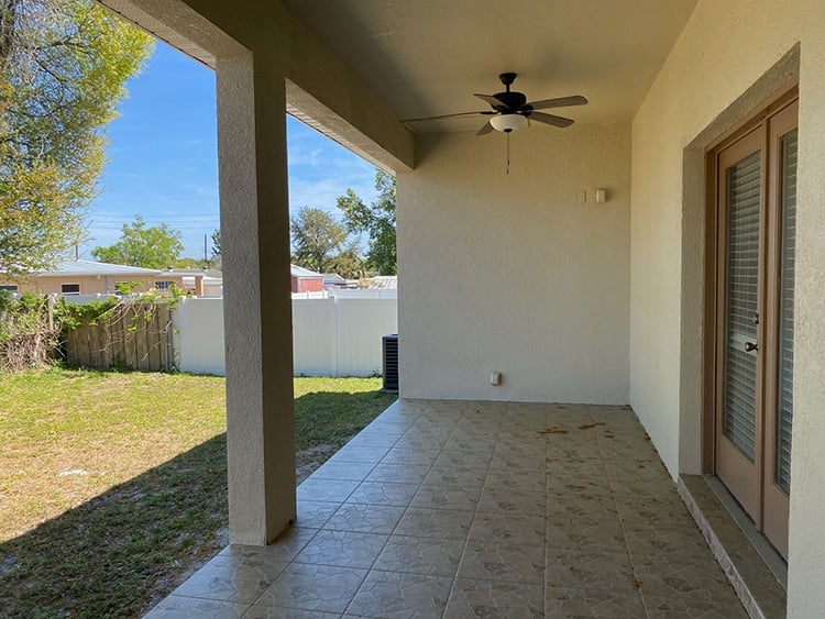
Front porch & back patio
For simplicity’s sake and cohesiveness, I decided to use the same tile for the front porch and back patio. It was challenging enough finding an outdoor-safe tile that I loved—and I actually changed my mind since announcing my original decision back in June’s progress update:
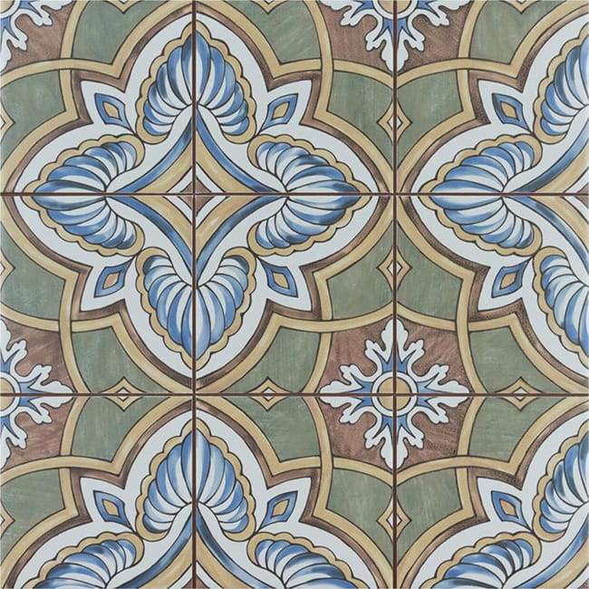
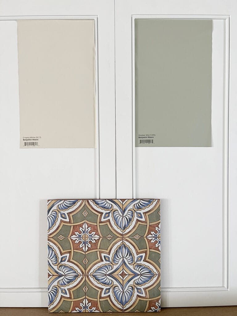
One benefit of slow renovations is that you have tons of time to think it over, and wait for new products to hit the market. The latter is what ended up happening, and this ceramic patterned tile checked all the boxes:
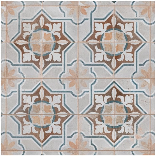
These durable and low maintenance tiles have a naturally aged look which should wear well over time, the colors are spot on, and do you notice the star & cross pattern? That’s a recurring theme in this house—this tile was meant to be.
The only problem? We have steps both on the front and back patio, and there’s no coordinating bullnose or stair nose tile (and I’m not a fan of metal edge strips). I’ve been searching for a solution for the better part of a year, and I finally found it just last week:
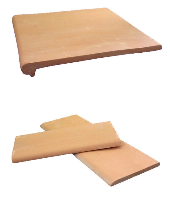
These terra-cotta floor tiles are handmade in Mexico, the perfect color, reasonably priced, and most importantly: the same thickness as the patterned ceramic tile. Every other stair tread or bullnose I found was too thick, so it would be near impossible to use them as a border tile. I haven’t decided if I’ll use the stair treads or the bullnose on the steps, but they will at least line the perimeter, with the patterned tile in the center.
Finding a solution to this problem was such a huge weight lifted off my shoulders! Now I just need to hurry and order it before it’s discontinued 😉
Kitchen backsplash
The kitchen tile selection isn’t news if you’ve been around for a while—I shared it in my Kitchen Kickoff post back in August:
Unlike the patio tile, I decided on this Harmonia Grove ceramic tile the moment I laid eyes on it. When you know, you know. The muted earthy colors, the hand-painted look and traditional Spanish design are everything I wanted in a backsplash tile. And with these paint colors? So dreamy…
PS: we’re still working behind the scenes on this kitchen! I haven’t shared any blog updates in a while, but you can find our progress in my Instagram story highlights.
Bathroom 2
For the second ensuite bathroom, I’m channeling more of a Moroccan feel. Keep an eye out for the design plans after we finish the kitchen—but for now I’ll share that I landed on this stunning sea glass Miabella tile mural on the floor:
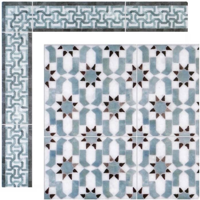
Truly a work of art, don’t you agree?
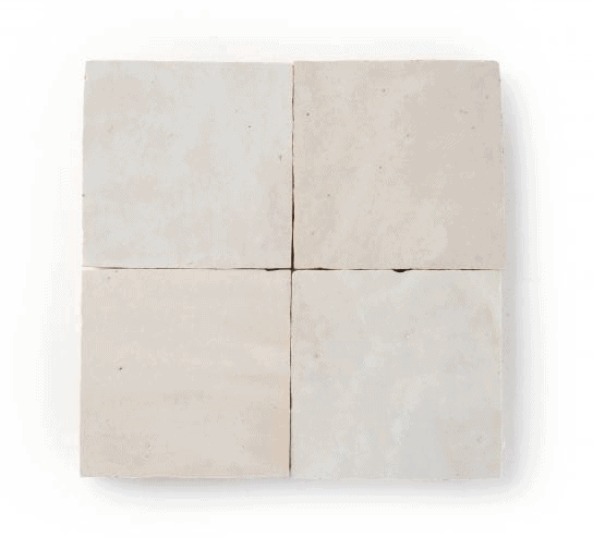
The shower tile will play a supporting role with traditional 4×4″ zellige tiles in natural white:
That’s all I’ll say for now… but this bathroom is gonna be a special one.
Bathroom 3
I’ve gone back and forth quite a bit with this room—debating between dark and moody, or light and playful. I’m still working out those details, but I recently came across a tile that I haven’t been able to get out of my head:
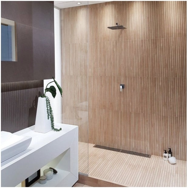
Have you seen this? It’s a maple wood-look porcelain ribbon tile, and it’s one of the most interesting ideas I’ve seen in a while. Not prohibitively expensive either at under $12/sf (especially for a small shower), and perfect for a minimalist-spa-resort vibe.
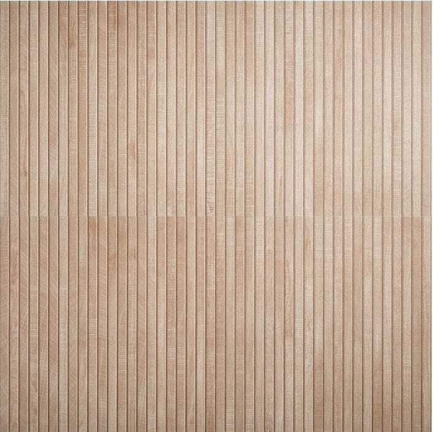
It’s currently on backorder (no surprise) but I’ve already purchased it, in hopes that it will arrive this year!
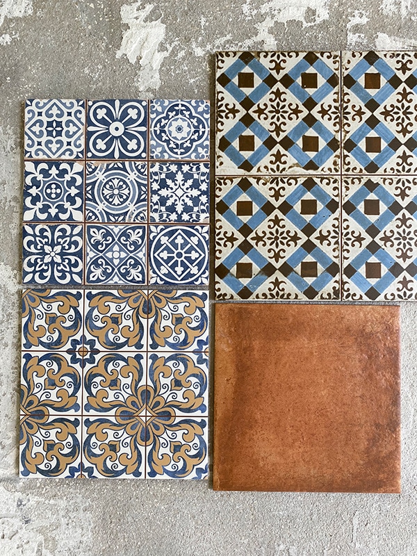
To pair with the organic/minimalist shower tile, I’ve rounded up a handful of patterned floor tiles I’m considering. Check them out below, and let me know your favorite:
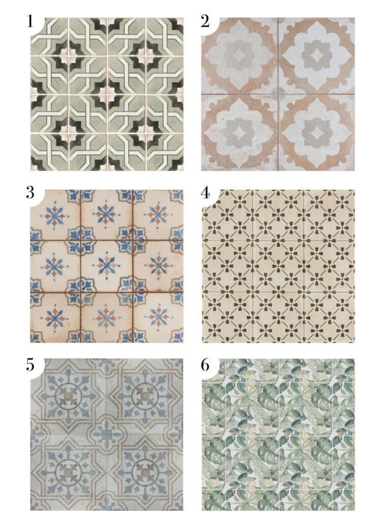
- Bedrosians Matte Ceramic Casablanca // This was actually the first tile I landed on (hello again, star & cross!) but now I’m wondering if it’s too bold and geometric (aka trendy).
- Merola Tile King’s Clay Blossom // I love the subdued colors and pattern, and it’s also from the same collection as our outdoor tile (yay for cohesiveness!)
- Merola Tile Mirambel // This was on my shortlist for the patio last year. The traditional pattern and hand-painted style have a timeless appeal.
- Bedrosians Antique Cotto Bloom // I’ve had this tile saved for years, and am drawn to the simple and sweet pattern.
- Merola Tile Llanes Perla // Fun pattern, super low maintenance, budget-friendly.
- Merola Tile Imagine Botanical Tropic // This one is a little wild—but I love trying something I’ve never seen before! A small area in a vacation rental would be the place to use a statement tile like this. Certainly the most unique and memorable option. I’m also eyeing this tropical leaf mural.
What do you think? Or is there another floor tile you’re in love with and willing to share? The star of this show will be the wood tile shower so I’m not too stressed about finding the one “perfect” floor tile (any of the above would be great!) I also like to have more fun and take more risks with our vacation rental designs—as you’ve seen with the Riverside Retreat 😉
And now, it’s back to work on this kitchen project. We’ve made some good progress over the last few weeks—head on over to my Instagram story highlights in case you’ve missed any of the fun!


Cathy says
The shower tile is absolutely awesome. I would pair it with #2, which not too busy and will blend well with the shower.
Jacine says
I love # 2 and 3. I think the “brown” hue will blend so nicely with the colour of the wood looking shower tile, which I love by the way. I also really love #5 but that’s me. I love the faded, aged look of the tile. Good luck. Great choices and really, any of these would turn out to look stunning.
Hilary says
Have you seen the emmeline tile by Clay imports?
Sweet pattern and can customize!
Mudrick says
Number two is my favorite for the bathroom tile but four could also be sweet!
Kathy says
Love 6 with those leaves. So cool and refreshing in there. Number 2 would be the safe bet.
Alyson says
Love seeing how your brain designs. This is such a fun post. Cannot wait to see it all together. The wood look tile in the smallest bath is going to be a show stopper and I love #2 with that. The colors and the earthiness are so grounded. #2 is stunning but in a supportive and undemanding way. My second choice is #5. It totally fits the vibe of the house too. I do love #4 too but it feels a little more european to me than The rendered vibe that is happening in the other two baths. I’m sure it will all be stunning. Been following for years and have always appreciated how you are able to pull off cutting edge and timeless at the same time.
Kimberly says
My vote is #2. More cohesive and current, and blue is always a good choice!
Kelli says
Girl…. #1!!! (Star and cross all the way!) the middle of the white star looks warmer and would play so nicely with the maple tile. Maybe with a pale golden sand colored grout? I think leaning on the warmth here mellows the dark in the floor tile and lessens the geometric-ness (New word!!? 😆) overall.
#3 is a close runner up. Love the blue, and it’s interesting and perfectly “hacienda” without being too visually busy. Especially once combined with the vertical shower tile.
#2 & #5 feel too safe both in scale and color of the patterns. Pass on vanilla, bring on the risk!
#4 and #6 may compete too much with the vertical lines of the maple tile. That is so lovely, it deserves to be featured. The small scale with these two options risks cancelling out all that goodness.
Just my two cents ($5!) that you really don’t need. You are Midas. Whatever you chose will be 🤌🏻💋.
Claire says
Number 2 for sure!! Stunning and simple and subtle. It complements the rest of your tiles well and really seems “zen” with the ribbon tile.
Kathryn says
Looks like #1 or #2 would blend with the ribbon tile colorwise
Lindsay says
My favorite with the shower tile is #4. My second choice would be #2. #6 is fun but doesn’t feel like it goes with the other choices for the rest of the house. #5 is very similar to the outside tile you picked – pro or con depending on what you’re looking for. I agree that #1 could be kind of trendy, and #3 just isn’t my favorite.
Pam says
First choice would be #2 and second #4.
Olga says
Ooops! Didn’t mention Luca and the little one good job guys👏💪🙂🤍🙌
Olga says
Everything you do it’s magic! Can’t wait ! Well done🤍🙂🙌!!
SANDRA BROWN says
It’s tough like you say to decide. I like #4 for the same reasons you do. #2 is second choice for me. Both do not compete as much with the ribbon tile in my opinion.