As we continue to make progress on the Spanish Sanctuary kitchen and backyard, we’re squeezing in a quick makeover of the last unfinished room upstairs!
Before
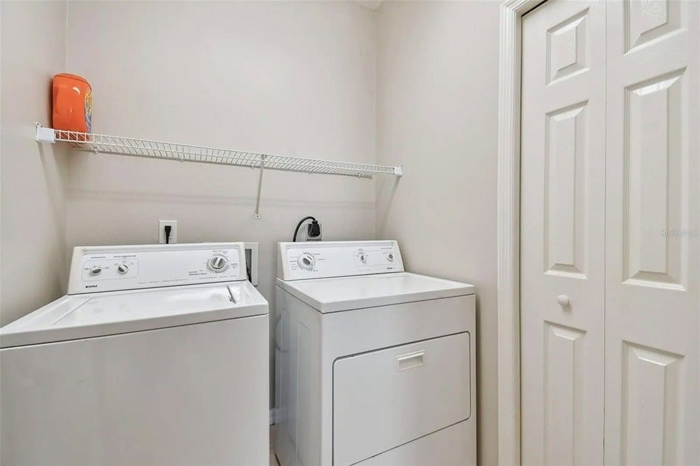
I present to you, the saddest laundry room there ever was:
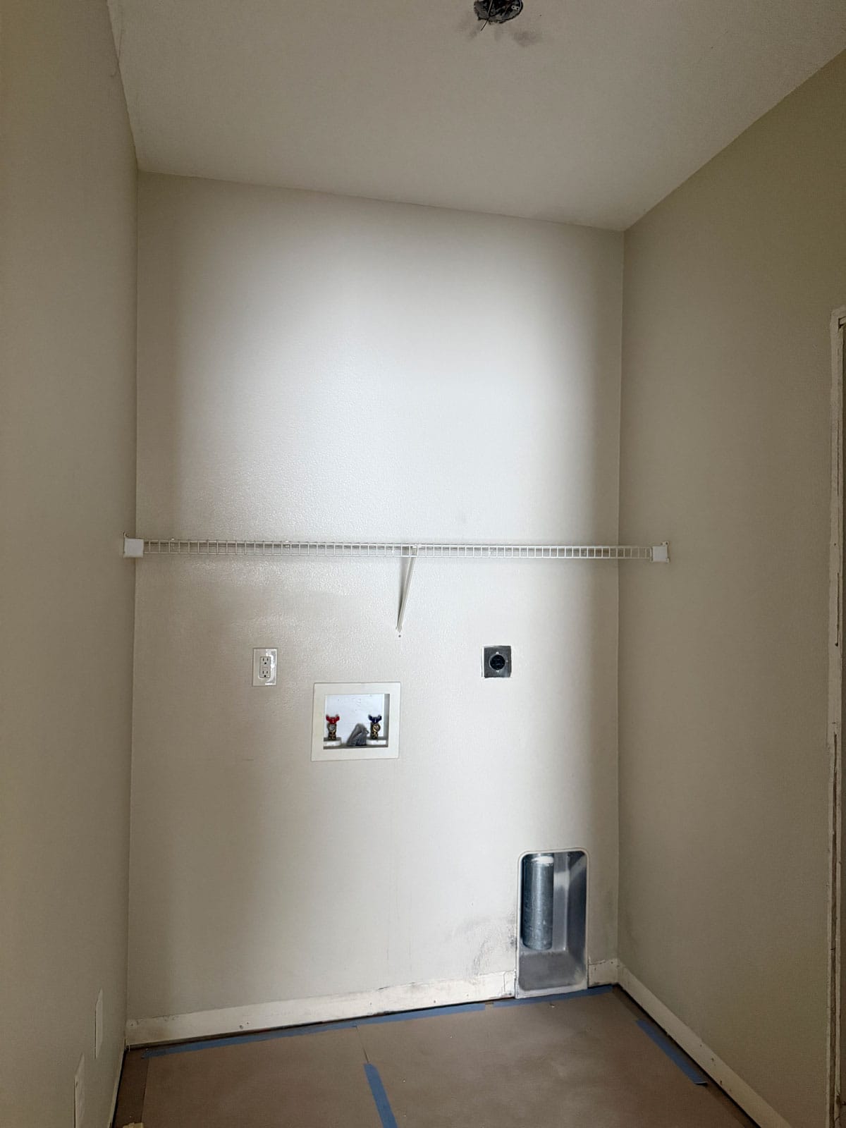
This laundry room was clearly an afterthought in the building plans, tucked into a dark interior corner next to the AC closet with no natural light.
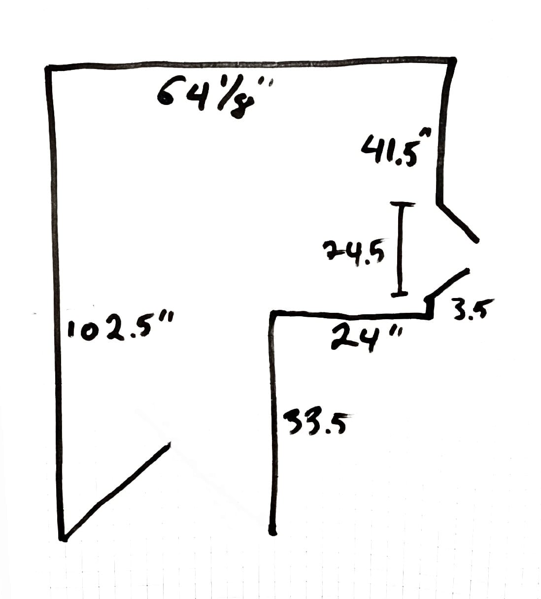
Here are the dimensions we’re working with. Just enough space for the washer and dryer on the back wall, with access to a small storage closet on the right.
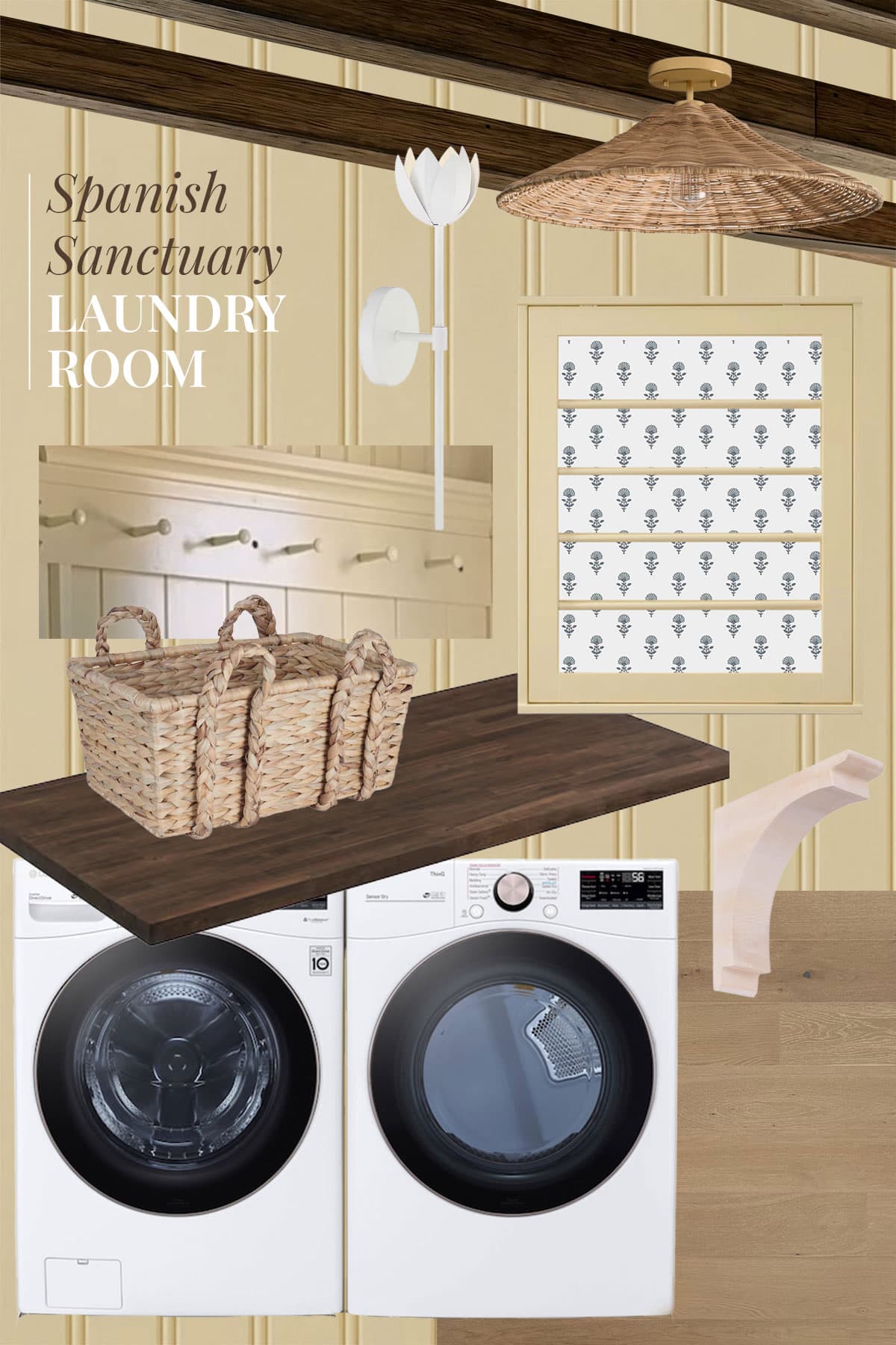
Inspiration
I debated leaning into the cave-like feel with dark and moody colors, but ultimately decided I wanted this space to feel light and happy. I’ve been loving the soft yellow trend, and thought this would be the perfect space to try it out!
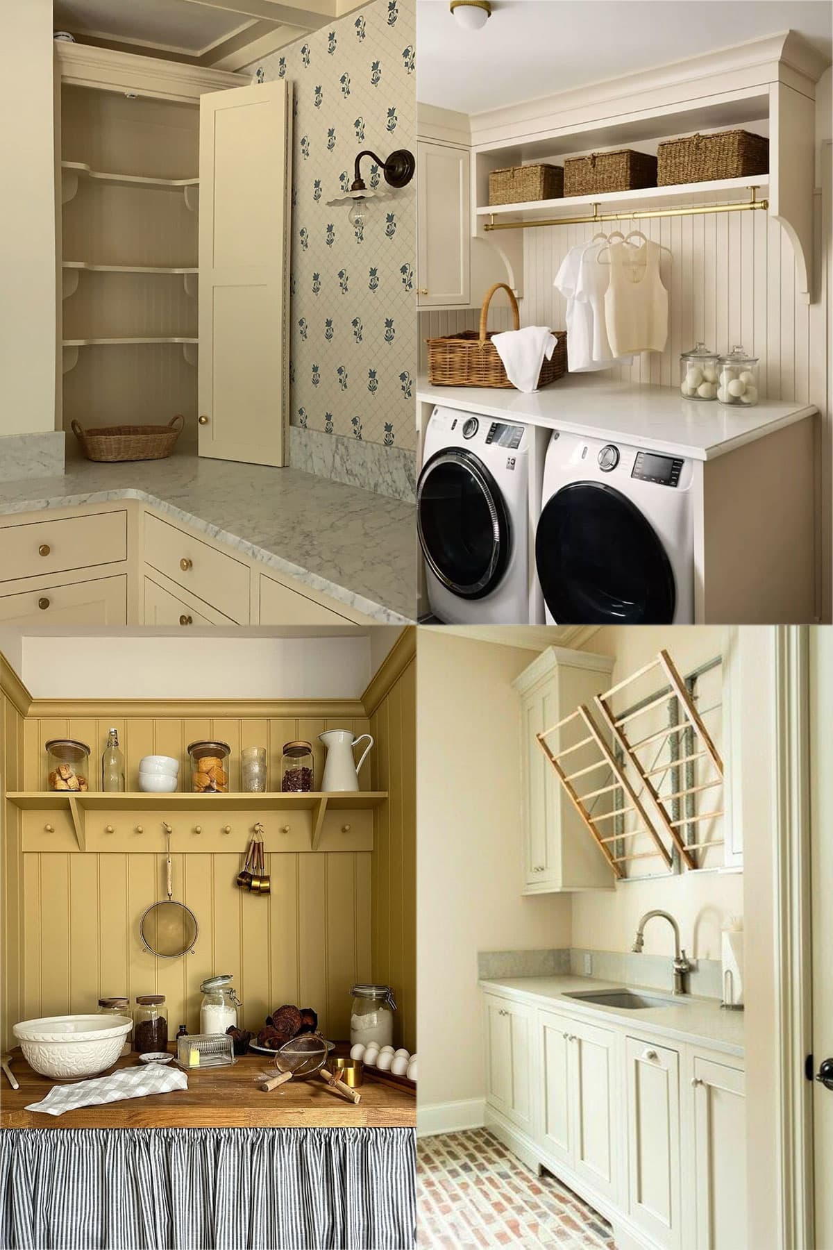
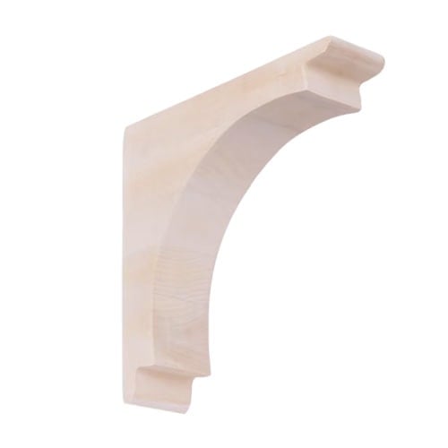
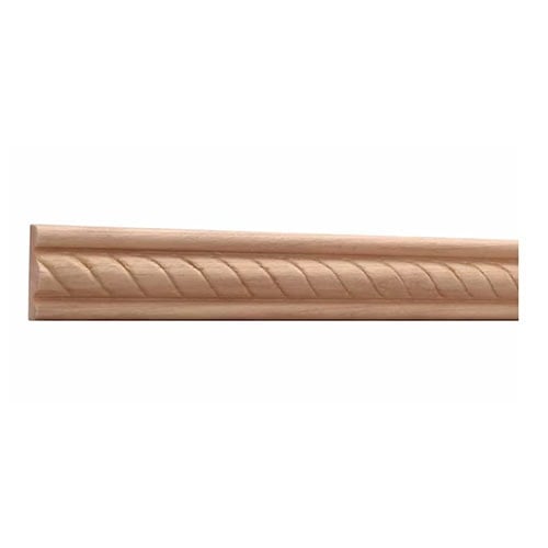
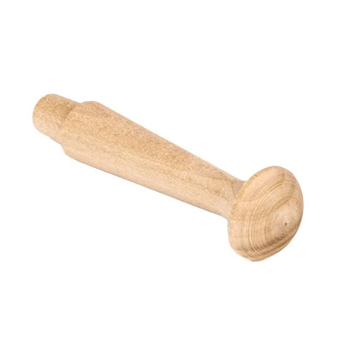
My deep dive on Pinterest led me to a cottage-inspired feel with all the charming details—woven textures, stained wood, vertical paneling, rope trim detail, shaker peg rail & shelf with corbels—all color drenched in a soft golden yellow.
The Design Plan
Apart from its size, the biggest limitation of this room design is the budget and timeline. I’m partnering with Lowe’s on this project so we have a set materials cost and due date—which is coming up in just a couple weeks! Fortunately I was able to source everything I needed for my vision within the budget, and work is officially underway.
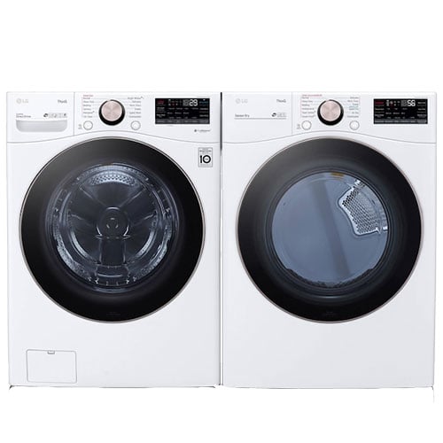
The most important decision, naturally, is the washer and dryer selection. I ended up choosing the exact same model we used in our Hacienda Hideaway rental, as it has been a true workhorse with zero issues or complaints from guests or the cleaning crew (which is rare!). I grabbed them on sale last week and they’re still marked down as of now.
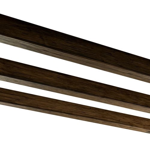
With a looming deadline and Lucas down one hand after an unfortunate hammer incident, we’re hiring some help with the millwork install. I chose these wide-groove vertical panels to clad the walls, along with thick 1×6″ baseboard/crown, plus rope chair rail molding for added detail.
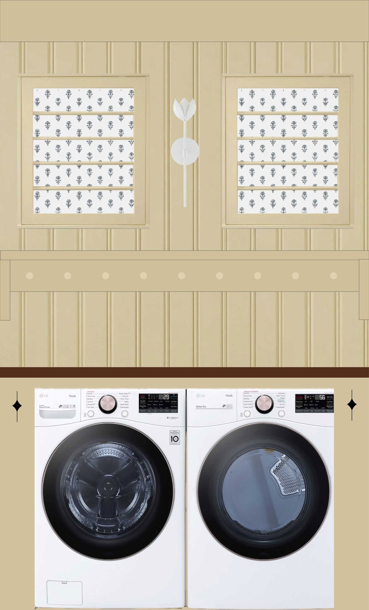
Here’s the best rendering I could manage with Gemini—the details aren’t accurate but at least you get an idea:
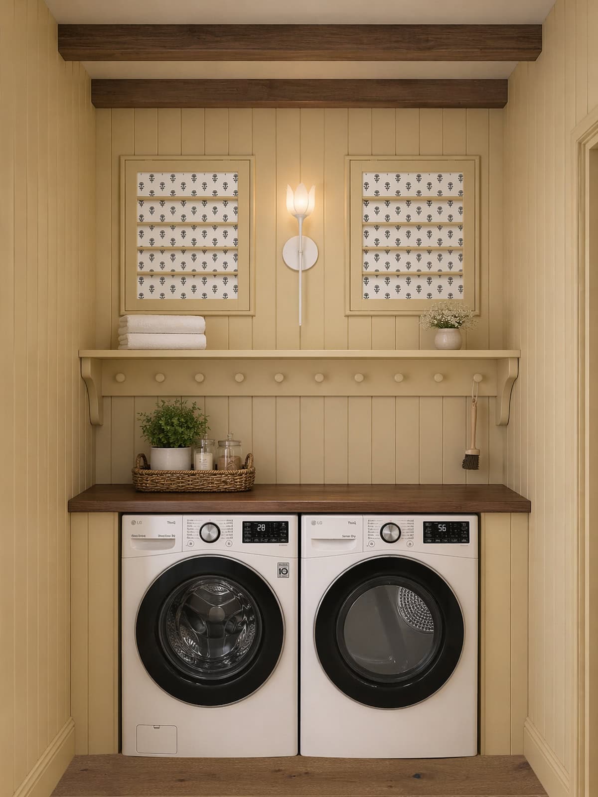
Originally I built upper cabinets into the plan, but after factoring in all of the customizations needed, we decided it would add too much cost and time to the project. Since this is a vacation rental, that space really isn’t used, plus there’s a linen closet just to the right.
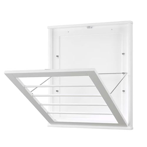
Instead, I opted for an open shelf (with a shaker peg rail) and two drying racks mounted to the wall. Everything will be color drenched in the same soft yellow, but I love the idea of bringing in another color & pattern with this wallpaper on the back of the drying racks.
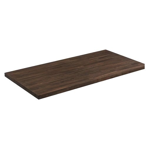
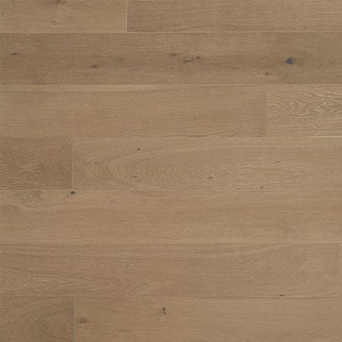
The painted surfaces will also be contrasted with the dark wood ceiling beams, stained butcher block and white oak flooring. We’re using the same ceiling beams as the rest of the house, and the butcher block comes pre-stained which saves us time!
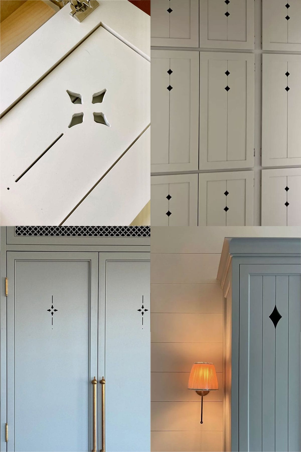
Another detail I’d love to include but haven’t quite figured out how to do yet are these cabinet cutouts (on the panels to the left and right of the appliances). Typically they’re made with a CNC machine, but we’d have to figure out how to create them by hand… any ideas?
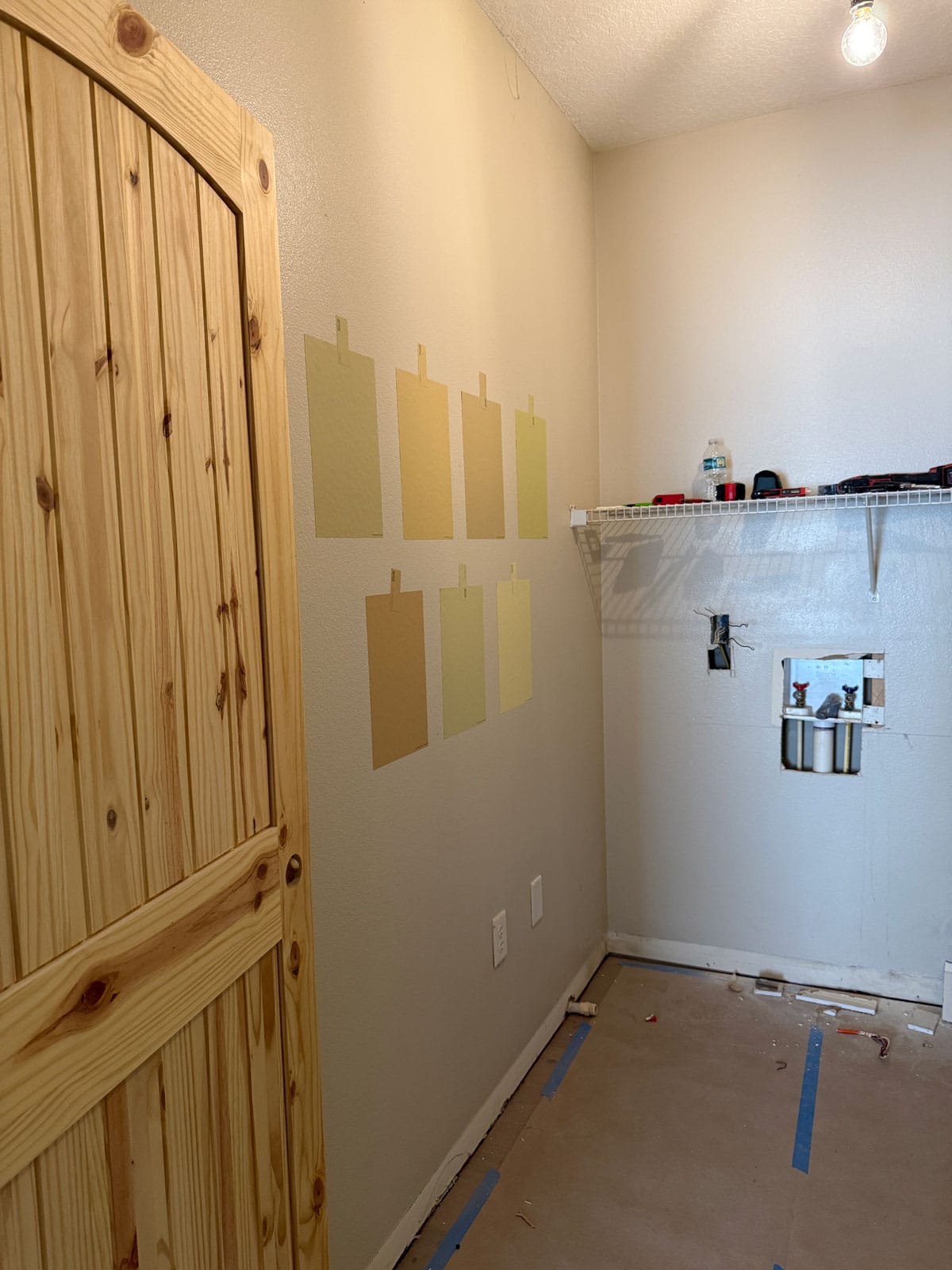
The next big decision to make is paint color. I narrowed down the options and ordered 14 different peel and stick samples from Samplize to test out in the space (these are all Sherwin Williams):
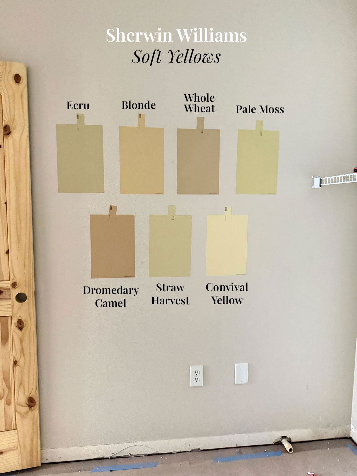
The photo above is under natural ambient lighting. They look a lot more saturated with the overhead light on…
Do any of these jump out to you? I’m leaning towards one in particular, and curious to hear your thoughts in the comments!
Sources
You can see the full supply list on my Lowe’s Storefront.
Tap to shop the sources below:

I’m sharing more today over in my stories and will be posting updates there if you want to follow our progress!


Teri says
Blonde! and not just because that’s my hair color…
Jen C says
Blonde! Love everything that you have put together for the laundry room.
Sandy Clifton says
Blonde
Cathy says
I agree
Peggy S says
I wonder if it would work to paint the pattern to mimic the cutouts.
Jenna Sue says
I was thinking that could be plan B!
Denise says
My two favorites are Convivial Yellow and Blonde. Then I realized Convivial is actually too bright to be in keeping with the rest of the home. I’m afraid all the other colors will really look like a jail cell in that small windowless area so Blonde for the win!
Jenna Sue says
I’m right there with you! The colors shift so much depending on lighting but I think Blonde is the closest to my vision.
Barbara Scott says
I really like blonde. A few of them look more green than yellow.
Have you consider investing in a laser machine for the cut outs?
Alana says
Top choices are Whole Wheat and Pale Moss. I have used both and they are lovely. However, I’m not sure why Whole Wheat is looking so brown and Pale Moss may be too green for what you’d like. So Convivial yellow might be your best choice. I would try an actual sample of whole wheat though. It is a lovely color and looks like your image in person.
Jenna Sue says
They really do look so different in this room than other examples online. Just goes to show how important it is to sample them first! Whole Wheat appears very beige/brown in this room. Convivial Yellow is lovely and was my second choice after Blonde 🙂
Victoria says
Convivial yellow followed by Blonde. Cute design.
Jenna Sue says
Those are my top two as well!
KJ says
For happiness and brightness – Conival Yellow. For moody neutral Blonde
Jenna Sue says
My thoughts exactly!
Mandy Allen says
I like Blonde by far the best. Your sad little room is going to look wonderful! Sorry about Lucas’s hand, hope it gets better soon.
Jenna Sue says
Thanks Mandy! He’s feeling much better now 🙂
Jennifer Christian Haidu says
I love light & bright – especially in a laundry room. Helpful to better see stains to pre-treat. Therefore, I like the Comvival yellow best! Second choice would be the blonde.
Love your plan!! So charming!!
Jenna Sue says
Those are my top two as well!
Mellie says
Blonde looks the closest to your rendering … a warm yellow that feels buttery, not too green and not too sunshiney yellow.
Jenna Sue says
Agreed. I think it’s the perfect balance!
Patrice says
Convivial yellow will bounce light in that dark little room! Second choice
is Blonde – but, perhaps at 50% – 75%
saturation to lighten it up…
Holly says
I like Blonde a lot, but I love a bold saturated yellow. I’m loving the yellow from the 90’s that’s coming back.
Jane says
I love Hawthorne Yellow from Benjamin Moore.
Gail says
Maybe 1/2 concentration of the Blonde or Convivial Yellow?
I’m thinking in that small of a space the color will intensify with the walls reflecting the color onto each other, but both these colors looked the most cheerful to me.