Now that Poolside Palms and The Riverside Retreat are done, it’s time to get back to work on our Heights House! I’ve been anxiously waiting to jump back in to projects here, dreaming and planning in the meantime. Today, I’m excited to share the plans for our upstairs bonus room (and get your help on some design decisions!)
The space is currently being used for storage/overflow, and it was always our intention to turn it into a multi-purpose office/storage/media/play room:
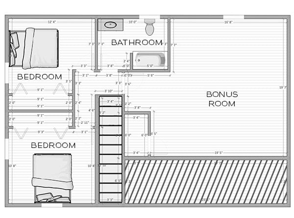
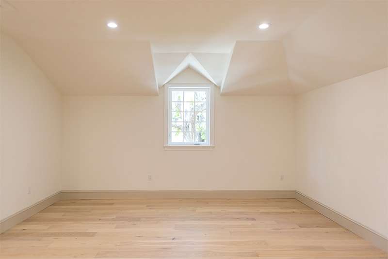
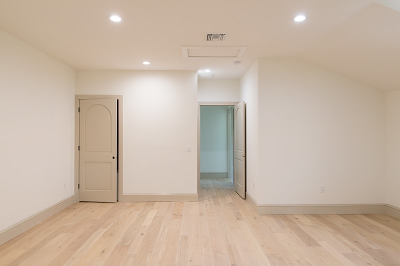
It’s a fairly large room at approximately 380 square feet, with some interesting angles due to the shape/slope of our roof. Here’s the view when you walk in:
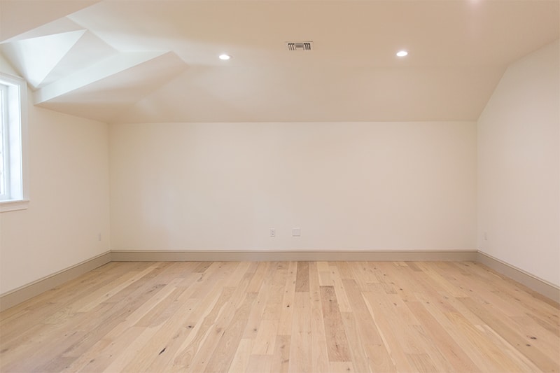
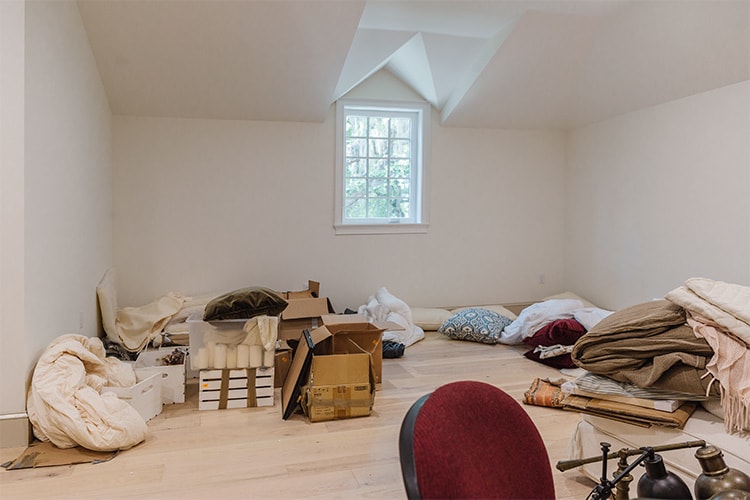
The biggest drawback is the fact that there’s only one window—we didn’t have the budget to add more when building. But we also figured since this would be our movie spot, a darker room isn’t the worst thing in the world.
Now that Esmé is mobile, we need a safe place for her to roam freely (she’s in the open/empty every drawer stage) and somewhere to contain her toys so our downstairs doesn’t look like a tornado came through 24/7.
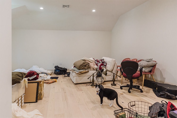
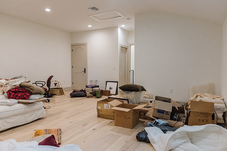
Those photos were taken when we moved in, but here’s how it has been looking for the past year (you might remember these from our recent one year house tour update!)
Lucas has been using one of the guest rooms as a makeshift office, but we want to create a designated desk/workspace here, since eventually that room will become Esmé’s big girl room.
And of course, we need lots of storage for my growing collection of throw pillows and decor. A wall of deep floor to ceiling cabinets should do the trick.
We’re not TV people (we don’t have cable and only watch football—ahem, Patriots games… and maybe Bucs games too now that we have Brady!) but we figured eventually this would be the perfect spot for family movie nights.
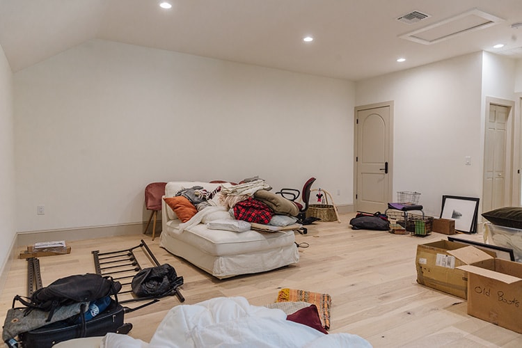
This past weekend we finally finished unboxing and organizing everything up here, and now we’re ready to start DIYing! Let’s dive into the design plan…
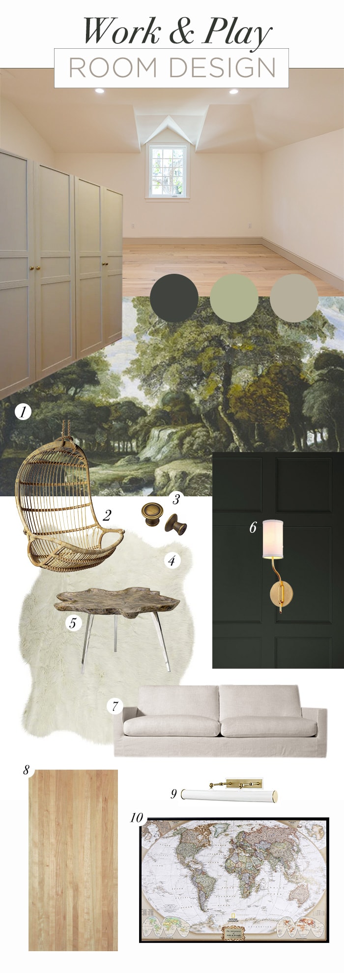
Click for sources: 1 / 2 / 3 / 4 / 5 / 6 / 7 / 8 / 9 / 10
I’m still finalizing product selections so this mood board is more of a general idea of what I’m envisioning—not necessarily these exact sources. There are actually only a few things I’m certain of at this point, and one is the inspiration for the whole room:
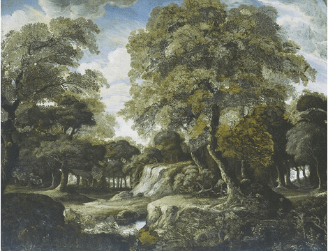
Stunning, right?! I found this mural from Walls Republic and immediately fell in love. I wanted a conversation piece that was whimsical enough for a playroom, yet sophisticated enough for an adult/work space. This mural nails it—it’s calming yet playful at the same time. And I’ve never seen it ‘in the wild’ before so I can’t wait to try something new! This will be the first thing you see when you walk in, covering the entire back wall:
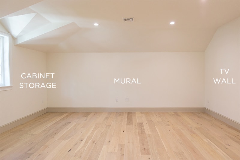
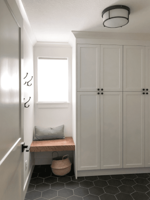
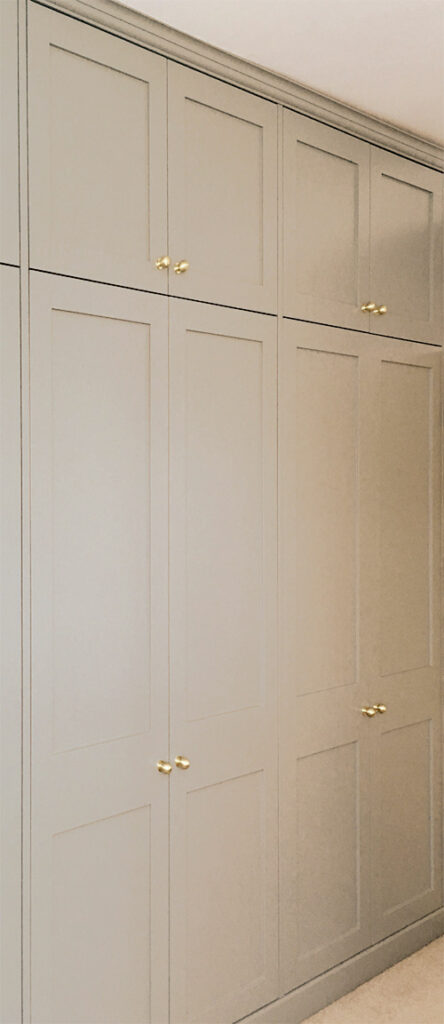
The other main component that has already been decided on is the cabinets. We designed a custom Ikea Sektion (kitchen cabinet) layout which will include floor to ceiling storage, a countertop/desk, and a custom built-in window bench/future kids desk.
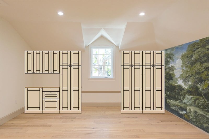
The desk mockup is missing from this photo, but it will extend above the far left cabinet along that wall. Those upper and lower cabinets will be used as office storage, while the tall cabinets will all be decor. Below the window we’ll use the same countertop material (butcher block?) to build a window bench seat/future kids desk. Here’s the view from the mural wall, looking towards the entrance:

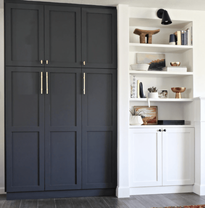
I’m so excited to work with Semihandmade as a sponsor on this project as I’ve been waiting for the perfect time to try their products, and I’ve chosen their DIY shaker style doors and drawer fronts. Here’s a couple of their customer examples with a similar setup (taller doors below, shorter on top):
The doors were delivered last week and are still in boxes while we prepare our garage painting station, but I couldn’t help take a peek at them!
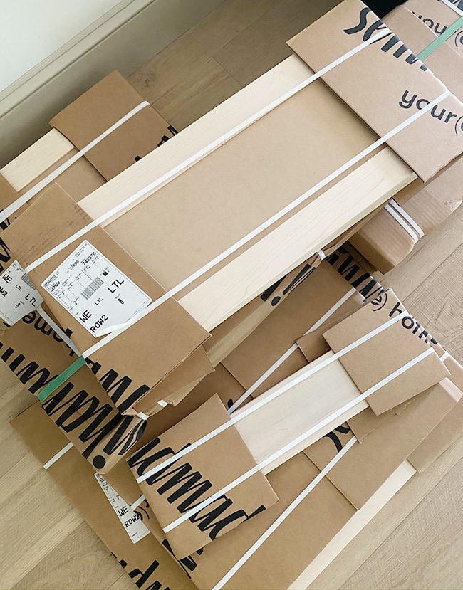
Last week we went to Ikea to buy the cabinet boxes, but unfortunately they’re out of stock since they’ve been shut down and are still trying to catch up. We’re staying hopeful that there won’t be another shut down, and we can get these boxes ASAP! They’ll require quite a bit of custom modifications for this room, and I plan to do a dedicated blog post covering the installation process (and another one for painting the doors!)
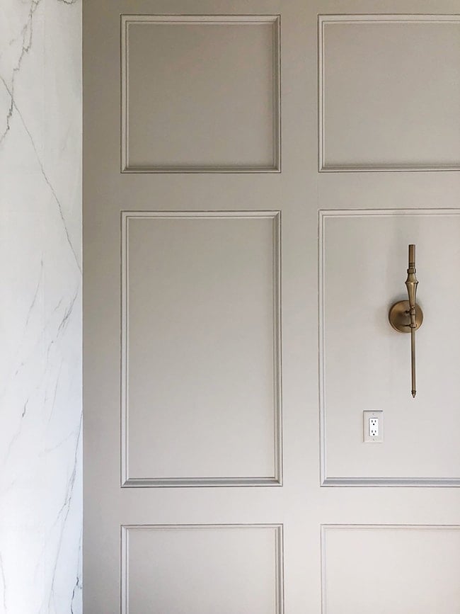
Opposite of the cabinets will be the TV wall. Here we’ll be installing custom trim paneling—the same style we used in our master bathroom:
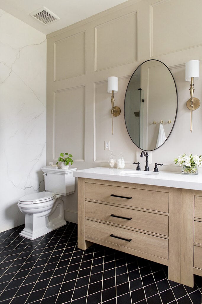
The board size and spacing may be different, but same technique. It’s a lot of work on a large wall, but the end result is so elegant.
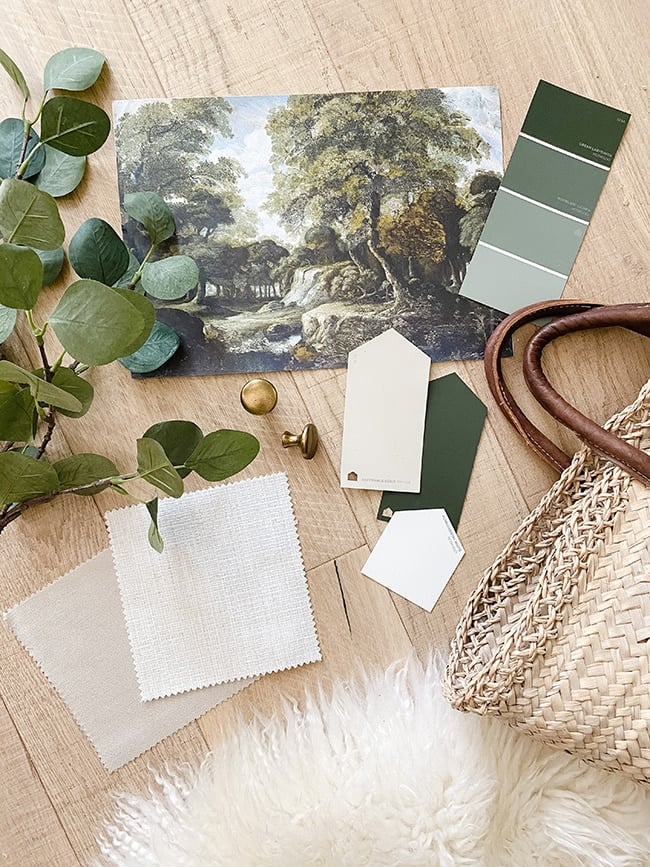
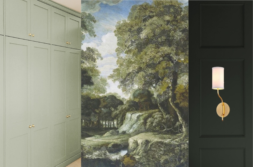
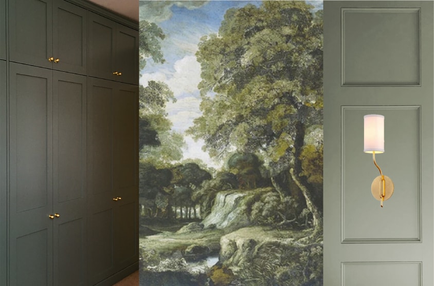
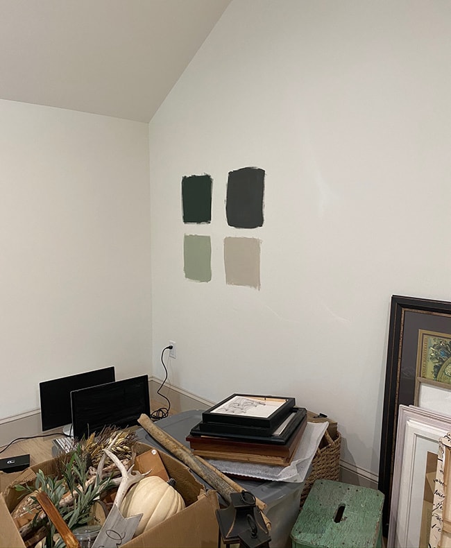
And now the million dollar question—which paint colors to use?! This is where I need your help. I’ve narrowed it down to a deep green-gray, and either Accessible Beige (the color in the bathroom photos above, and our doors/trim throughout the house) or a light gray-green. One color will be used on the cabinets, the other color will be used on the TV wall. I made these mockups to help us decide!
Option 1:
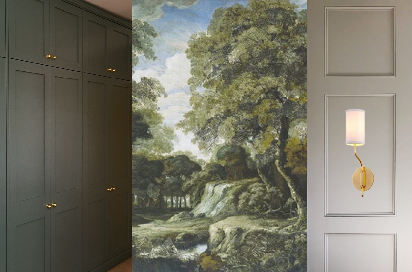
Option 2:
Option 3:
Option 4:
Here are my thoughts: the original idea was dark greenish gray cabinets—I couldn’t get this vision out of my head and was set on it. But I also love a dark wall behind a TV—I think it looks more dramatic, and helps the TV blend in when off and stand out when on. I think the room would be too dark and cave-like if both the cabinets and wall were dark (Lucas also isn’t a fan) so I have to choose one or the other.
Since the cabinets will be hand painted, durability is a concern and a lighter color will wear better/not show as many imperfections. I’m also thinking about using light green cabinets in our future laundry room. Because of this, I’m leaning towards Option 2. This isn’t the exact same color or hardware, but very close… pretty, right?
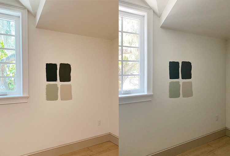
Yesterday I picked up a couple Sherwin Williams paint samples to test out. I already had Accessible Beige and Softened Green on hand (the green was used on our Riverside Retreat laundry room ceiling) and I also found these two deep greens:
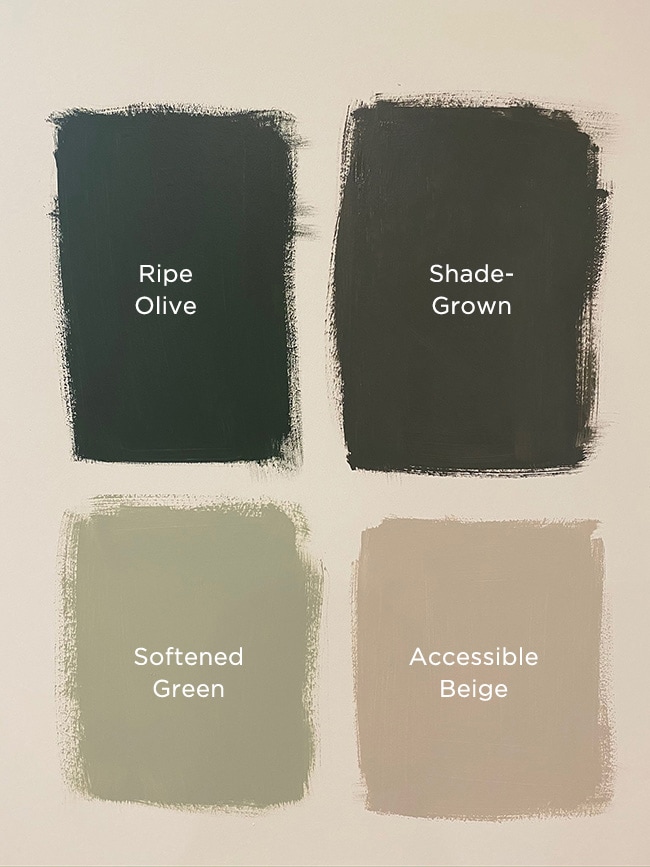
I will say, the colors look quite different in person than in the photo—the top greens are much darker in person. Because the room is so dark and there’s no direct light shining on the wall, you can’t even really tell they’re green (again, this photo is deceiving!) Here’s how they look on the TV wall:
Here’s how they look on the cabinet wall, with the lights on and off:
I found an example of Ripe Olive in this bathroom by Vintage Revivals, and it’s the exact color I’m going for. It looks much lighter in this room, though:
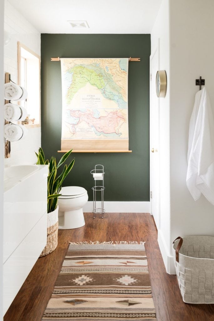
I suspect once it’s on the entire wall with molding I’ll be able to see the depth and lighter tones, but maybe I should still get a different sample to try out. Shade-Grown looked too olive, more like a dark muddy brown in person. This is yet another example of why you can never trust colors online, and must always test out samples in your room before committing!
Clearly, we still have a lot of decisions to make, but at least they’re the smaller/fun decisions. I’m really excited about adding a hanging chair! We may actually end up building a wood/rope swing instead, but I’ve always wanted a chair like this…

The sofa is still up in the air, but we need something large and comfortable. This Devyn sofa is the right size/color/fabric, but we may decide on a sectional instead…

I love the idea of a soft, cozy textured rug like this faux sheepskin. There isn’t enough space for a large rug so something small like this in front of the sofa is perfect, and it won’t compete with the mural:

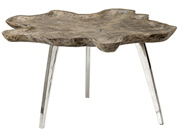
I also found this cool live edge wood coffee table, perfect with our forest themed space (and only $194!)
Above the desk, we’ll fill the wall with a large cork map with pins of our travels. I haven’t spent a ton of time looking yet, and we may end up DIYing our own, but I’m picturing something like this:

I’d love to mount a large picture light above it, but that would require running a new electric box so not sure if that’s worth the cost/time. But something like this would be lovely:

And speaking of sconces, we’re definitely going to run electric for sconces on either side of the TV. I have an idea of the style I want, but can’t decide on which one! What do you think?
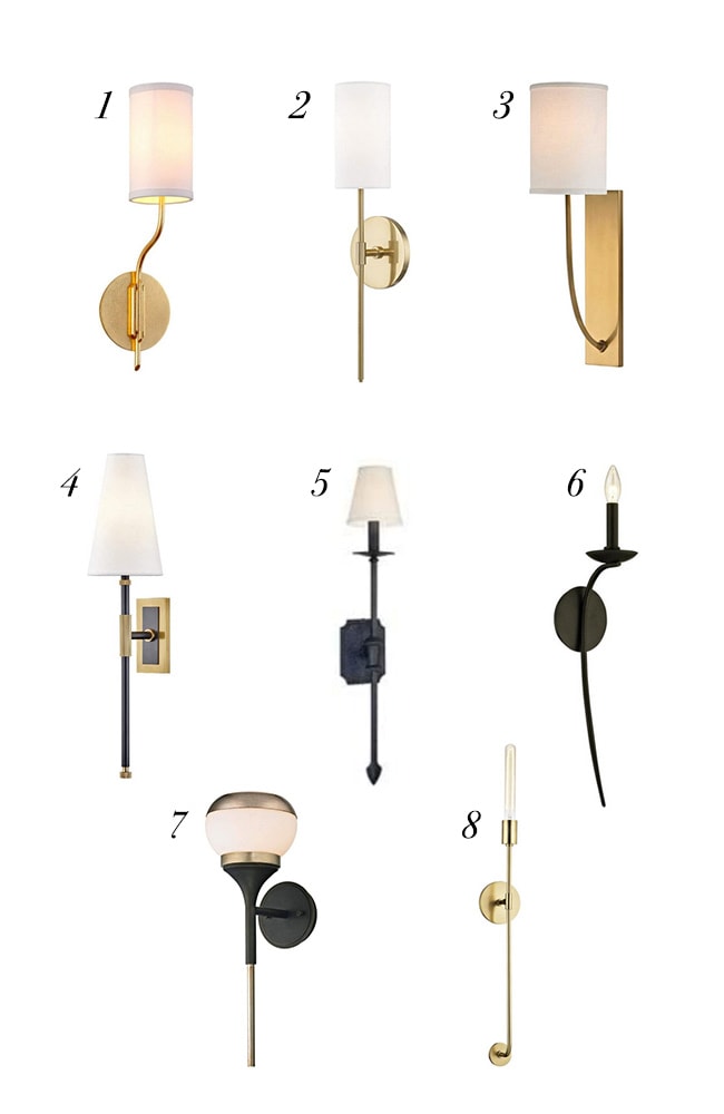
Click for sources: 1 / 2 / 3 / 4 / 5 / 6 / 7 / 8
I’m 100% set on brass so if I choose option 5 or 6, I’ll use my Rub n Buff technique to color them. Option 5 is the single light version of our two-light sconce in our dining room, and the medieval style is probably favorite of the bunch. And option 6 is the wall sconce version of our living room chandelier. Each one has something unique, I can’t decide! Let me know your favorite in the comments.
Alright folks, I think that covers everything! This is just the beginning of our room renovation journey, and you can expect updates over the next couple months or so as we make progress. I’ll be sharing more frequently over on Instagram if you’re not following along already! Let me know which part you’re most excited to see, and if you have any color/design input. Another room renovation begins… let’s gooooooo!


Miss Boots says
Yes, who is the new photo bomber? He/she is beautiful!
Love the mural, and all of your design elements. I would go for the greens, options 4 or 3.
Can’t wait to see your progress in this room,
Teddee Grace says
Whew! The paint color options and decisions. I love the dark olive, but can see that those selected to date are too dark in that room and wonder if they are too dark for a young child. However, the green, in my opinion, makes the mural pop so I’d opt for Option 1 with a lighter shade of dark olive. I think if you are going to change the finish of the sconces with Rub ‘n Buff you might as well go with brass to begin with. I see you have selected Sconce #1 for use in your paint options and it looks quite nice. Looking forward to seeing what you do.
Darcy says
What a beautiful design you have created!
Color Option #2 – Let the tv wall and the mural wall be the stars of this room. The cabinets are beautiful in their own right and don’t need to ‘stand out’ more.
Wall Sconce #3 – I think they are the best design for the molding you plan to do.
Rather than running electric for the sconces, could you do the “magic light trick”?
Whatever you choose will be the right decision, Jenna!
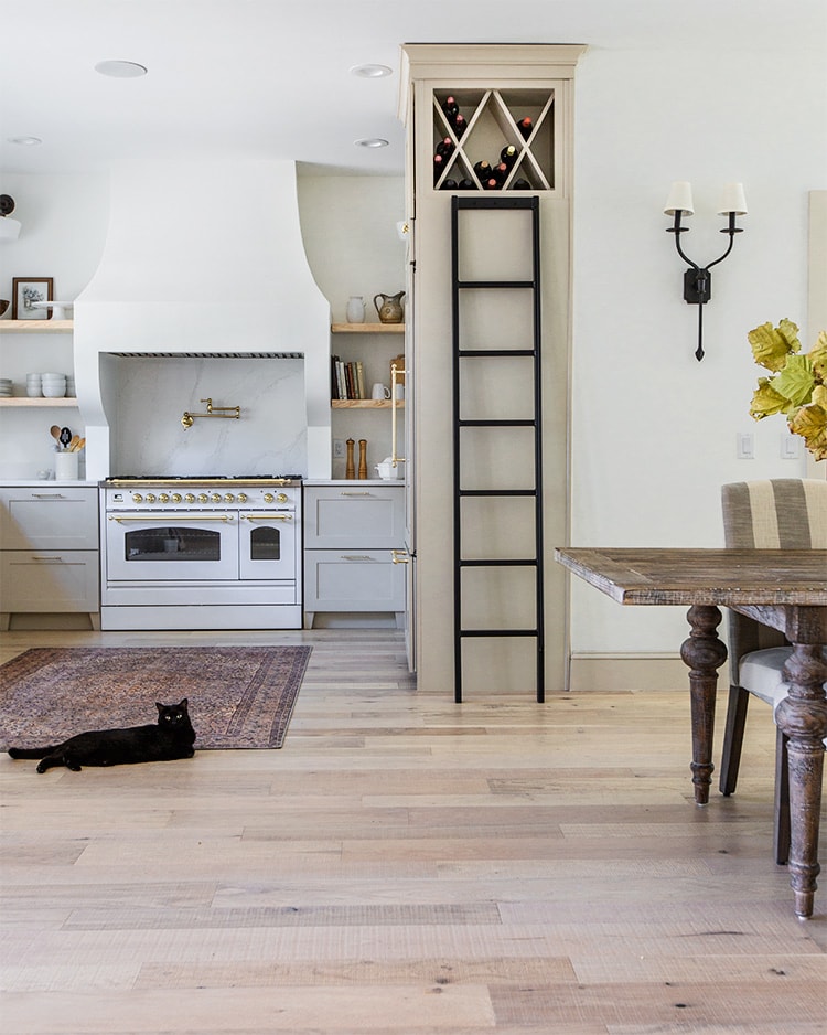
I’m wondering about the black and white kitty too! 🙂
Jenna Sue says
Thank you, Darcy! I’m glad you’re a fan of Option 2 as well. #3 is one of my favorite sconces, it’s so elegant! We could do the light trick but there’s a lot more flexibility with wiring, much better bulbs and brighter light, plus we want them on dimmers. It’s worth the extra effort! And the kitty is my sister’s — we were cat sitting 😉
kiki says
So pretty! Excited to see how it will come together. As a mom of a 6yo who has learned from experience, let me just highly recommend a sofa that’s super easy to clean and forgiving – especially in a playroom. Even if you don’t allow snacks in there, it will get trashed. And, what’s family movie night without a couple of snacks. LOL. Personally, I prefer leather with kids, then we can just call it a “patina” 😉
Jenna Sue says
That’s a good point! I never considered leather but a nice brown leather might actually look really nice against the mural and dark walls… hmmmm… thanks for bringing this up! Now my decision is harder ;P
Caroline says
I like option 5 for the sconces and option 2 for the paint.
I can’t wait to see this room come together! It is serving as inspiration for the facelift I am about to start in my family room.
Jenna Sue says
Thank you Caroline! Seems like most folks agree with option 2 so that’s great news!
Gail says
Use Nesting with Grace’s magic light trick for the light above map.
Jenna Sue says
I’ve used that before but a puck light wouldn’t fit inside a picture light! Plus it needs a shade to be hidden 😉 Otherwise it would be a good idea!
Danna F says
Loving your design for this room. I am a huge green fan and especially olive greens. The shade green would be my pick because I like the name and its more of a muted green (on my computer anyway). Those sconces are beautiful! So hard to choose. You can’t go wrong but if I had to choose it would be #3, #1, #6 (in brass). They seem playful and not too serious.
Your master bath is one of my favorites. Love love love it!
Cannot wait to follow along on your IKEA and Semmihandmade cabinet transformation and build. Have a great Wednesday.
Jenna Sue says
Thank you so much for the input, Danna! On the computer I love Shade-Grown too, but it honestly looks brown in person (in this room, I’m sure it’s different in other spaces!) Paint colors can be so tricky.
Kasadie says
I love the last sconce! That one is my favorite by far!
Jenna Sue says
Thanks Kasadie! That’s a really unique one, I love the design. Too had to choose!
HELEN TABOR says
Hi room looks like it is going to be gorgeous. I love the clean simplistic lines of sconce number 2.
HX
Jenna Sue says
Thank you Helen! #2 is very classic and simple, actually very similar to our bathroom sconces!
Izabela says
I like option 2 with dark TV wall. Since the room is so dark, maybe Treron by Farrow & Ball could work?
Jenna Sue says
Ooh that color is gorgeous! I might be able to find a similar shade in Sherwin Williams. I want to stick with that brand since they’re close by and easily accessible 😉
west.roxbury says
Option 3 for the paint arrangement. The dark TV wall is moody and striking and the light green cabinets are fun for a playroom. Wouldn’t beige be too serious for children? And also given the fact that there’s only one window, then light green would be more visible than dark and not so backlit. Overall, I love the whole concept. Anything forest related is absolutely beautiful and it suits the feel of the Heights House perfectly 😀
Jenna Sue says
Thanks for your input! I think the light green is absolutely gorgeous, but I worry it’s too much green with the green wall and primarily green mural. I refuse to repaint these cabinets one day so this decision is forever! Haha. Either way, I think it will be beautiful 🙂
Karen says
Option 2!
Karen says
And 3 for sconces.
Chelsea says
I absolutely looove this design! I think you’re leaning toward the right option with #2 for the paint colors. Since the cabinet wall can’t go flush at the top with anything, I think a dark, horizontal line of cabinets would be a pretty harsh contrast against the ceiling/roof angles. At least accessible beige ties into the molding and trim, but I think it balances out the mural so nicely as opposed to two shades of green (even though the lighter green is also beautiful).
I just love how your aesthetic has changed over the years (follower from the Modern Farmhouse days :D) and I absolutely love how this house has come along. There’s just not enough space in a comment thread to share how your designs have inspired me in the same phases of my life (love, marriage, motherhood, etc.). I’m so excited to see how it turns out. <3
Jenna Sue says
Thanks for the insight, Chelsea! As much as I love a bold dark cabinet, I don’t want to regret this decision one day, and I agree that Accessible Beige is the safe choice. Great point about the ceiling contrast as well. Definitely leaning this way now, and it seems that most of you agree! And you totally made my day with that last note… I love that you’ve taken this journey with me and that I’ve helped in some way! That means the world <3
Kat says
# 1 or 4 for the walls. I feel the anchor of the dark color should be on the wall with the window. It will keep the room from being too cave-like!
For the sconces I say 2,3 or 5!!
This room is gonna be gorgeous!
Jenna Sue says
Thanks Kat! I can’t wait to share our progress!
Joanne says
I have the most bizarre comment. Who is the black and white cat in the “current” pic? I know Susie is all black…..
Jenna Sue says
Haha, we were cat sitting for my sister when I took that photo 😉
Alison says
I was wondering the same thing ?
Linda Grubbs says
me too!!
Janice says
I like option 1. But I trust your vision!..
Are the sconces for TV wall. ..all of them are super cute!.. Hard to pick a favorite!