
After testing hundreds of paint colors over the years, I’ve learned that choosing the right one is less about luck and more about following the right process. Paint is incredibly dependent on its surroundings, and a color that looks perfect in one home can look completely different in another.
These are the tips, rules and steps I rely on for every project.

Jump to:
Paint Color Basics
Before you start comparing paint swatches, it helps to understand a few characteristics that determine how a color will actually look in your home.
LRV (Light Reflectance Value)
LRV measures how light or dark a paint color appears on a scale of 0 (black) to 100 (white).
- Lower LRV = darker color. Higher LRV = lighter color.
- Photos can be deceiving. Always reference LRV when comparing colors.
- The same paint color can look dramatically lighter or darker depending on the amount of natural light in the room.
- In low-light or north-facing rooms, go warmer and lighter than you think you need. Colors read darker and cooler in limited natural light.
- In bright south or west-facing rooms, colors can handle lower LRV without feeling cave-like.
Undertones
Ignoring undertones is one of the most common paint mistakes.
The mass tone is the main color you see, while the undertone is the subtle secondary color that becomes more noticeable when the paint is compared with other colors around it.
- Whites and neutrals can have yellow, pink/red, green, blue or violet undertones, even when they look relatively neutral on a paint chip.
- Grays, greens, beiges and other colors can lean warmer or cooler depending on their undertones.
- Undertones become much easier to recognize when similar paint colors are placed next to each other.
- Always compare paint against your flooring, tile, countertops, cabinetry, trim and other fixed elements.
- I personally gravitate toward warmer undertones and typically avoid anything that pulls cool gray or purple.
- Greiges are especially tricky because they can shift noticeably depending on the lighting and surrounding finishes.
This is one of the biggest reasons you should never choose a paint color based on an online photo or tiny paint chip alone.
Saturation
Saturation refers to how strong, vivid or muted a color appears.
- Two colors can have a similar LRV but feel completely different if one is more saturated than the other.
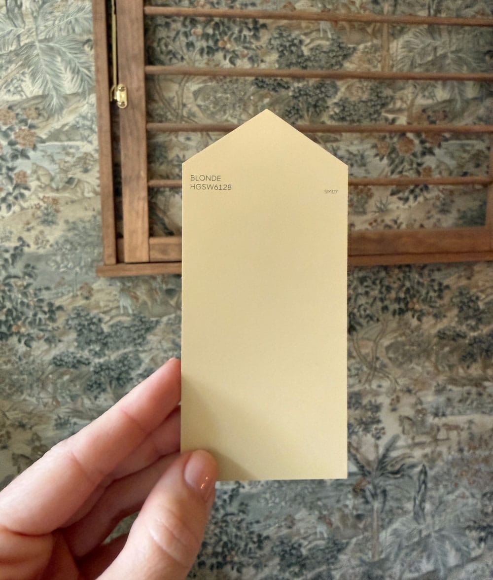
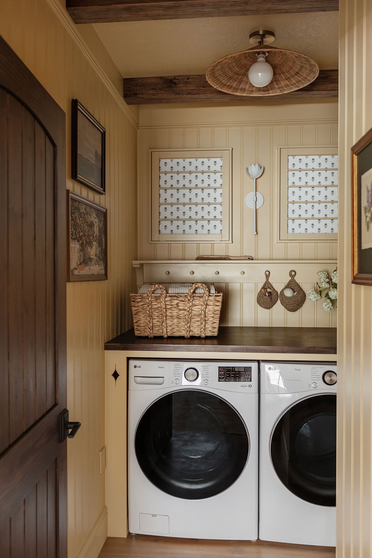
- Colors tend to appear more saturated once they’re covering four walls instead of a small paint swatch. If a color is reading a little too bright or intense, compare it with a slightly muddier or more muted version of the same hue.
In our recent laundry room renovation, I wanted to find the perfect soft, buttery yellow. The winning swatch looked much more neutral (nearly beige) but I knew it would appear more saturated on the walls:
Lo and behold, here’s how the paint color turned out. It was perfect 💛
Natural Light Direction
The direction your windows face has a major impact on how paint reads throughout the day.
- North-facing rooms: Tend to receive cooler, softer light, which can make colors appear cooler and darker.
- South-facing rooms: Typically receive the most consistent warm light and can often handle deeper or cooler colors.
- East-facing rooms: Have warmer morning light and become cooler later in the day.
- West-facing rooms: Tend to be cooler in the morning and much warmer/golden in the afternoon.
These are useful guidelines, but every house is different. Trees, overhangs, window size, surrounding buildings and even the season can affect the quality of light. Ultimately, nothing replaces testing the color in the actual room.
Artificial Lighting
Your light bulbs affect paint color too.
- Warm bulbs (2700k) will make a room feel warmer, while cooler bulbs (above 3000k) can make colors appear cooler and more sterile.
- I only use warm bulbs throughout our homes and try to stick with the same color temperature across connected spaces so the lighting feels consistent.
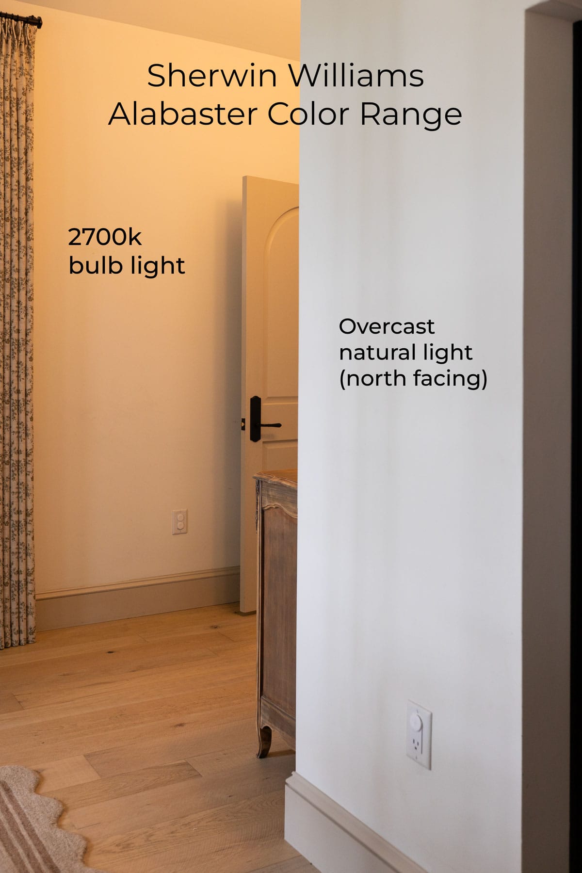
White walls tend to have the most dramatic color range. Notice the contrast of the wall color from the warm bulb light, compared to the cooler natural light coming from the window on an overcast day. The range varies even more depending on the time of day, the room and its surroundings.
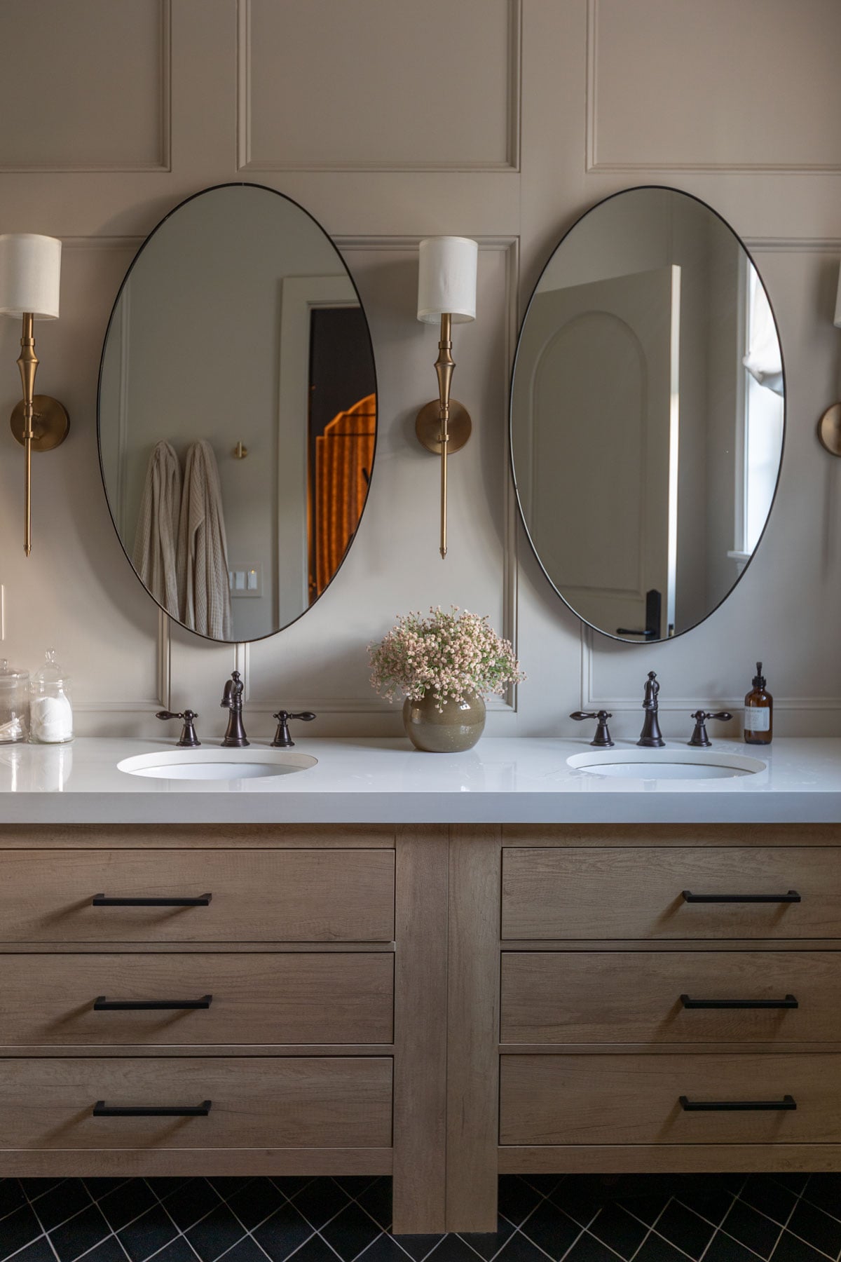
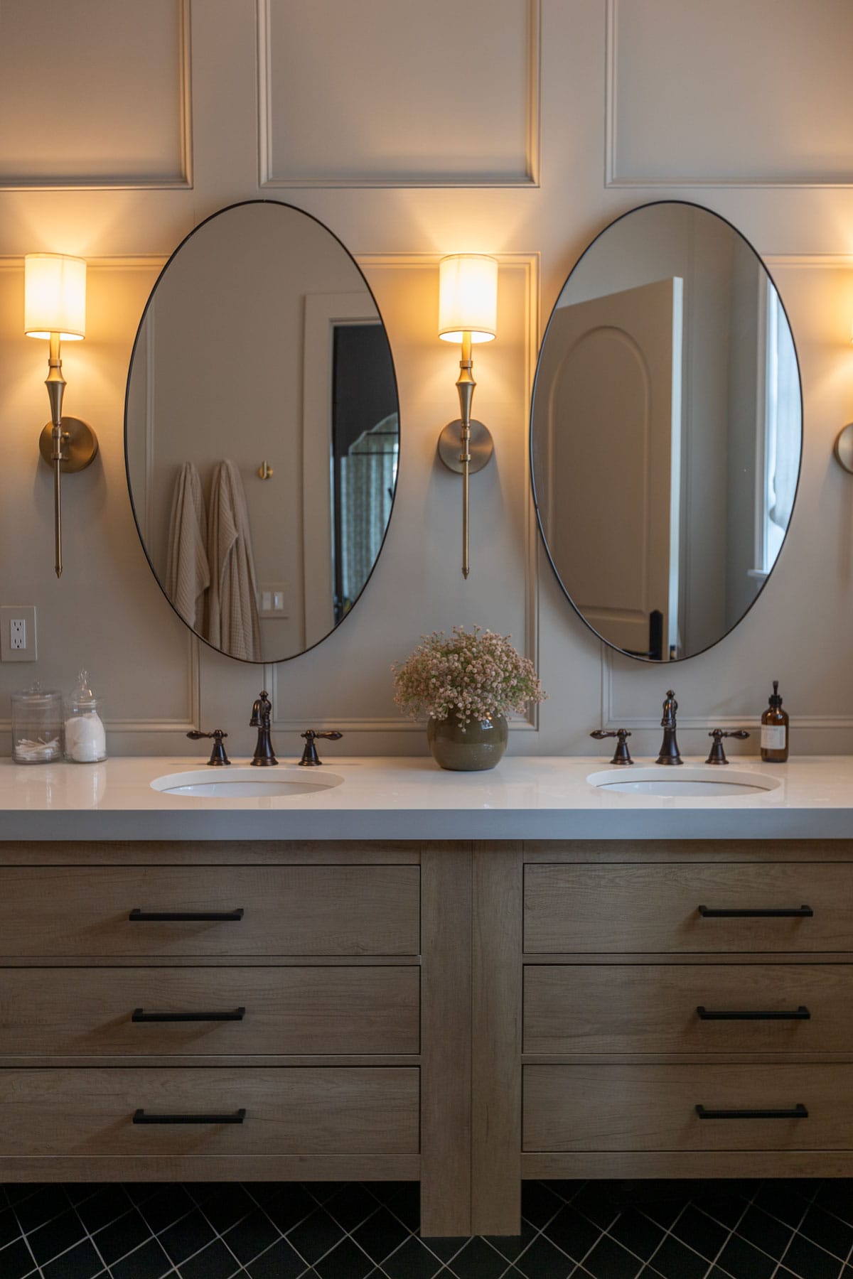
Here’s another example of our bathroom under three different lighting conditions. You can see how much the color (SW Accessible Beige) varies throughout the day. Below it reads almost gray with overcast light:
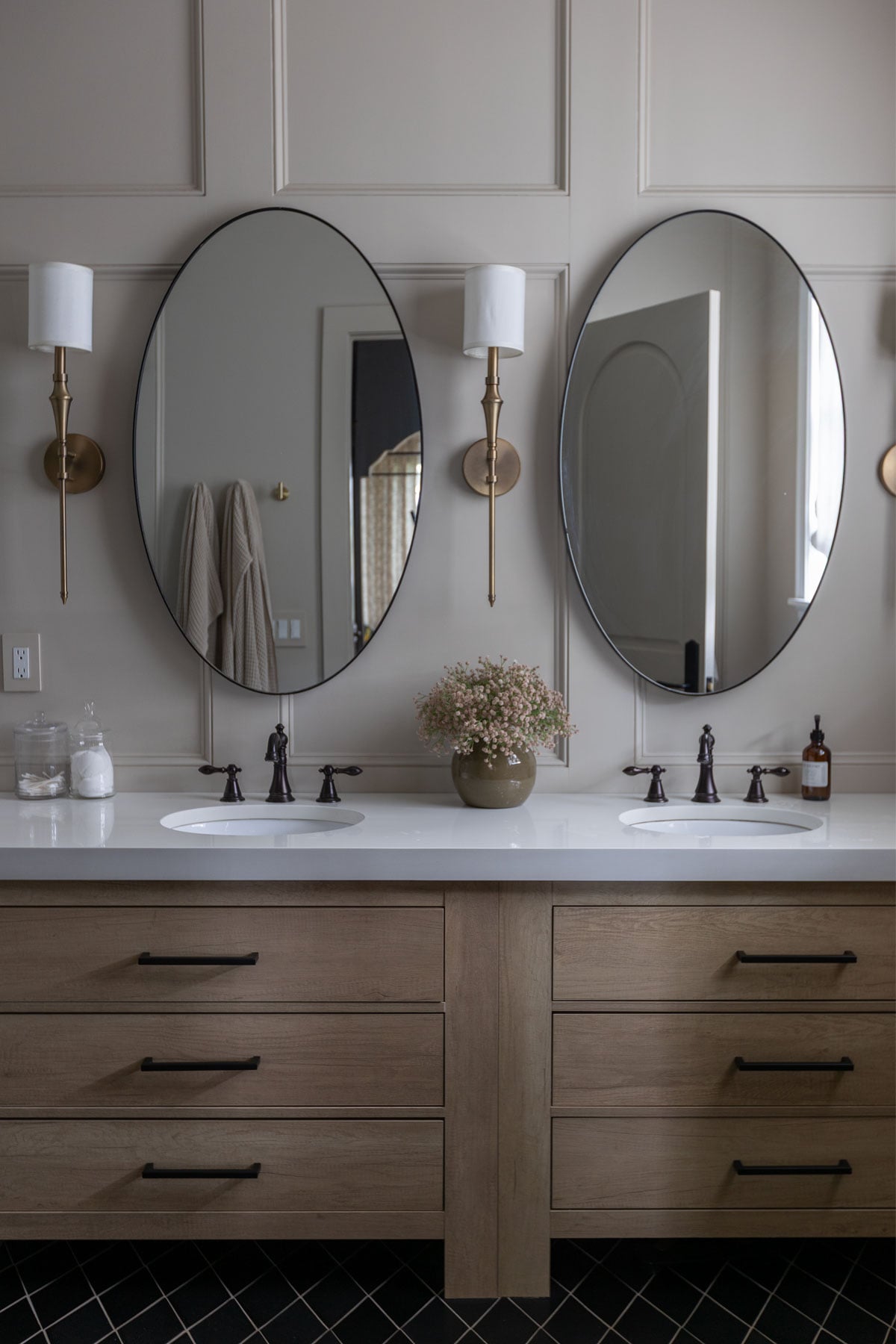
Looking more beige at golden hour:
And even warmer with 2700k bulbs:
Designer Tip: Choose Paint Last
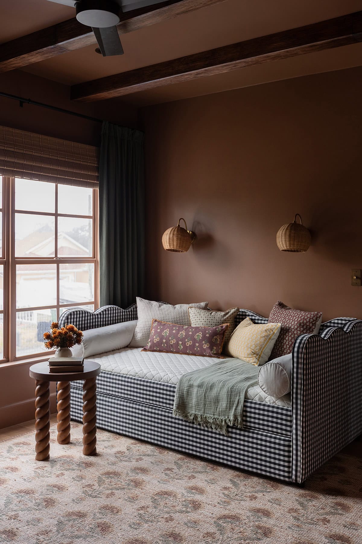
Paint should usually be one of the last major design selections, not the first. Choose your flooring, tile, countertops, cabinetry, rugs, fabrics and major furnishings first whenever possible. Those items have far fewer options and are much more expensive or difficult to change.
On the other hand, there are thousands of paint colors. It’s much easier to find a paint color that works with your rug than to find the perfect rug that works with a paint color you’ve already committed to.
This doesn’t mean you physically have to paint the room last, it simply means your paint color decision should be informed by the other finishes and furnishings you’ve selected. The exception to this rule is a neutral white, as it will typically work with any space.
Creating a Cohesive Whole-House Color Palette
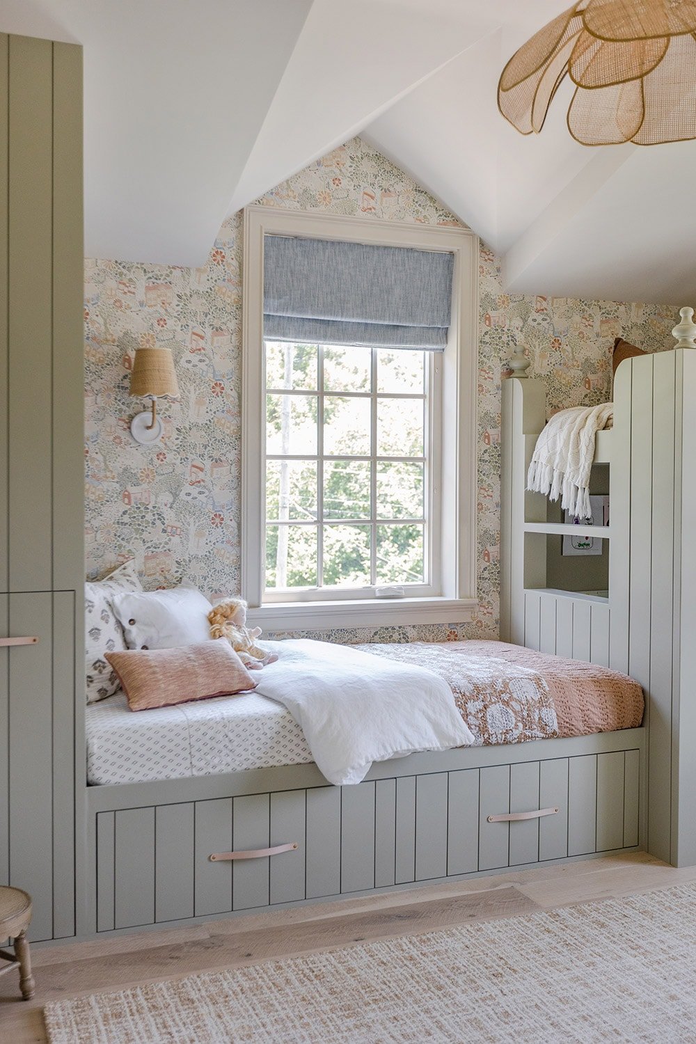
You don’t need to use the same wall color in every room for your home to feel cohesive (in fact, you shouldn’t!) The goal is for your colors to feel related rather than identical.
A few guidelines I follow:
- Start with the fixed elements. Flooring, stone, countertops, tile and other permanent finishes should help guide your palette.
- Pay attention to sightlines. If you can see several rooms at once, make sure those colors work together.
- Repeat colors strategically. Using the same wall, trim or cabinetry color in more than one space creates continuity.
- Keep undertones compatible. Colors don’t have to match, but they shouldn’t visibly fight with one another.
- Use trim as a connecting element. Repeating the same trim color throughout much of the house is one of the easiest ways to create consistency.
- Don’t be afraid of contrast. A dark room next to a light room can be beautiful as long as the colors relate to the overall palette.
I don’t think there is a magic number of paint colors every house should have. Let the architecture, lighting and mood of each room guide the decision while keeping the bigger picture in mind.
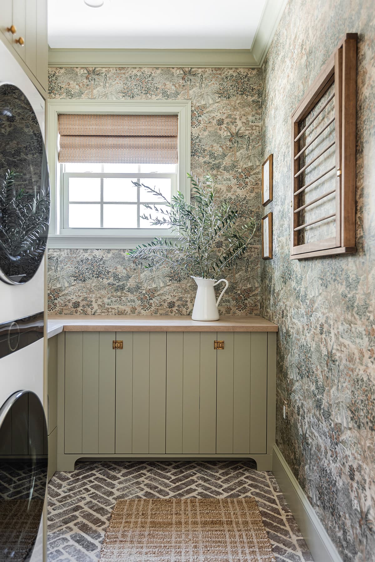
My 7-step Paint Color Selection Process
1. Start by researching colors online
Once I know the general color family I’m looking for, I’ll search paint color names online to see real-life examples. Photos of a paint color used in actual homes are much more helpful to me than computerized room visualizers. I look at as many examples as possible to get a sense of the color’s range and identify shades I want to sample.
Just remember that this is only the starting point. Camera settings, editing, lighting and your screen can all dramatically change how a color appears.
2. Compare similar colors side by side
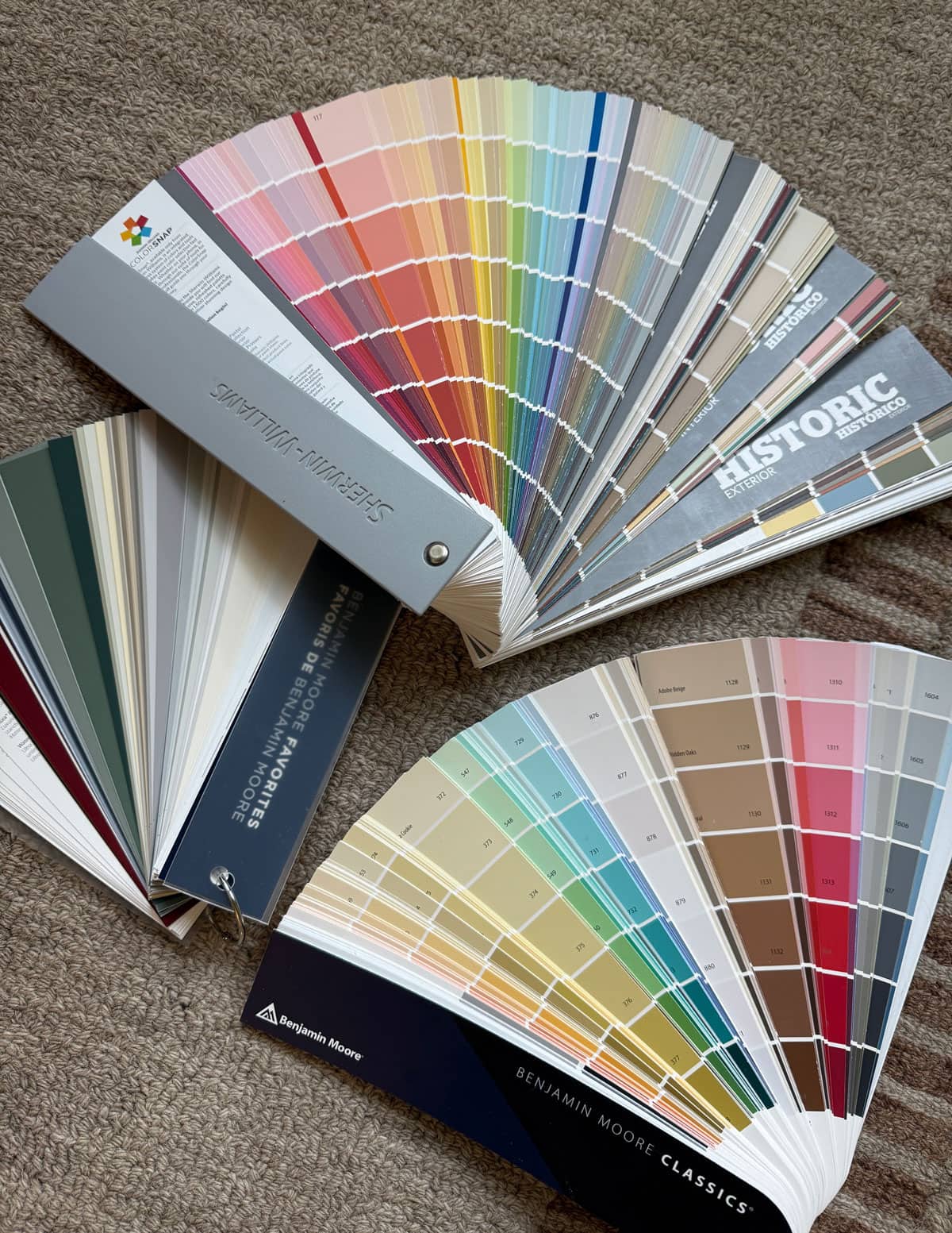
This is where undertones become much easier to spot. I use Sherwin Williams and Benjamin Moore fan decks to compare neighboring colors. You can buy fan decks online or at many paint stores, or grab free paint chips in-store.
Once you find a color you like, look at the shades immediately around it. Is there a version that’s slightly warmer? Less saturated? A little lighter? More muted? Always identify several near-matches to sample—you’ll regret not having them on hand once you start comparing colors in the room.
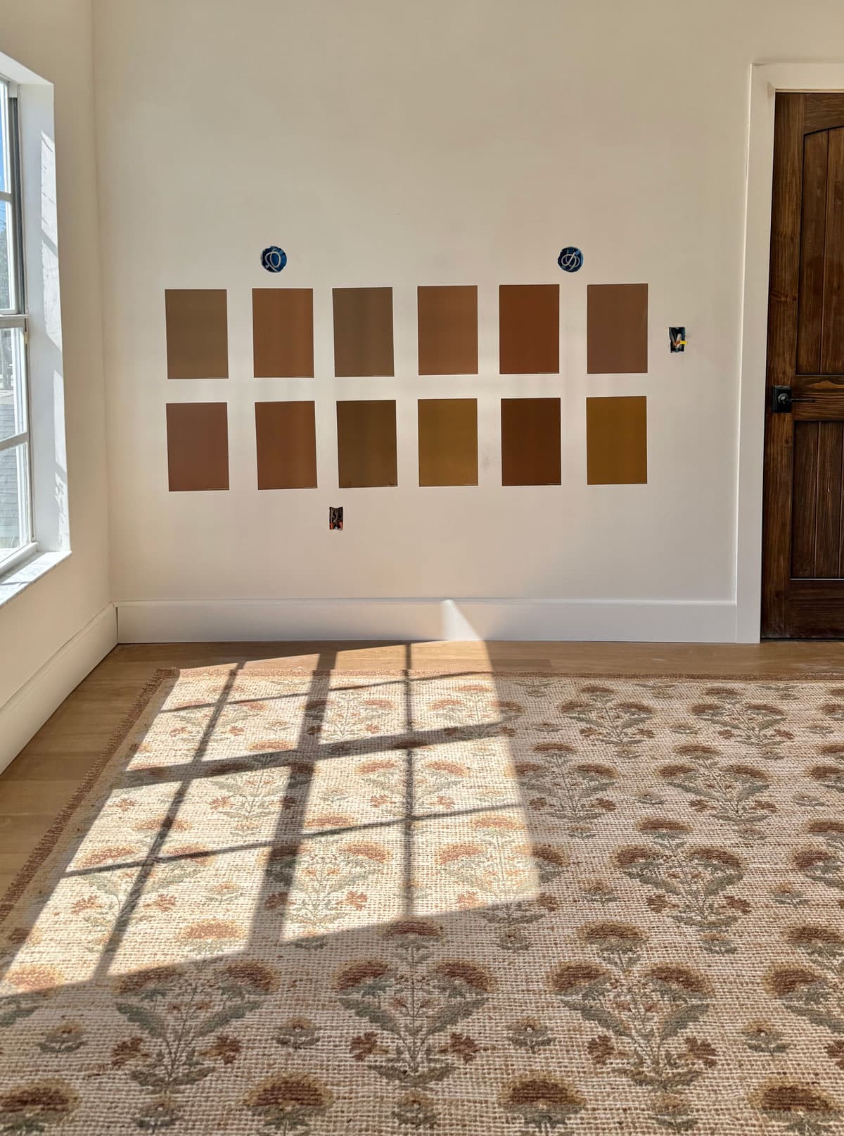
3. Order peel and stick paint samples
The most important step. I use Samplize peel and stick samples (use code JENNA15 for 15% off orders $30+) and usually order at least 8–10 options for a single paint decision (I’ve ordered more than 20 sometimes!)
That may sound excessive, but paint is one of the least expensive decisions you’ll make during a renovation. Spending a little more on samples is worth it if it prevents you from repainting an entire room. Larger samples also make it much easier to see undertones and get a realistic sense of how strong the color will feel.
4. Test your samples in the actual space
Move the samples around the room and look at them on different walls. Check them:
- In the morning
- In the afternoon
- At sunset
- On cloudy days, if possible
- With the lights on
- With the lights off
A sample next to a sunny window may look completely different from that same sample on the opposite wall. I also like to give myself at least a day or two with the finalists rather than forcing a decision immediately.
Pro tip: When there’s no clear winner, take photos of the samples in different lighting and from different angles. Photos can sometimes help you spot subtle differences in colors that your eyes may not pick up on.

5. Compare the finalists with your fixed elements and decor
This is often the real deciding factor. Hold or place your samples next to flooring, tile, countertops, cabinetry, rugs, furniture, etc. You may love a paint color on its own and immediately realize its undertone is wrong once it’s beside your flooring. The paint doesn’t need to be the star of the show, it needs to work with the entire room.
6. Narrow it down and live with the finalists
Once I’ve eliminated the obvious no’s, I’ll leave my top two or three samples up for another day or two. Pay attention to how you feel about them at the times of day when you actually use the room most.
You may love one color at a certain angle or time of day, and not love it at other times. You’re looking for the option that works best overall in your home’s real-life conditions.
For an especially important or large paint project, you can also test a small area using the actual paint before committing to several gallons. The final product, surface texture and sheen can subtly affect how a color appears.
7. Confirm your paint sheen
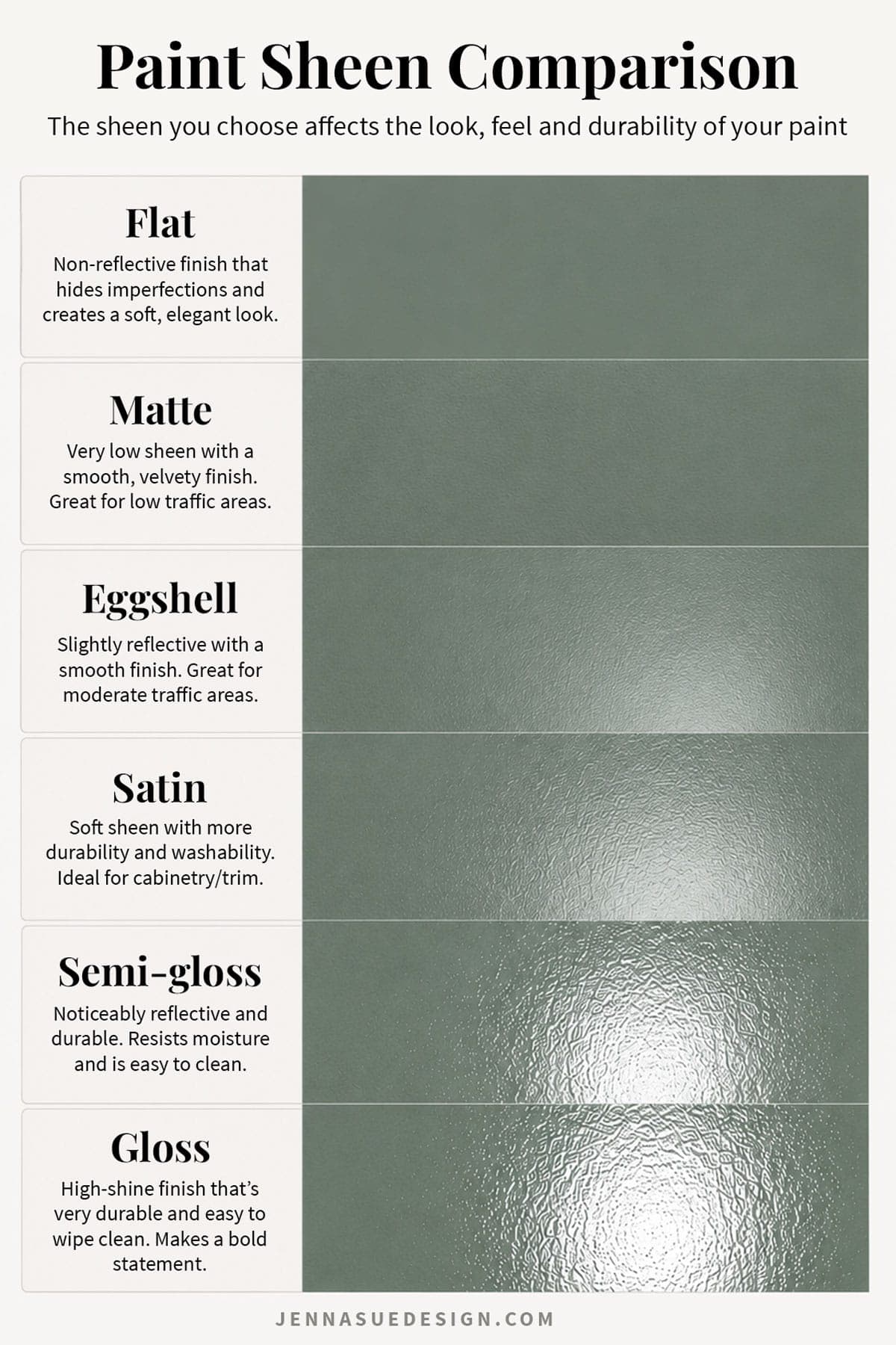
Sheen affects how paint reflects light and can subtly change how a color looks and feels in a room. Once you’ve selected your color, confirm the finish that makes sense for the surface and how the room will be used. Read through my Paint Sheen Guide to determine the best option for your space.
Paint Sheens: What I Use
- Drywall: Flat or matte in most rooms. Eggshell in higher-traffic spaces when added durability is important.
- Walls with millwork: Satin.
- Cabinets: Satin or semi-gloss for durability (Benjamin Moore Advance and Sherwin Williams Urethane Enamel are two formulas I’ve used for cabinetry)
- Doors and trim: Satin or semi-gloss.
- Ceilings: Flat or matte.
Higher sheens reflect more light and tend to highlight surface imperfections, while flatter finishes absorb more light and create a softer look. The same paint color can look noticeably different depending on the sheen.
You can learn more about the different finishes in my Paint Sheen Guide.
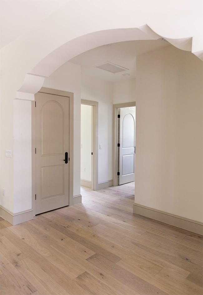
Choosing Trim and Ceiling Colors
Your trim and ceiling are part of the color palette too. If you’re using white trim, don’t automatically default to the brightest or most popular white—compare it with your wall color first.
For white trim:
Look for a white with undertones that complement the walls. A very cool, stark white can make a warm neutral suddenly look yellow or dingy, while an overly creamy trim can look off beside a cooler wall color. If your existing trim works throughout the house, keeping it consistent is an easy way to connect different rooms.
For white walls:
One of the simplest options is to use the same white on the walls, trim and ceiling and change only the sheen. This eliminates the challenge of trying to coordinate several almost-identical whites while the different finishes provide subtle contrast.
For color-drenched rooms:
Walls, trim, doors and even the ceiling can all be painted the same color. You can either use different sheens to emphasize the architectural details or keep the finishes similar for a more enveloping effect. There’s no rule that says ceilings or trim have to be white.
Does paint brand really matter?
I typically stick with Sherwin Williams and Benjamin Moore, mostly because both offer huge color libraries and are easy for me to access locally. I’ve used both extensively and find their quality and options very comparable. I’ve also had great results with Valspar and other reputable brands over the years.
Because I choose paint colors so often, I’ve invested in several fan decks from both Sherwin Williams and Benjamin Moore. They make it easy to browse, reference, and compare colors at home. If you don’t have fan decks, you can grab free paint chips at most stores, though they may not carry every color.
In my experience, the specific paint formula matters more than the brand name alone. Higher-quality formulas typically offer better coverage, application, washability and durability. I would avoid the cheapest line available, especially for cabinetry, trim or high-traffic areas.
What about color matching between brands?
Most paint stores can create a close match to another brand’s color, and I’ve had plenty of colors successfully matched over the years. That said, if you are particular about getting an exact color, I’d use the original manufacturer’s formula whenever possible. Different paint bases and tinting systems can produce slight variations which may yield visibly different results.
For simplicity’s sake, I almost always select a color directly from the manufacturer’s collection.
Common Paint Color Mistakes
Choosing paint before everything else. It’s much easier to match paint to flooring, tile and furnishings than the other way around. Whenever possible, choose those harder-to-change pieces first.
Choosing from a photo alone. Online photos are great for inspiration and narrowing your options, but they can’t tell you exactly how a color will look in your home.
Testing too few colors. If you’re considering one beige, sample several similar beiges. Side-by-side comparison is one of the easiest ways to identify unwanted undertones.
Looking at a sample in only one spot. A color can change substantially from wall to wall. Move your samples around the room.
Ignoring artificial lighting. You may love a color during the day and dislike it once your lamps turn on at night. Test both.
Choosing a white without checking the undertone. Whites are chameleons and shift throughout the day. Always compare them with your other whites, fixed finishes and furnishings.
Assuming dark colors don’t work in small or dark rooms. Sometimes trying to force a dark room to feel bright with a light paint color simply leaves it feeling flat. A deeper color can create intentional contrast and make a low-light room feel cozy and dramatic.
Remember: there is no single “right” color
There is no universally perfect paint color—only the right color for your home, your lighting, and your finishes. Every paint color changes throughout the day. Morning light, evening light, cloudy skies, and artificial lighting all reveal different sides of the same color.
The goal is to find a color that you love in the conditions that matter most, not one that’s flawless in all of them. And if you’re still torn between two colors after you’ve sampled them properly? There’s a good chance either one would work. At a certain point, just trust your eye and move forward 🙂






KJ says
I need to bookmark this. I will be moving soon to a home that will require, at a minimum, an entire interior paint job. Thanks as always for the helpful information.
Amy says
Would you be willing to offer your paint guide in a downloadable pdf?
Jenna Sue says
That’s a good idea, I’ll put it on my to-do list 🙂