While we patiently await the arrival of our furniture & accessories to complete the Rainforest Room, we’ve been hard at work on our new dining room. Take a look at this week’s vlog episode to watch the progress unfold—and get a Heights House update too!
Before I dive into the Dining Room Design Plan, I have to give you a quick update on our new build. You guys, this progress is INSANE.
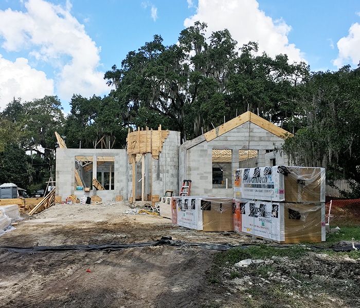
Just 10 days ago the house looked like this…
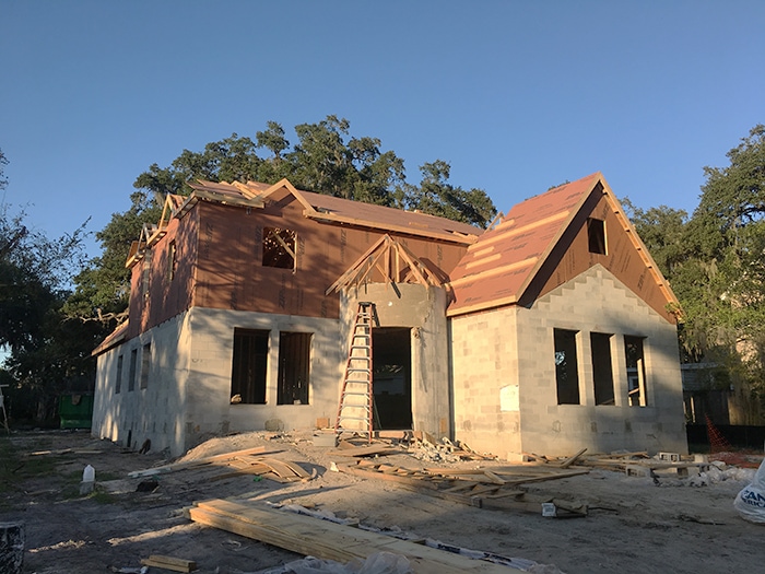
And now it’s basically move-in ready:
I can’t explain the level of excitement this process has been, especially the past week as we’ve started talking details with our builder (custom archways, antique pocket doors, stone facade and custom window details). There’s a lot more to share, and I’ll put it all together in a blog update for you in a couple weeks!
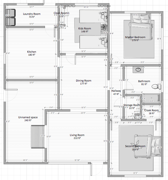
But for now, let’s talk about the topic of the day—our new dining room. This room is situated directly in the center of the house, and our goal is to make it truly feel like the heart of the home—the main gathering space. Here’s the floor plan, for reference:
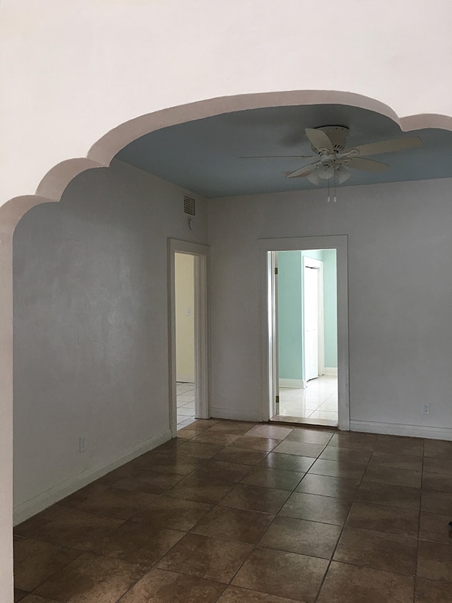
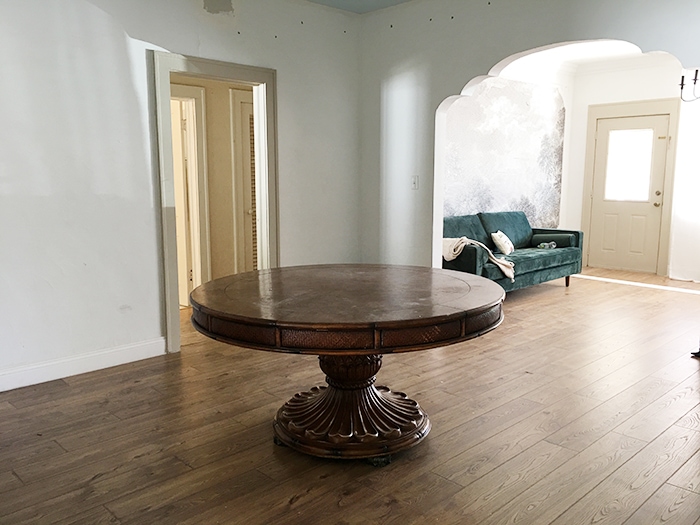
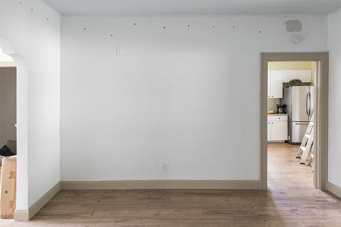
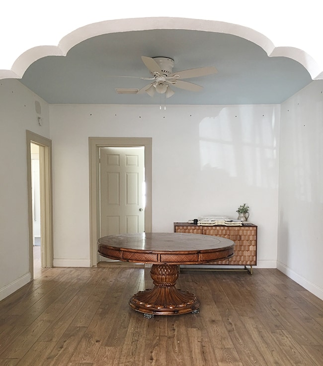
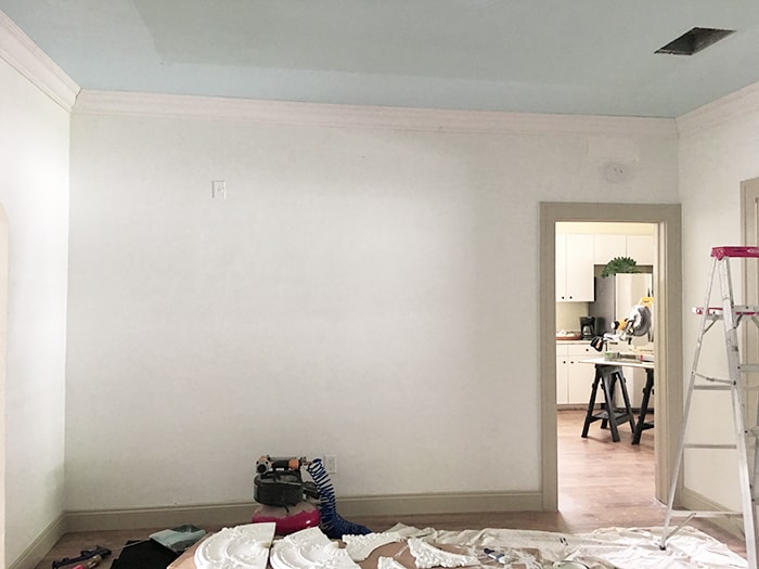
You may remember it looked like this when we moved in a few months ago:
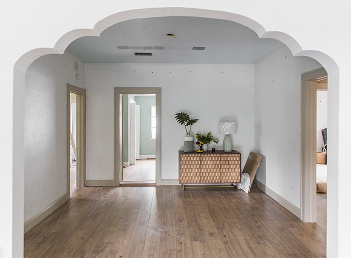
In came the new floors and fresh paint:
Standing at the kitchen doorway, looking back towards the living room:
As you know, we’re renovating this house to use as a vacation rental so we’re making a point to go bold with the design (at least compared to my usual style) and give our guests a fun Florida-esque experience. Each room will have its own style, but all in keeping with the overall tropical/jungle/nature/resort vibe.
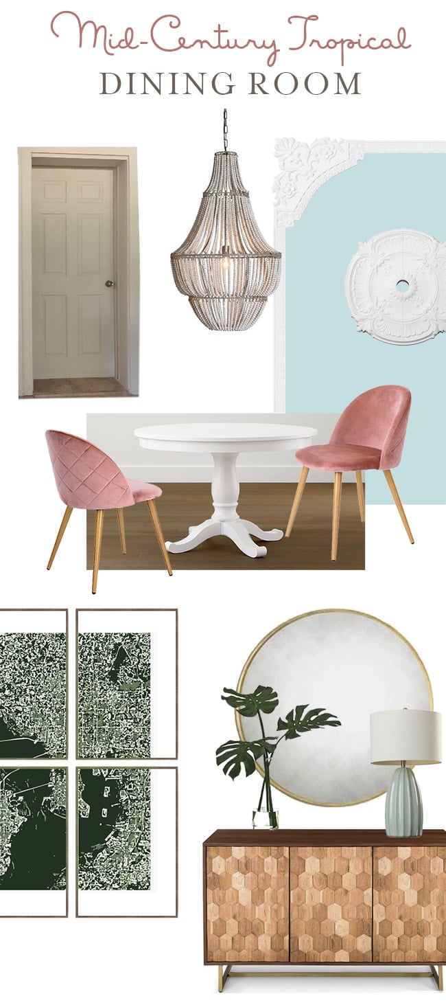
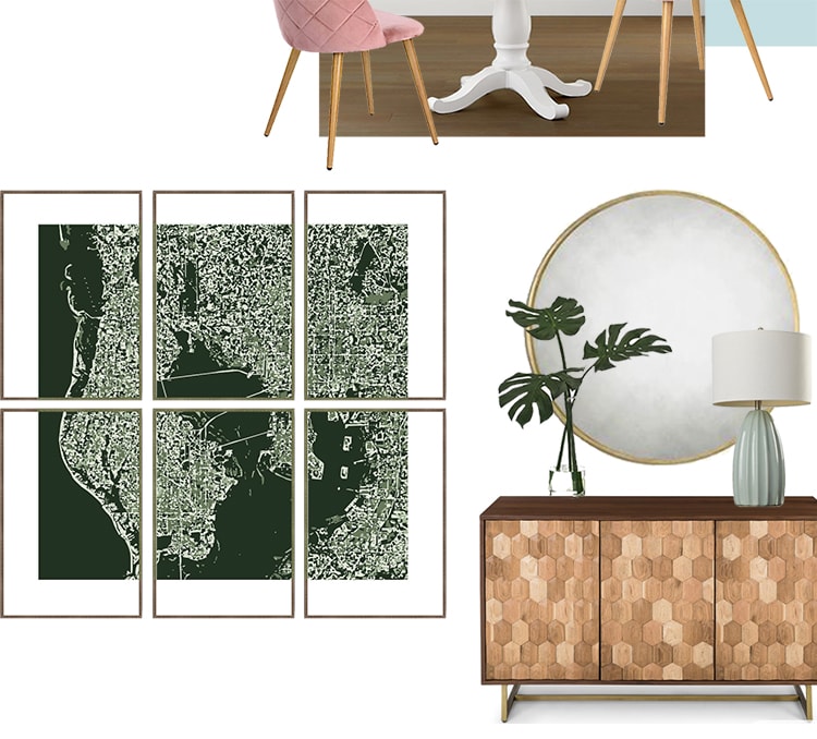
Here’s what I came up with for the dining room:
It took a few iterations to get here, so let me share a bit more about the evolution of this plan.
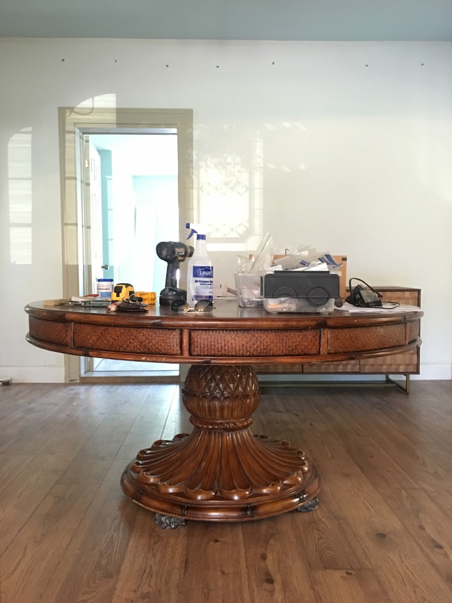
The first requirement was a large round table, which I spent weeks scouring the internet for (Facebook marketplace, Craigslist, OfferUp, Letgo). It’s surprisingly difficult to find a 60″ round table, by the way. Eventually I found this beauty in Orlando and hired someone off Craigslist to transport it 2 hours to me:
Did you know that pineapples are a symbol of southern hospitality? It was meant to be! (this won’t be the last pineapple, fyi).
I’ll be painting the table white this week (sorry wood purists, there’s no way I’d keep all these different wood tones in this room).
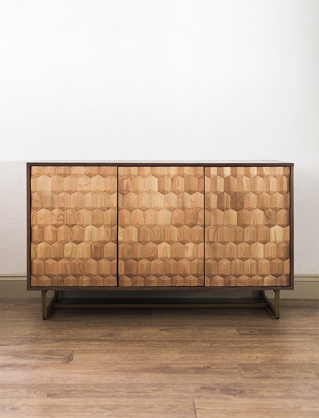
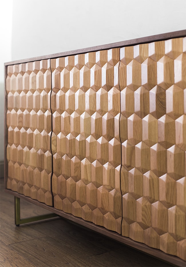
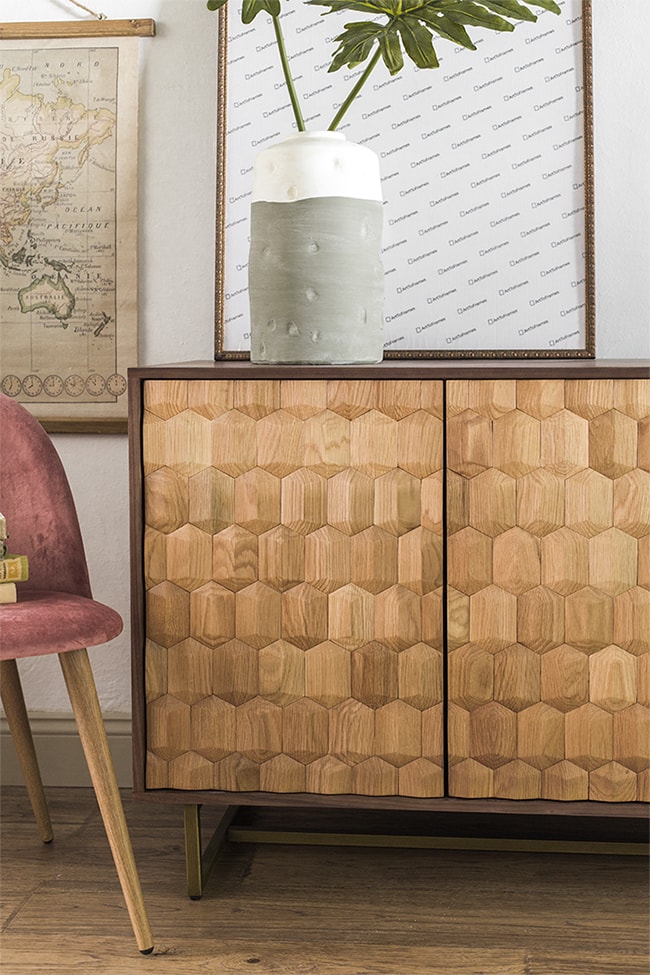
The next piece I found was this Geome sideboard from Article:
I was captivated by that geometric texture and wood tones—seriously how gorgeous is the craftsmanship here?
It brings such a nice earthy element to ground the space and contrast with the lighter tones and pastel colors.
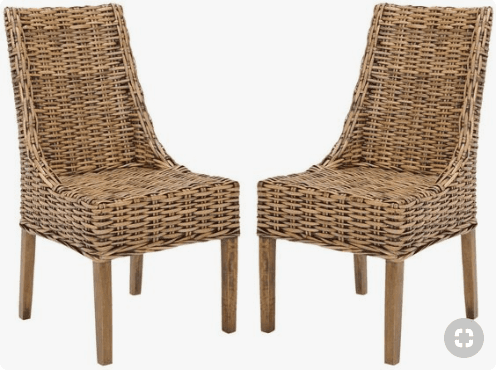
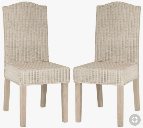
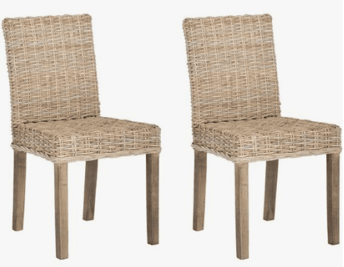
Next came the chairs. Originally I was thinking I’d do a wicker/rattan style for texture, and had it narrowed down to these three options (click for the sources):
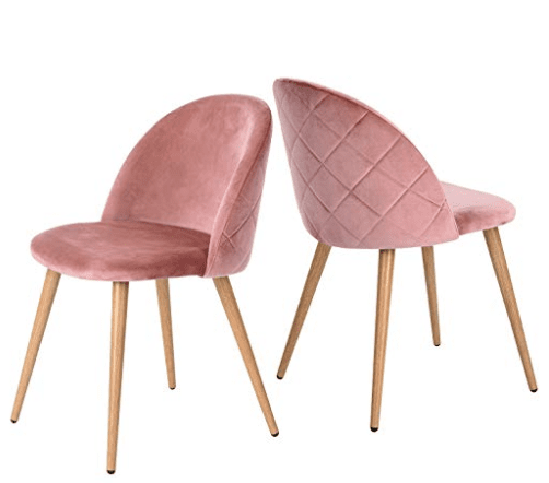
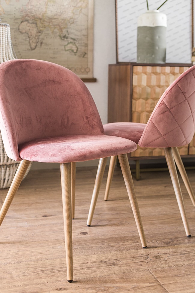
But then, right as I was I was about to make my final decision, these pink velvet beauties came out of nowhere…
Pink was not even on my radar, but these were speaking to me and I couldn’t ignore it. So I switched up the design plan to make them work. NO REGRETS.
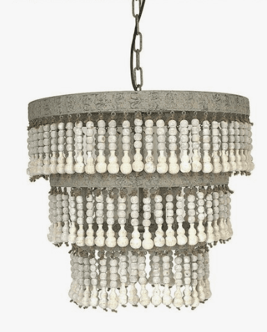
Next up: the ever important chandelier. It needed to be eye-catching, statement making, and give off a tropical yet elegant feel. Wood beads were the solution.
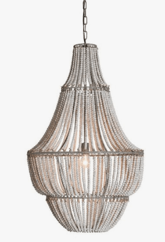
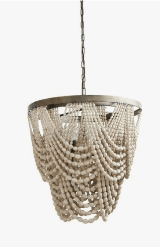
I spotted this one months ago, and thought it was on the small side, but I couldn’t find anything else similar (and it’s a good price!) so I was ready to place my order:
Before pulling the trigger, I did one last internet deep dive looking for possible alternatives, and then I found it…
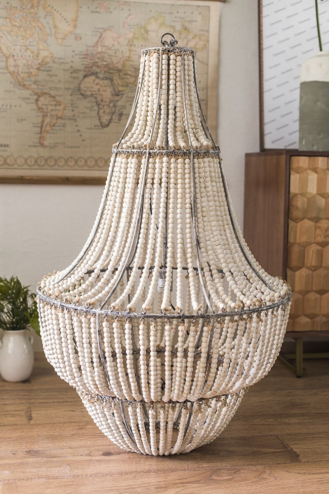
It was larger, more elegant, and certainly more of a statement maker. I worried it may have even been too large, but I’d much rather err on the side of oversized than undersized.
It’s worth mentioning that I found this chandelier after I had already placed my order, and was a little heartbroken because I had been looking for one just like this but couldn’t find it (somehow it never came up in the 80 hours I spent looking through every option on Wayfair):
At least now you have the chance to get it! You’re welcome 🙂
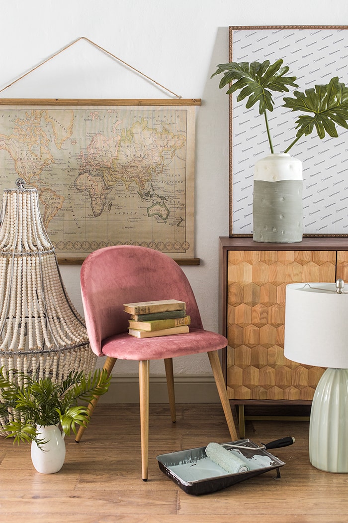
Our goods have been arriving and I’m LOVING how well they’re getting along…
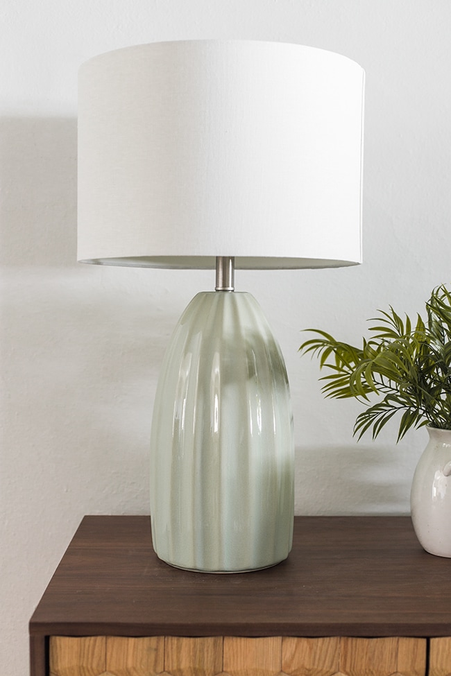
The vintage map is something I picked up earlier this year (it’s such a bargain!) and so is the vase, and I chose this pretty light aqua lamp to sit atop the sideboard:
I love the way the curves play off the hard lines of the sideboard:
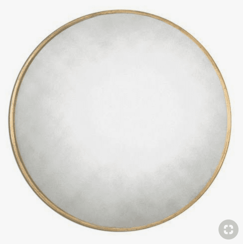
Above the sideboard I found this large round gold mirror:
We needed something simple to let the sideboard shine, and round to contrast with the geometric shapes. This mirror fit the bill, and bonus points for the unique aged/patina finish. I haven’t unboxed it yet but I’m looking forward to getting it on the wall!
And finally… what to do with this giant 10′ blank wall?
There wasn’t room for furniture (or a need for it) and we already had a big mirror on one wall, so large scale art was the answer!
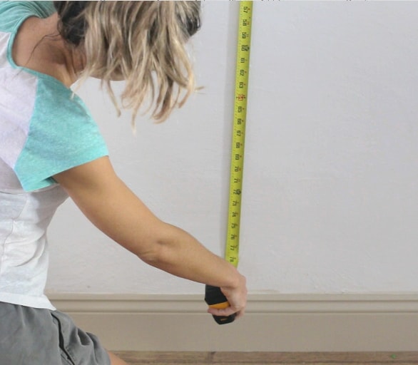
Most people make the mistake of displaying undersized art, so I always recommend going larger when in doubt. I measured the wall and decided that a total size of somewhere around 6′ x 6′ would be sufficient.
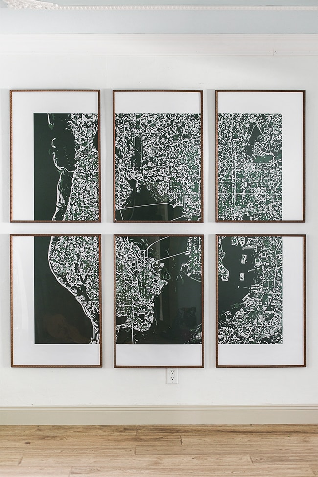
One tip to save on expensive framing is to have your artwork enlarged and split up into multiple standard sized frames (or just hang several pieces of art in a grid). There are a handful of standard sized frames that will always be cheaper than going with a custom size. With my wall, six 24×36″ frames (a standard poster size) displayed in a grid was my best option to fill the space.
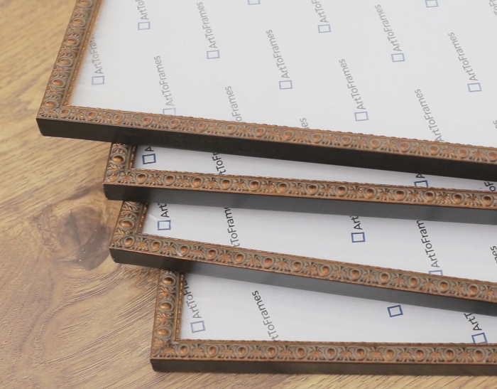
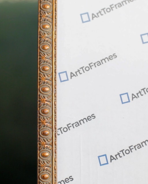
I chose to partner with Art To Frames for this project, because they have the widest range of customization options at the best prices I could find online. They had a lot of styles to choose from in my size, and I settled on these lovelies:
It’s hard to find slim profile frames and these are just what I was looking for, at only .625″ thick. The warm gold ties in with the wood tones in the room, and the egg and dart pattern coordinates with the ceiling trim. Perfect!
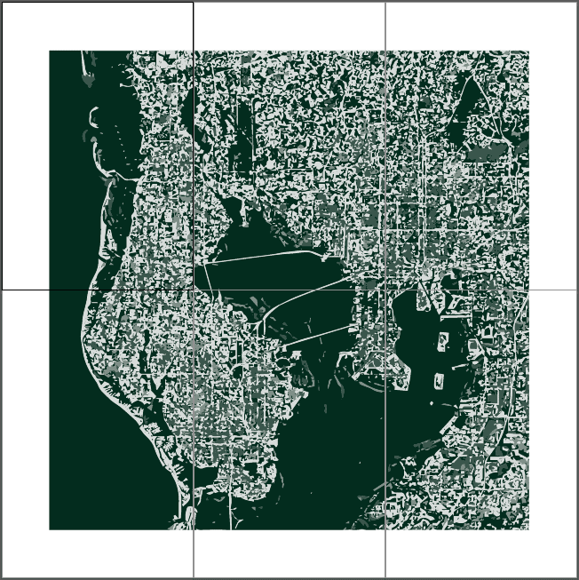
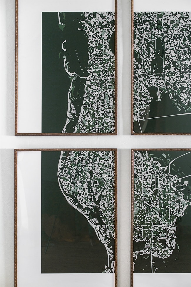
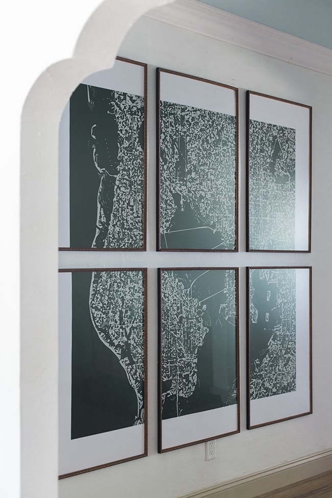
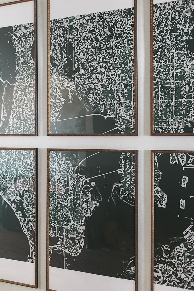
Now for the artwork. I wanted something with a local flavor for this space, especially since this will be a temporary home to out of town guests. It’s important to represent the area within the home, and you can never go wrong with maps as art. So I designed this abstract aerial cityscape of Tampa Bay:
Here’s another trick to save on framing costs—faux mats. I think art looks so much better framed with mats (the white space around the artwork), it’s a more classic and professional look. However, mats can be expensive. If you don’t have the budget for one, consider having your artwork printed with a white border around it instead. It’ll mimic the look of a mat and save you lots of moolah.
Since I was splitting up one larger piece of art, I designed the white border around the edge of the entire design instead of inside the individual frames. It gives it a more interesting look, don’t you think?
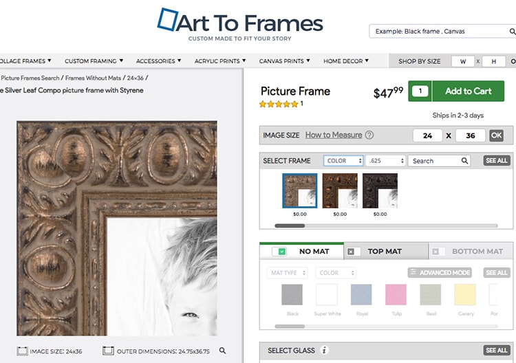
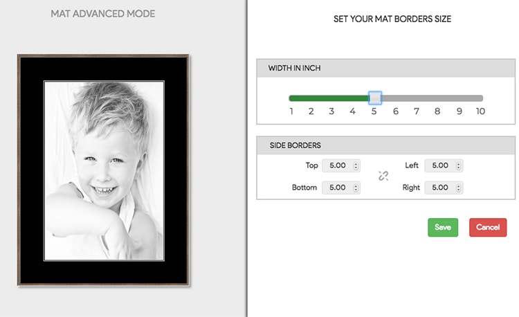
Of course if you have the budget, go for the mat! Art to Frames allows you to completely customize your mat color, size, even add multiple mats. And you can preview it before ordering:
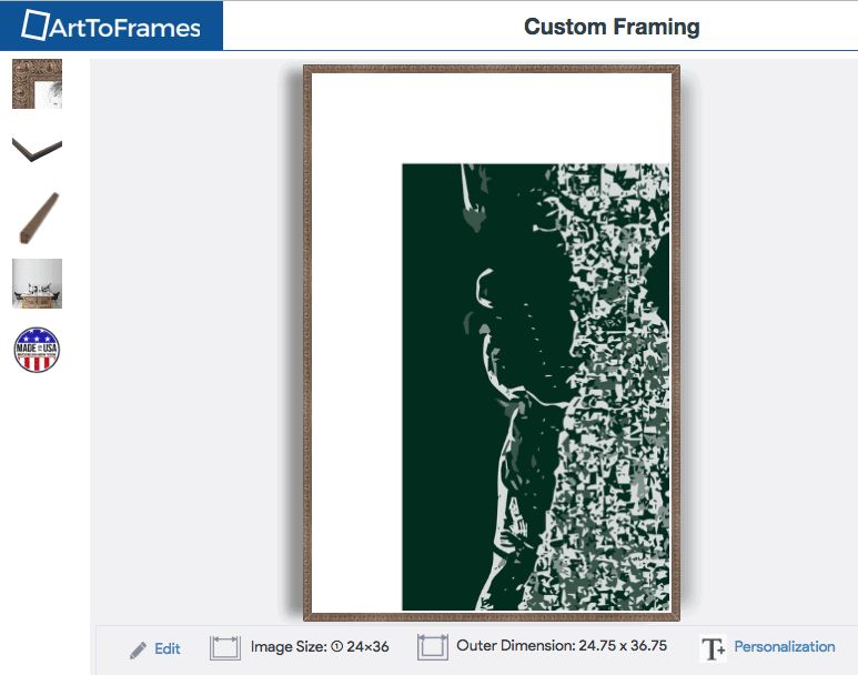
That’s actually one of my favorite parts about the website—you can upload your art, play around with different frame styles & sizes, and see exactly what your finished result will look like before ordering (you can even see it mocked up in a room at scale):
I also pulled my previews into my design plan in Photoshop just to make sure before ordering:
Art to Frames is a full service shop too, so they can print your design and have it delivered to you framed and ready to hang. I used my own printer, but it’s nice to have that option and save a step!
My frames arrived in just 3 days and the they look much more expensive in person!
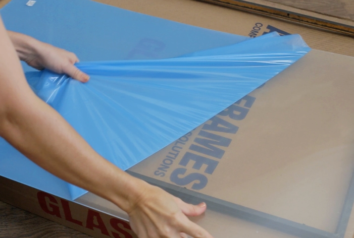
I opted for the non-glare plexiglass since the wall has light hitting it at weird angles, and I wanted to help reduce the reflections. If you aren’t planning on doing photo/video shoots in the space though, that’s not as important 😉
I love love love the way it came together! It’s bold, beautiful, and a nice dark contrast against the white walls and light accessories.
I also love the abstract nature and that you don’t immediately recognize what it is. It’s a great way to represent the area and I think it’ll be a fun addition for our guests 🙂
Friendly reminder: if you’ve never noticed the ‘Shop‘ section of this website, I have hundreds of abstract city maps and I’d love to design something custom for your home too! Just send me a photo of your space and we can come up with the perfect solution.
OK—with all the walls addressed, I couldn’t forget about the 5th and arguably the most important wall in this design… the ceiling!
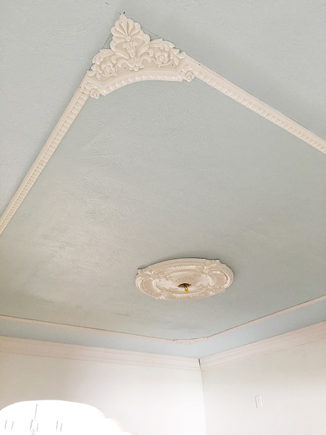
It was painted blue when we moved in, and I decided to keep it blue (to represent the sky) but paint alone wasn’t enough of a wow factor. Enter fancy molding:
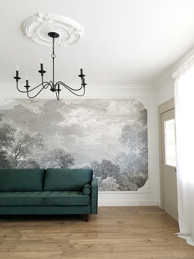
Look familiar? This is the same molding we used in the adjacent living room a couple months back:
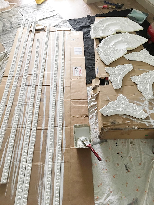
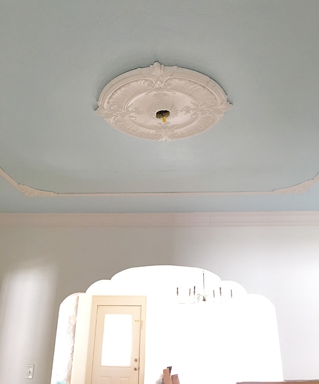
Except this time instead of attaching it to the wall to frame a mural, we decided to replicate the same design on the ceiling around our blue accent color. We chose a slightly different blue (SW Pristine Skies) and installed the same crown molding first:
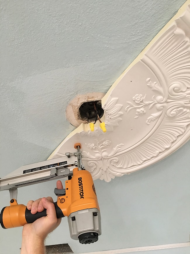
Then we attached our ceiling medallion and molding pieces. It was so much quicker and easier this time around! (get the tutorial here if you missed it).
The blue ceiling portion will only be inside of the molding design, as we plan to paint the outside perimeter white (between the crown and outside of the fancy molding).
It has already made our 9′ ceilings feel so much taller by drawing your attention upwards, and I think it’s the perfect way to balance the large chandelier.
We still have to caulk, spackle & paint, and I can’t wait to show you the end result! There’s a lot of moving parts to this design and a lot of different styles to balance, which has made piecing this puzzle together that much more fun.
Before we get to that, I’ve got a bedroom reveal to share… that’s coming next!



Jen says
Hi there! I just was HOPING as a future blog post maybe you could share some ideas on how to style ROUND dining tables?? I have a 72″ round and I am always at a loss for casual styling of it? I don’t want to dress it with dishes but I’m not sure how or if I should use a runner on it? It’s concrete and i don’t want to cover it all with a round tablecloth but I have shopped and shopped and all I end up doing is some sort of centerpiece, which is hard to layer because of the round shape, and it always feels a little lackluster. Anyway…would love your ideas even if they are taken from other pics around the web. I just can’t seem to find good content for round dining table styling!!
Jenna Sue says
This will be my first round dining table too! I have a round tray I plan to use in the center for now, but I’ll experiment and see what I can come up with 🙂
Steve says
Jenna,
Was the “fancy molding” really expensive, it looks it. Wood or plastic?
Note that band on the ceiling outside of the border/molding. Did you consider painting that the color of your walls? (instead of blue)?
That is supposed to make the room look higher than it is. Ya think that would make any difference? As a general rule I hate pink, but those chairs actually look lighter and airier than the rattan ones did! Do you only have 2 of them? Anyway they look great and somehow don’t mind the color, it is so ‘dusty”. Good work and I look forward to more. You might want to scotchgaurd them, especially for a rental.
Jenna Sue says
Hi Steve, the molding is polyurethane and not nearly as expensive as it looks! Quite affordable actually. They are all linked in the post.
The trim and outside portion of the ceiling has been painted white — I had mentioned in the post that it was painted blue when we bought it and only the center of the ceiling would be blue. So that’s all fixed now! We have 6 chairs for the table, and great tip with the scotch guard! We’ll definitely have to pick some up before we turn it into a rental 🙂
Gwen says
I just stumbled across this blog and I am SO motivated to kit out my apartment using some of your ideas! Once thing I’ve found that might be a good fit for the cloud/sky guest room is this super neat cloud lamp (https://imgur.com/gallery/SJJKf). Not sure how practical it would be as the main lighting, but for a floating bedside reading lamp/accent lighting it would fit right in!
Jenna Sue says
Ummm this is amazing!! I absolutely love it… and will have to figure out how much of a fire hazard it is ha. I kinda just want one for myself.
Danna says
Love the progress and design in this house. The gallery wall is my favorite. Would you or have you done a post on how to hang a gallery wall? Do you have hardware that is easy? We have hung many a picture and its so time consuming measuring the wall, then each picture frame hanger, etc. Is there an easy way?
Jenna Sue says
Thank you, Danna! For me it depends on the frames. For the super lightweight (Ikea) I’ll go with command strips, and for heavier ones I prefer to use sawtooth hangers if possible (with a little frame putty to keep it in place). Since these frames were so large, I had to go the traditional wire/hook route. There’s no easy way to get around all the measuring/leveling/adjustment process, it just gets a bit easier over time with more practice! And it’s worth spending a couple hours for something that will last a long time 🙂
Ava says
Lovely as always! I bought a passepartout knife for cutting my own mats. Super investment , as it can be very expensive to have them made to order.
Amy Holland says
OMG- that’s the same exact chandelier that we have in our dining room. It was the first purchase I made when we moved into our house 1.5 years ago, and it’s still one of my favorites. You can see a pic (you’ll have to scroll back a bit) on my IG thehollandhouseher. Can’t wait to see the finished room. I’m loving following all your new projects.
Jenna Sue says
I just love this chandelier, it looks great with so many different styles! And now that we have it, I’m seeing it everywhere ?
Teddee Grace says
So fun to see your creative endeavors. Of course if I were there I’d be throwing my body across that wonderful table to keep you from painting it so I guess that makes me a wood purist. I’d be painting that “strange” modern piece instead! Looking forward to the bedroom reveal!
Jenna Sue says
Thanks Teddee, but the wood on the sideboard is gorgeous! Much nicer than the dated cherry wood lacquer on the table IMO 🙂
Jen says
Hi Jenna!
I love the city map idea!! What size is your map??
Jenna Sue says
Thanks Jen! It’s broken up into six 24×36″ prints 🙂